June 28, 2026
SOMEONE FINALLY REDESIGNED THE BIBLE — AND IT LOOKS LIKE THIS
Dylan Da Silva isn't a designer. He's a property developer from Sydney who decided to redesign the Bible. The result is Byble — and honestly, it works.
The Bible Has a Design Problem
Pick up any Bible and you'll notice the same thing: tissue-thin paper, a font size designed to ruin your eyesight, double columns packed edge to edge, a faux-leather cover that belongs on a nightstand at a Holiday Inn. Maybe a ribbon bookmark if you're lucky.
For a book that has been printed more than any other object in human history, the design language surrounding it has barely evolved. That's a strange contradiction — the most consequential text ever written, dressed in the most forgettable packaging imaginable.
Part of it is practical. The Bible contains somewhere around 783,000 words crammed into a single volume. That constraint has historically dictated everything: paper weight, type size, layout density. Legibility lost to compression.
But constraints are design problems. And design problems have solutions.
Enter Byble — Bible + Yield
Dylan Da Silva is not a designer. He comes from property development, and around 2022 he was thinking about how to build something meaningful around his faith. His observation was simple: most people who own a Bible don't display it. And in a culture obsessed with aesthetics, that's a gap worth addressing.
The question he asked himself was sharper than it sounds: if we live in a world that curates everything — shelves, coffee tables, wardrobes — why is the most important book most people own also the ugliest one on the shelf?
That question became Byble. The name isn't a typo. The Y stands for Yield — a deliberate call to pause, reflect, and surrender. Bible + Yield = BYBLE. It's a concept baked directly into the design system, not just a naming exercise.
Da Silva spent two years developing the visual language with a typographic partner in Greece. No illustration, no photography. Just text, space, hierarchy, and production quality.
The Design System, Broken Down
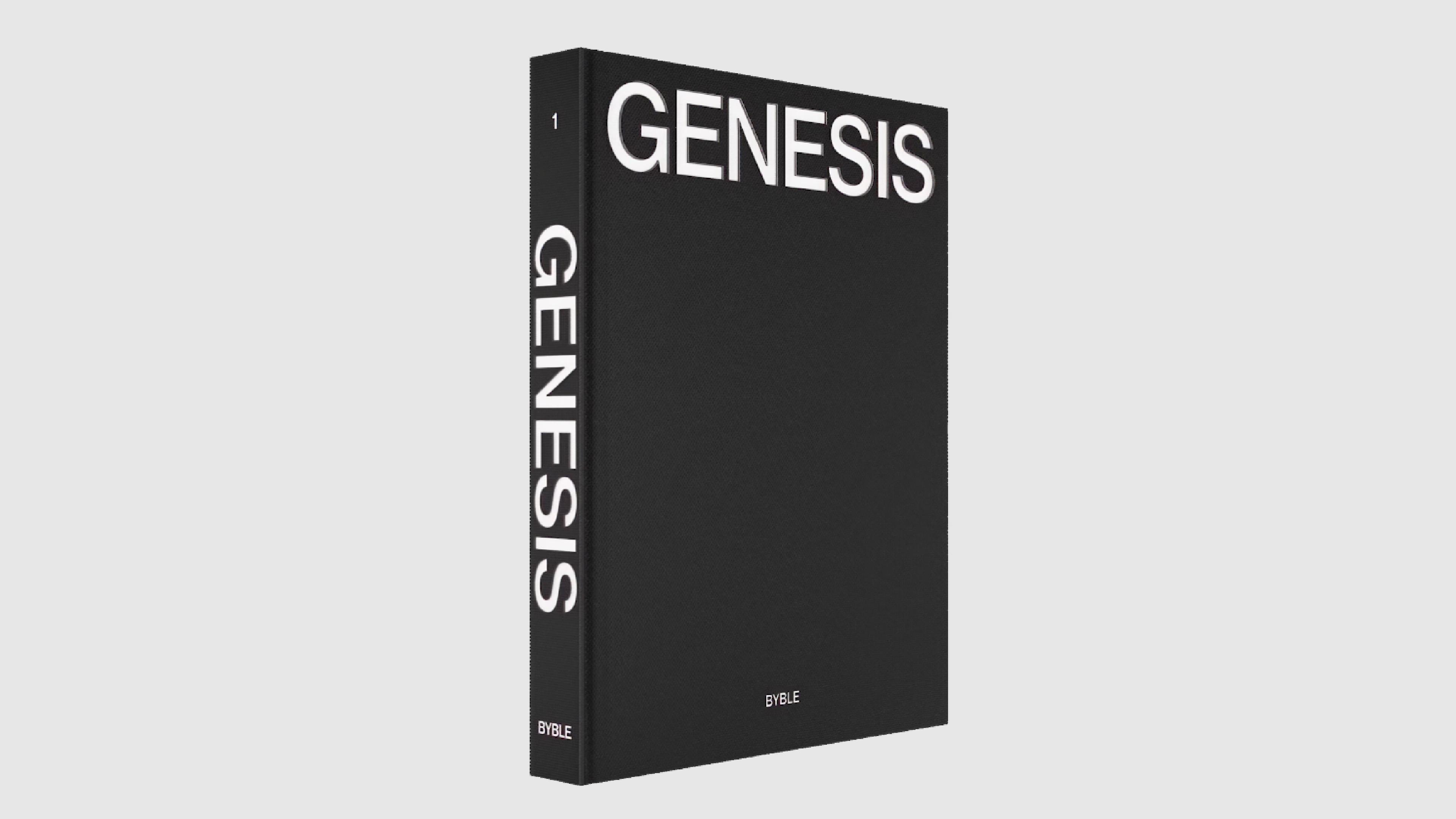
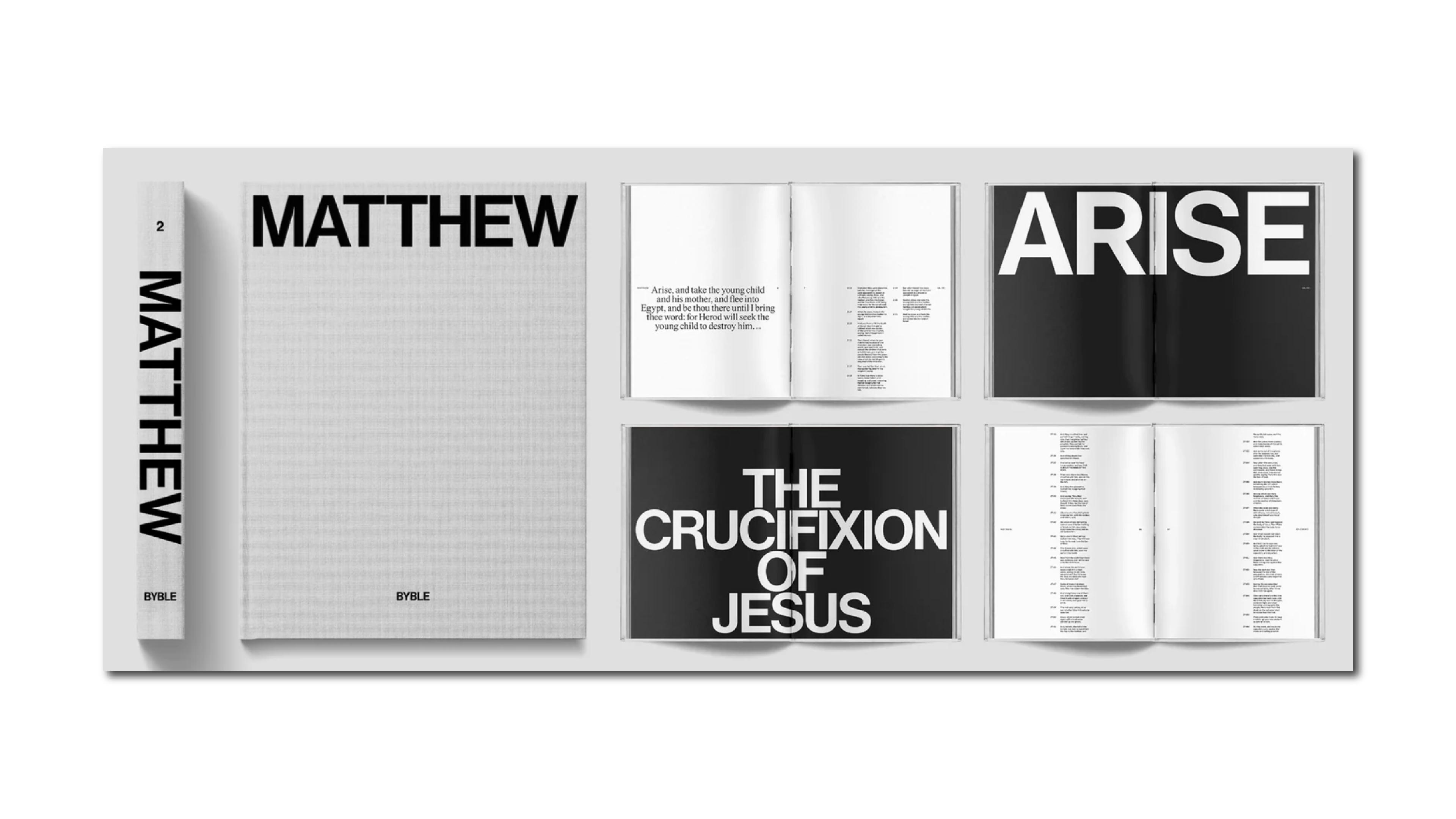
Each Byble volume is 13 × 10 inches and weighs 11.5 pounds. Hardcovers with silkscreened fabric. Typographic edge painting. 220 gsm stock — the opposite of the paper-thin pages you'd expect. These are physical objects with weight and presence, designed to sit on a desk the way an architecture monograph does.
The typography on the spine and cover is debossed Grotesk — a direct visual reference to the Gutenberg Bible, translated into a contemporary sans-serif. Da Silva also drew from Gutenberg's structural approach: columns, generous margins, occasional typographic flourishes that break the monotony of dense body text.
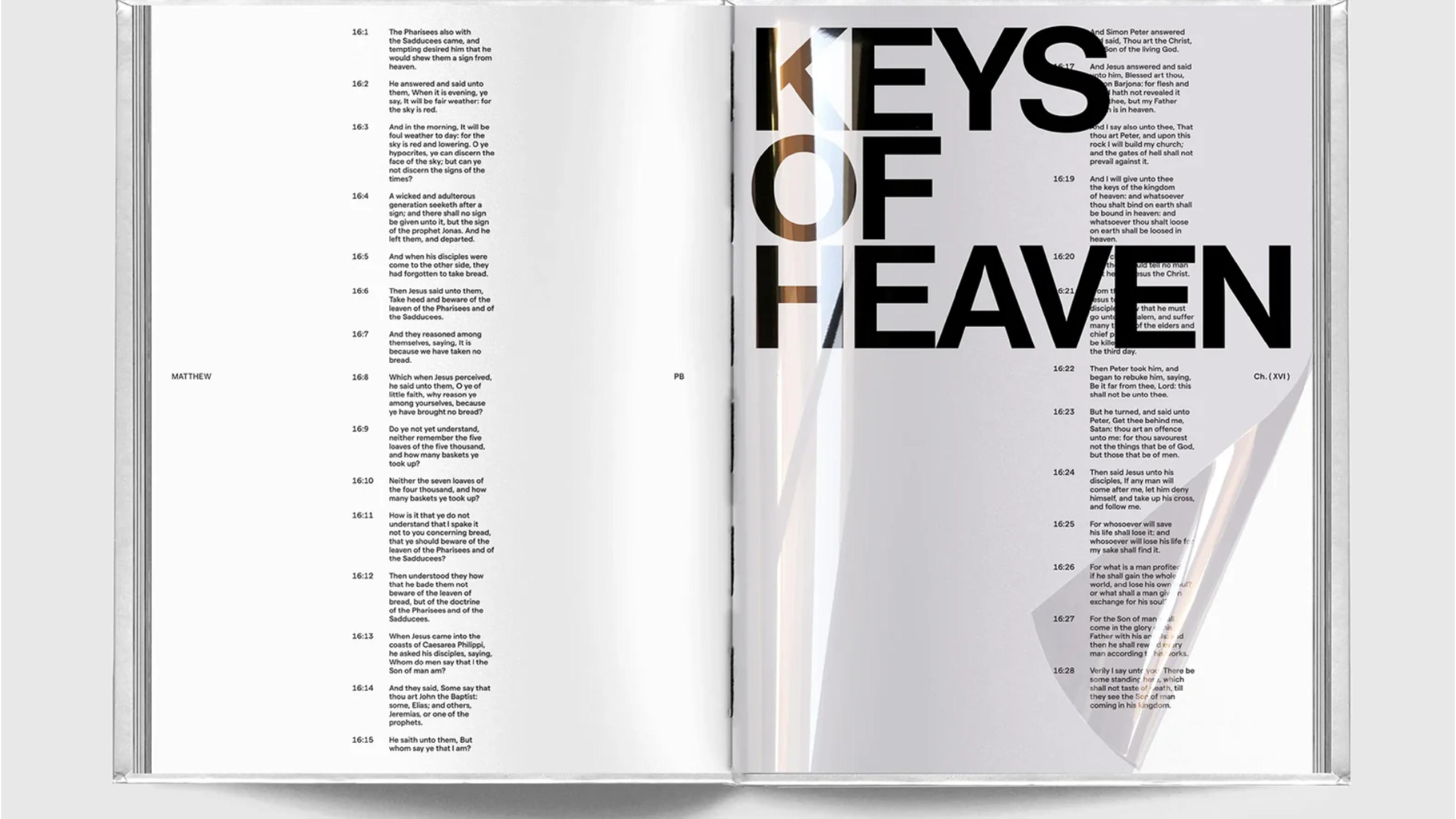
The most distinctive decision in the system is what Byble calls "Yield moments" — full spreads of large-scale, all-caps type distributed throughout each volume. No images, no decoration. Just a single excerpt scaled up to demand attention. They function the way a rest functions in music: space that makes everything around it hit harder.
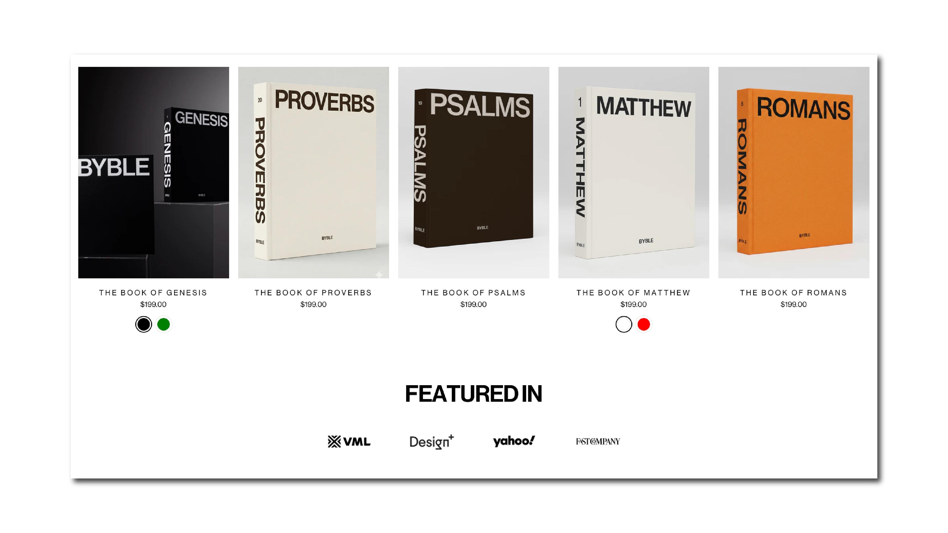
The other structural move is fragmenting the Bible into individual volumes. Genesis, Matthew, Psalms, Proverbs, Romans — each book released as a standalone object. Breaking the 783,000-word whole into singular, manageable pieces. Each volume also comes in colorways tied to the text: Genesis in black or green (a nod to the Garden of Eden), Matthew in white and red (the blood of Christ). The concept reaches all the way into the palette.
What Happens When You Strip Sacred Text Down to Pure Type
There's a useful framework for understanding what Byble is doing visually: editorial brutalism. Not brutalism in the aggressive sense — but in the original architectural meaning. Raw material, exposed structure, nothing decorative for its own sake.
The standard Bible layout fails a basic typographic test: it optimizes for compression over comprehension. Small type, tight leading, minimal margins, columns competing for attention. The reading experience becomes effortful — and not in a meaningful way. Just literally hard to read.
Byble inverts the logic. White space here isn't a luxury — it's a reading instruction. The Yield moments are mandatory pauses built into the system. Large-scale type doesn't decorate; it forces the reader to encounter a sentence differently than they would in a compact column at 8pt.
What's interesting is that Da Silva arrived at these decisions instinctively, not through design training. He has a background in architecture and property development — and that shows. There's a distinctly structural quality to the typographic choices: spatial relationships, load-bearing hierarchies, how a person moves through a complex system without getting lost. Those aren't design-school instincts. They're builder instincts. And they translate.
The Obvious Question — Is This a Bible or a Design Object?
At $199 per volume, Byble isn't mass market. The price has generated real pushback online, and the conversation is worth having. There's a genuine tension in making sacred text into a premium object — charging close to two hundred dollars for a single book of the Bible while the full text is freely available everywhere.
Both things can be true, and neither cancels the other out.
The Byble isn't trying to replace the annotated paperback your grandmother carried for forty years. It's a different object serving a different function — closer to a limited-edition monograph than a devotional tool. Da Silva has been clear about who he's making it for: the devout, yes, but also design people, and younger readers who haven't found an entry point into the text that connects with how they already relate to objects.
That's actually a smart editorial position. If the design brings someone to the text who wouldn't have opened a standard edition, the object has accomplished something the centuries-old format never could.
What Byble Gets Right — And What Publishers Should Be Paying Attention To
Beyond the conversation about faith and aesthetics, Byble makes several editorial design moves that apply well beyond the Bible.
Fragmentation reduces intimidation. Breaking a massive text into individual volumes lowers the barrier to entry. A 66-book Bible is a commitment. The Book of Psalms on your desk is an invitation.
White space is an editorial argument. Every Yield moment is a structural decision, not a visual flourish. Space tells the reader: slow down, this matters. That's not aesthetics — that's information architecture.
Type hierarchy as emotional choreography. Moving between body text and large-scale all-caps spreads creates a reading rhythm that mirrors how we actually process meaning — alternating between absorption and pause. It's the same logic behind pull quotes and chapter breaks in any well-designed editorial project.
Production quality as concept. The 220 gsm stock, silkscreened cover, typographic edge painting, and physical weight all communicate something before the reader opens a single page: this was made to last. That's a statement about the text's value expressed entirely through material decisions.
A property developer from Sydney, working with a typographic partner in Greece, spending two years on a system most publishers would have dismissed as uncommercial — produced something that Fast Company, Creative Bloq, and Design Indaba all covered in the same week.
That's not luck. That's what happens when someone asks a genuinely good design question and follows it all the way through. The Bible has been redesigned hundreds of times. Byble might be the first one where someone started with the reader's experience and worked backwards from there.
And the difference shows.