July 2, 2026
WHAT ARE GRIDS IN DESIGN (AND WHY THEY QUIETLY RUN EVERYTHING)
Grids are the quiet structure behind almost every layout you trust — here's what they actually are, how they work, and why understanding them changes how you design.
Look at any layout that feels calm and intentional — a magazine spread, a well-built website, a clean product label — and there's a good chance a grid is holding it together. You won't see it directly. That's the point. A grid system is a structural framework made of columns, rows, and consistent spacing that helps designers place content with logic instead of guesswork. It's less a rule and more a quiet agreement: everything on the page relates to everything else in a predictable way.
For anyone starting out in design, grid systems can feel like an abstract concept until you actually break one down. So let's do that.
The Anatomy of a Grid
Before getting into types, it helps to know the basic vocabulary. A grid is built from a handful of recurring parts:
- Columns — vertical divisions that content sits inside.
- Gutters — the space between columns, keeping elements from feeling cramped.
- Margins — the outer space between content and the edge of the page or screen.
- Modules — units created when columns intersect with rows, useful for more complex layouts.
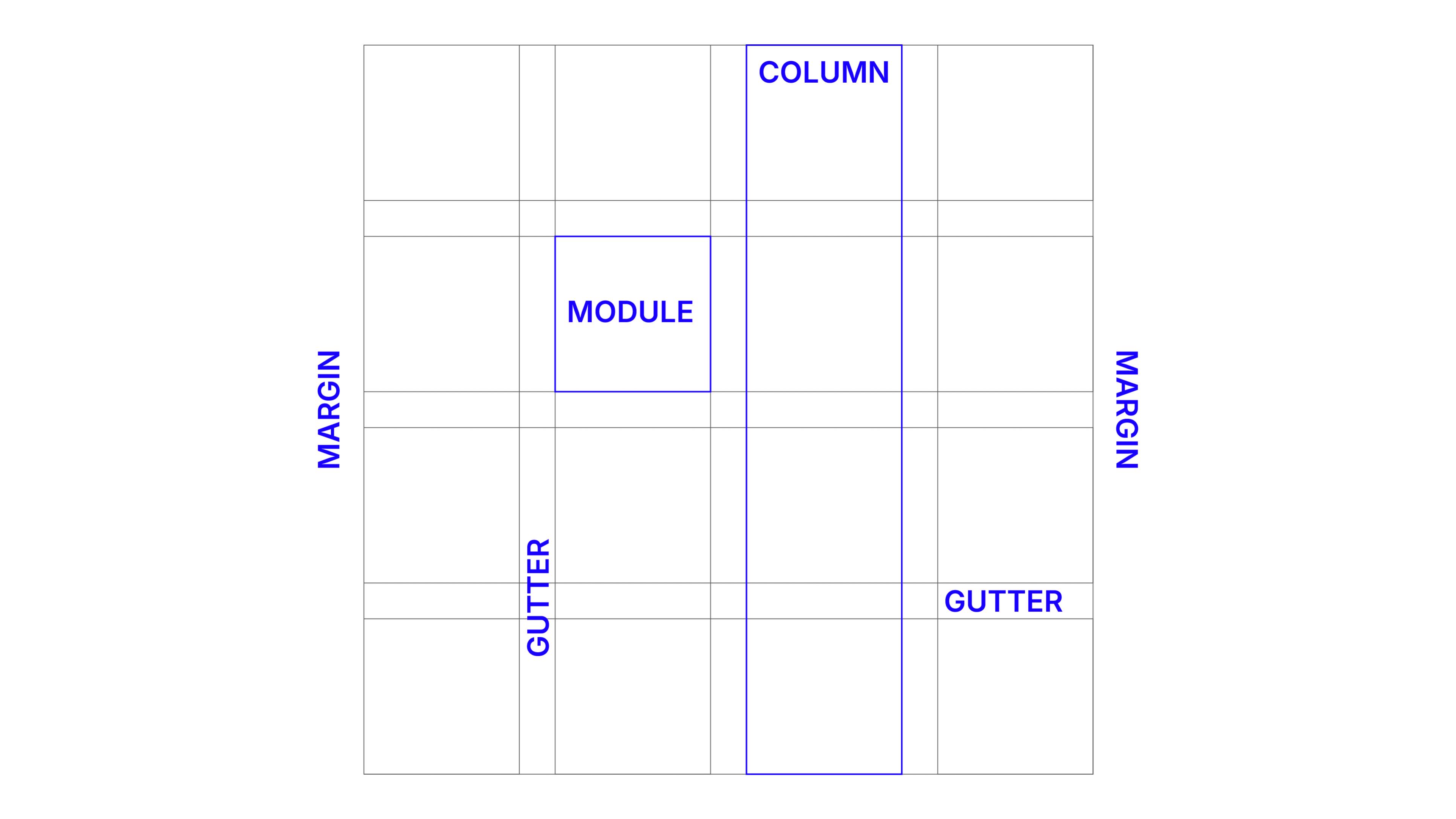
Think of it like a city laid out in blocks. The streets (gutters) separate buildings (content), the blocks (modules) organize where things go, and the city limits (margins) frame the whole thing. Nobody notices the streets when a city works well — they just notice that getting around feels easy. Grids do the same job for a page.
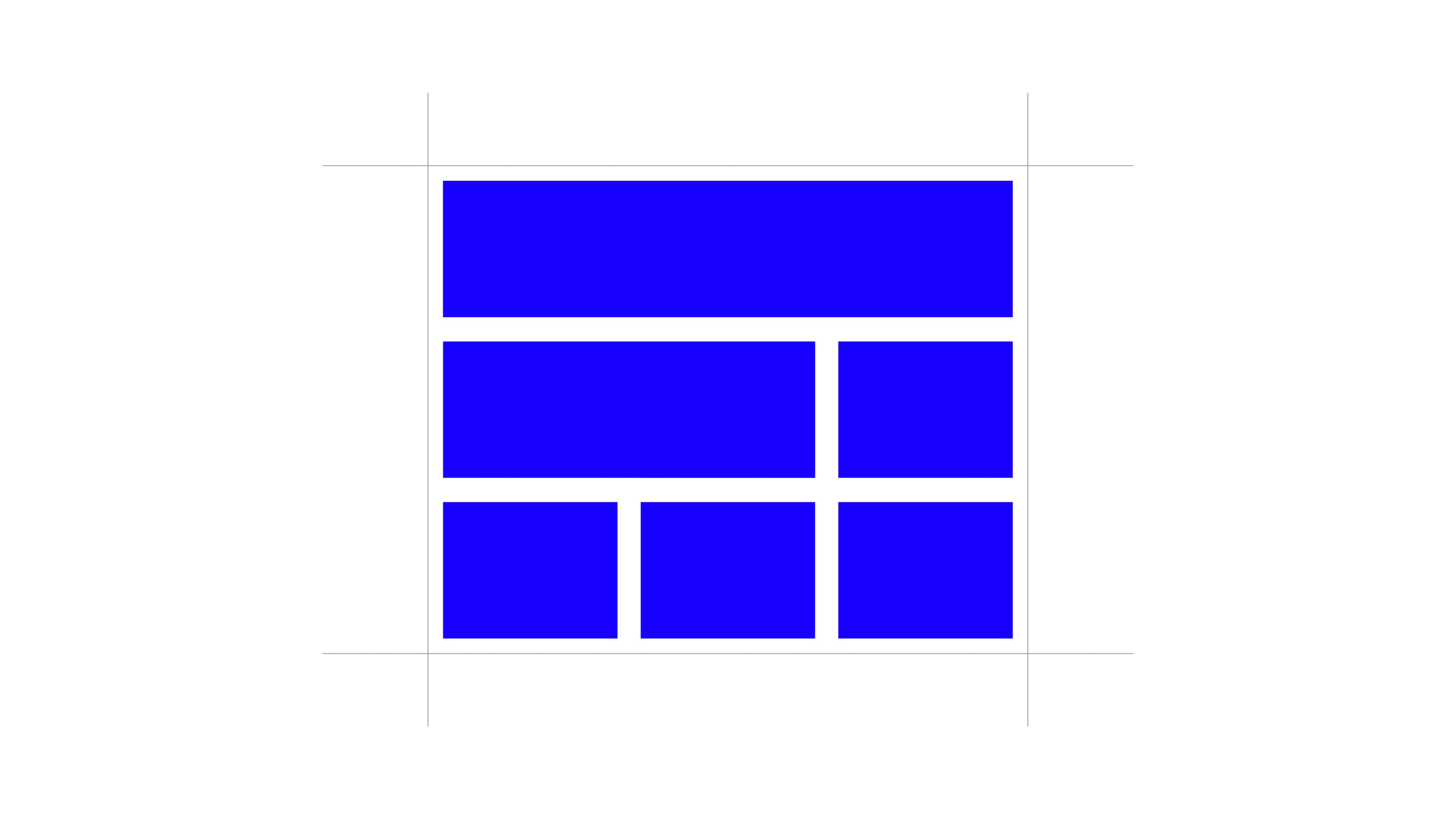
Column Grids — The Most Common Starting Point
The column grid is where most designers start, and for good reason: it's flexible and easy to reason about. You divide the page into vertical columns — commonly 12, sometimes 8 or 6 — and content spans one or several of them.
A 12-column grid is popular because 12 divides evenly in so many ways: two 6-column blocks, three 4-column blocks, four 3-column blocks. That flexibility is why it shows up constantly in editorial layouts and, even more, in responsive web design, where content needs to reflow across screen sizes without losing structure.
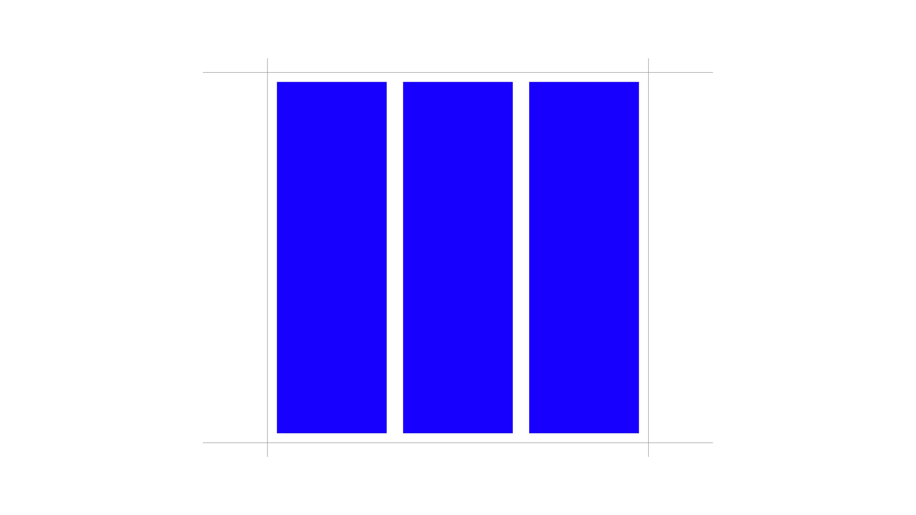
Fewer columns tend to read as more editorial and spacious — think of a magazine feature with generous white space. More columns give finer control, useful when a layout needs to juggle multiple content types at once, like a product page with images, specs, and copy competing for attention.
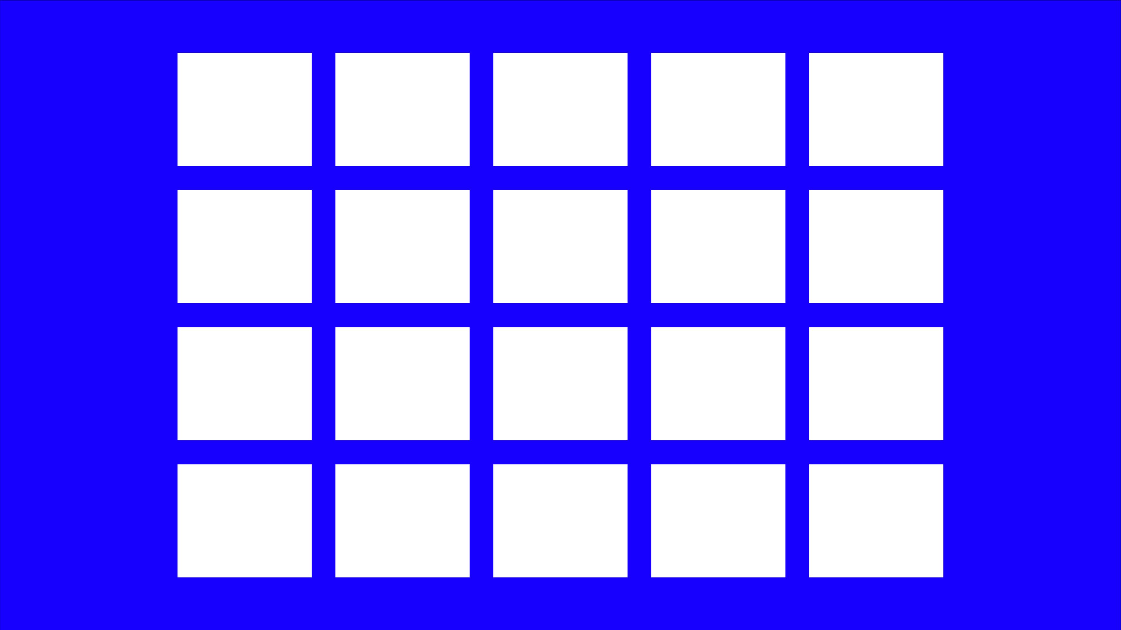
Modular Grids — When Content Gets Complex
A modular grid takes the column grid and adds rows, creating a matrix of individual modules instead of just vertical strips. This matters when content isn't just text flowing down a page, but a mix of elements that need to align both horizontally and vertically — think dashboards, catalogs, or data-heavy interfaces.
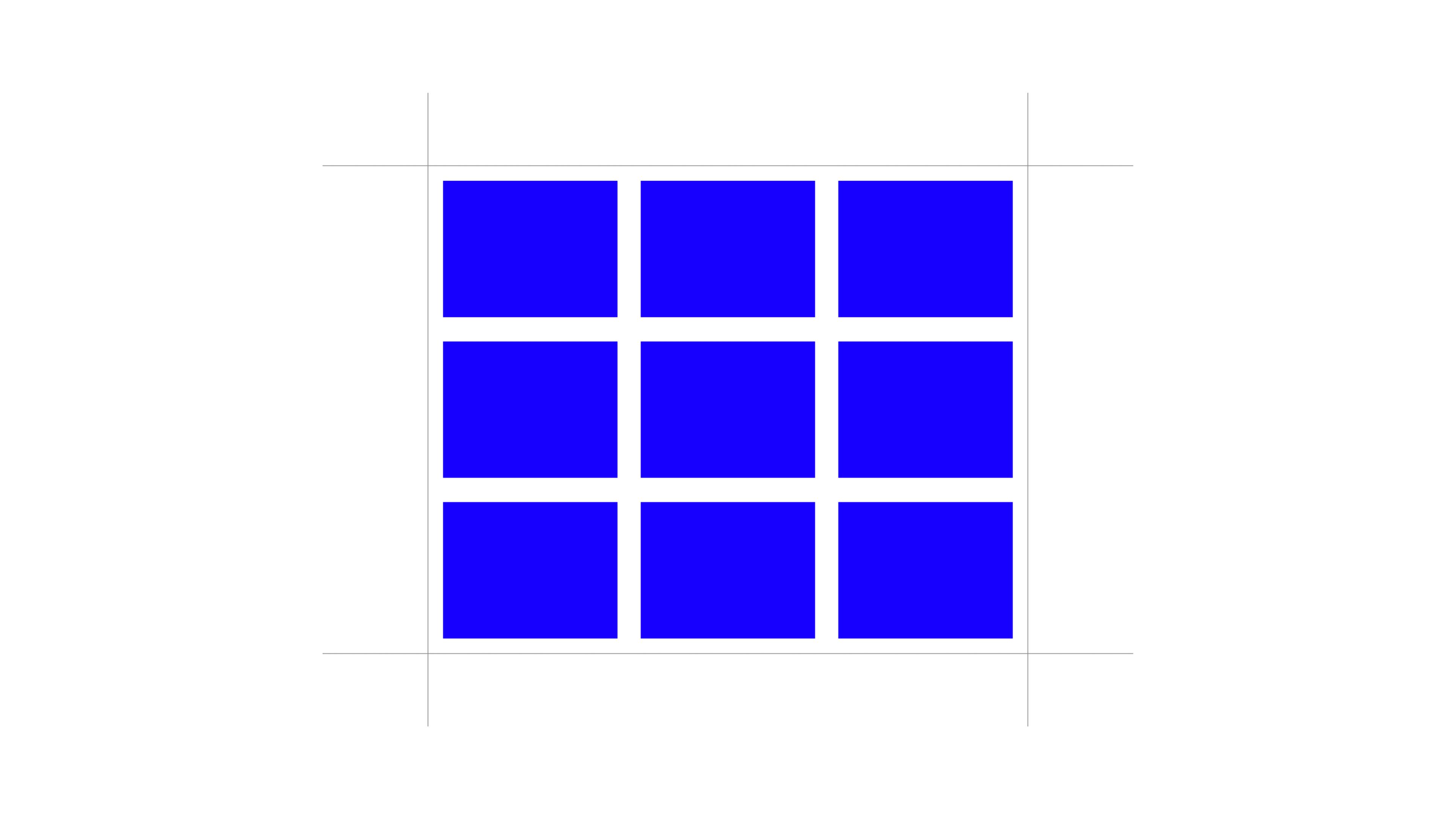
The advantage is control: every element has a defined space, and nothing drifts. The trade-off is discipline. Modular grids ask more of the designer upfront, because more relationships need to be planned. But once that structure exists, adding new content becomes far easier, since the system already tells you where things belong.
Baseline Grids — The One Nobody Sees
If column and modular grids handle horizontal structure, the baseline grid handles something quieter: vertical rhythm. It's an invisible set of evenly spaced lines that text aligns to, ensuring that lines of type across different columns or blocks sit at consistent heights.
This is the kind of grid most people never consciously notice, but they feel it. A page where all the text baselines align, even across columns, reads as calm and coherent. One where they don't feels slightly off, even if the reader can't say why. It's a small technical detail, but it's one of those craft signals that separates a considered layout from a rushed one.
Hierarchical and Asymmetric Grids — Breaking the Pattern on Purpose
Not every grid needs to be symmetrical, and not every layout benefits from one. Hierarchical grids — sometimes called asymmetric grids — are built around the content itself rather than a fixed mathematical structure. Instead of forcing an image or headline into a predefined column, the structure adapts to what the content needs to say.
This is common in editorial design and art direction, where a striking image might break out of the column structure entirely, or where negative space is used deliberately to create tension or focus. It looks freer, sometimes even chaotic at first glance. But it isn't random — it's usually a designer who understands grid logic well enough to know exactly where to bend it.
That's an important distinction. Breaking a grid effectively is a skill that comes after understanding one, not instead of it.
So, What Is a Grid, Really?
A grid system isn't a template you fill in — it's a set of relationships you define once and then rely on. Columns give you horizontal structure. Rows and modules add control for complex content. Baselines quietly hold type together. And when a layout needs to feel more expressive, understanding the grid is exactly what lets you break it with intention instead of guessing.
For anyone early in their design path, this is one of those foundations worth actually sitting with. Once you start noticing grids, you can't unsee them — and once you understand how they work, your layouts stop looking accidental and start looking decided.