June 22, 2026
HERMÈS AND BURBERRY BOTH WENT CARTOON. THEY COULDN'T BE MORE DIFFERENT.
Luxury houses don't post cartoons. Except when they do — and it's actually good.
There's a moment in one of Hermès' recent Instagram posts where a tiny pixelated horse — rendered in crisp 8-bit style against Hermès orange — carries a charger across the screen to plug in an Apple Watch. It's absurd. It's precise. It's completely on-brand. And it has no business being as compelling as it is for a house that sells a single bag for the price of a used car.
Burberry, on the other hand, has been dropping animated illustrations of Piccadilly Circus packed wall-to-wall with cartoon characters — every single one wearing a trench coat. Big heads, tiny bodies, red double-deckers in the background. Very British. Very specific. Very funny in that deadpan way only the British can pull off without trying.
Two luxury houses. Same general direction. Completely different logic. And that gap is worth examining.
The move nobody expected luxury to make
For most of its history, luxury fashion on social media followed a simple visual grammar: impeccable photography, controlled lighting, the product as protagonist. Everything aspirational, nothing approachable. The idea of posting a cartoon — something that reads as playful, even juvenile — would have felt like a brand equity problem waiting to happen.
That thinking is being quietly dismantled, and Hermès and Burberry are among the clearest examples of how it's being done right.
The key distinction is that neither house is doing cartoon content as a trend play. They're both doing it as a direct extension of what they already are — which is exactly why it works.
Hermès: the illustration was always the product
Hermès has worked with artists and illustrators as a structural practice for as long as most people can remember — the silk scarf alone has functioned as a canvas for commissioned artwork since the 1930s. What's changed is the surface: the social feed has become another place where that same approach plays out, and over the years the range of styles and animators invited in has only widened. The "Drawn to Craft" annual theme formalized what was already happening — drawing as a foundational act, not a campaign idea — and the content that continues to appear reflects a maison that has been doing this long enough to do it without thinking about it.
What makes the Hermès cartoon output remarkable is the stylistic range. There's no unified "Hermès cartoon style." There's a flat, graphic illustration of the Bond Street Maison façade — electric yellows, pinks, and greens against architectural line work, the store itself rendered like a vintage poster. There's a full anime-adjacent cooking sequence where the "ingredient" being prepared on a wooden cutting board reveals itself to be a Hermès motif — warm tones, smooth linework, unmistakably Japanese in reference. And then there's the pixel animation: 8-bit horses, Hermès-orange backgrounds, tiny characters moving through retro game logic — charging Apple Watches, carrying products, existing in a world where craft and absurdity coexist without contradiction.
[Image: Hermès Bond Street illustrated store — flat graphic poster style with Hermès signage]
Alt text: Illustrated Hermès Bond Street store façade in flat graphic style with bold yellow, pink and green tones
[Image: Hermès 8-bit pixel animation still — orange background, pixel characters with Hermès products]
Alt text: Hermès pixel art animation still featuring 8-bit style characters in Hermès orange setting
[Image: Hermès anime-style cooking animation still — wooden board, rolling pin, knife, round orange object]
Alt text: Hermès anime-style animation frame resembling a cooking scene on a wooden cutting board
Each of these looks nothing like the others. And that's intentional. Hermès has been commissioning independent artists and illustrators for its scarves, windows, and campaigns for decades. The social feed is just the latest surface. The through-line isn't a visual style — it's the act of commissioning real creative work and trusting it fully.
The range is the point
Most brands chase visual consistency as a mark of professionalism. Hermès operates differently: what stays consistent is the quality of attention given to each piece, not the aesthetic language. An 8-bit animation and a Japanese-inflected cooking sequence can both be "Hermès" because the brand's identity doesn't live in a color palette or a typeface — it lives in craft, curiosity, and the idea that drawing is serious work. That's a level of brand confidence that takes generations to build.
Burberry: cartoons as identity construction
Burberry's situation when Daniel Lee arrived in 2022 was fundamentally different. He inherited a brand that had lost its visual footing — and his response was to go back to the archive: the 1901 Equestrian Knight, the serif logotype, the trench coat as cultural artifact. The cartoon content that's followed since isn't decoration. It's worldbuilding.
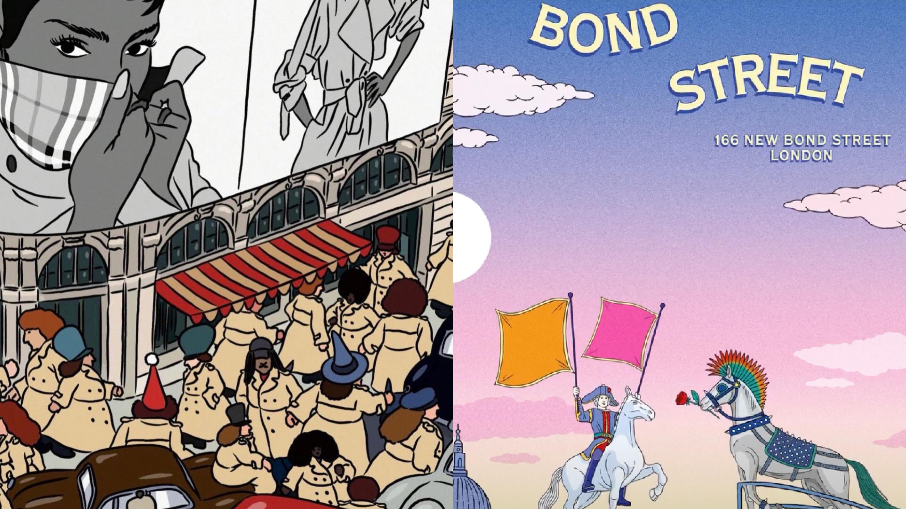
Look at what's actually being posted. "Trench Spotting" is a dense, Where's Waldo-style illustration of Piccadilly Circus — hundreds of cartoon characters, every single one in a Burberry trench, surrounded by black cabs and red buses, with Burberry campaign imagery on the billboards above. It's a visual joke that doubles as a brand statement: everyone wears a trench, and all trenches lead back to us. The big-headed characters at King's Cross station — tying their belts, checking the time, waiting for a train — carry the same energy: Burberry as part of the texture of everyday British life, not perched above it.
[Image: Burberry Trench Spotting — dense cartoon crowd scene at Piccadilly Circus, all characters in trench coats]
Alt text: Burberry illustrated animation of Piccadilly Circus crowd with cartoon characters all wearing trench coats
[Image: Burberry cartoon character at King's Cross — big-head character in trench coat tying belt]
Alt text: Burberry big-head cartoon character in trench coat tying their belt at an illustrated King's Cross station
Then there's the matchday animation — a football pitch inside a Burberry bag, with tiny groundskeepers mowing the Equestrian Knight crest into the turf, a small horse grazing in the corner. It's absurd and it's precise: it takes two things Burberry cares deeply about (British football culture and its own heraldic identity) and smashes them together in a way that feels effortless.
The knight jumping off a diving board — rendered in clean vector blue against a pale sky, the Equestrian Knight in full gallop mid-air — is the sharpest example of what Burberry is doing with its heraldry: making it move, giving it a personality, refusing to let it be static.
[Image: Burberry Equestrian Knight diving animation — blue knight figure mid-air above a lifeguard tower]
Alt text: Burberry animated Equestrian Knight figure in electric blue jumping from a diving platform
British humor as a design system
What ties all of Burberry's cartoon output together isn't a visual style — it's a tone. Dry, deadpan, slightly absurdist, grounded in specificity. These aren't generic cartoons; they're cartoons that could only come from a brand that is genuinely, culturally British. That specificity is doing a lot of work: it's what separates a charming brand moment from content that could have been made by anyone.
Same tactic, completely different logic
Placed side by side, the contrast crystallizes.
Hermès uses illustration because drawing is part of the brand's operating system — the maison has always worked with artists, the scarf has always been a canvas, the craft has always involved the hand. What's interesting about how this plays out on social is that Hermès doesn't have one cartoon style — it commissions what are essentially mini-campaigns in completely different visual languages: a flat graphic poster one week, an 8-bit pixel animation the next, an anime-inflected cooking sequence after that. Each one feels like a distinct creative collaboration rather than content from a brand playbook. The through-line isn't aesthetic — it's the quality of attention behind each piece. That's a harder thing to fake than a consistent look.
Burberry uses illustration because it's building something. Daniel Lee needed to give the Equestrian Knight — a 120-year-old heraldic device — a contemporary personality. The cartoon content does that by being bold, specific, and genuinely funny: the Trench Spotting crowd scene, the matchday pitch inside a bag, the knight launching off a diving board. It's a different kind of creative ambition — less about artistic range, more about building a world with a consistent energy and a recognizable British wit running through all of it. (If you want the full picture of how Lee rebuilt the brand from the ground up before any of this animation work started, our piece on Burberry's 2022 rebirth covers it.)
As for which approach we find more compelling: Hermès is curiously brilliant — the sheer variety of what they commission keeps you genuinely surprised. But personally, Burberry's work hits harder. There's a boldness and a humor to it that's immediately readable, immediately fun, and immediately theirs. Hermès makes you appreciate it; Burberry makes you want to share it. Both are valid outcomes. They're just different games.
What this actually tells us
The lesson here isn't "post cartoons." It's more specific than that.
Playfulness works in luxury when it comes from the inside, not from a trend report. Hermès can commission an 8-bit horse animation without eroding desirability because the brand's equity doesn't live in looking serious — it lives in being excellent. Burberry can fill Piccadilly Circus with cartoon trench coats because the trench coat is genuinely its most iconic product, not a prop.
The brands that will fail at this are the ones that reach for cartoon content as a way to seem more approachable or to perform cultural relevance. What Hermès and Burberry are demonstrating is something more interesting: illustration and animation as legitimate brand expression, held to the same standard as any other creative output.
When a luxury house posts a cartoon and it works, it's not because they lowered the bar. It's because they applied the same level of craft to a different medium — and trusted their identity enough not to worry about what it looked like.
That's the move.