July 18, 2026
THE FULL IMAGE: HOW HOSPITALITY BRANDS ARE BUILT, NOT JUST BRANDED
A hospitality brand isn't one decision — it's the same story told through a dozen different materials: a sign, a napkin, a photograph, a font. Two very different approaches show what happens when every touchpoint is telling the same story, and what happens when they're not.
A hotel or restaurant doesn't have a brand the way a shampoo bottle has a brand. There's no single label a guest looks at once and moves on. Instead, the image gets told over and over, in a dozen small materials, across the length of an entire visit — and every one of those materials is a chance to either reinforce the story or quietly contradict it.
That's the real work behind hospitality's full image: not designing a logo, but deciding what story gets repeated at every touchpoint, and then making sure the tableware, the signage, the photography, and the print all repeat it the same way. Branding is one piece of that. The image is everything.
Start With the Story, Not the Surface
The founders who get this right ask one question before anything else: what is the guest supposed to feel like they've stepped into? A different decade, a different country, a different pace of life? That answer becomes the brief for everything downstream. The image isn't the logo — it's the answer to that question, translated into a dozen different materials.
Skip that step and you get places that look expensive in isolation and incoherent in person: a refined typeface on the menu, generic stock-photo lighting on Instagram, and a dining room that looks like it was decorated by committee. Nothing is wrong on its own. Nothing is telling the same story either.
The Threshold: Where the Story Announces Itself
Every hospitality image has a first move — the moment a guest crosses in and the story has to land immediately. Carbone, in Greenwich Village, plays this almost literally: the restaurant kept the neon sign from Rocco, the classic red-sauce spot that occupied the space before it, glowing over the entrance. The threshold isn't just an entrance — it's the first sentence of the story, borrowed directly from the neighborhood's own history rather than invented from scratch.
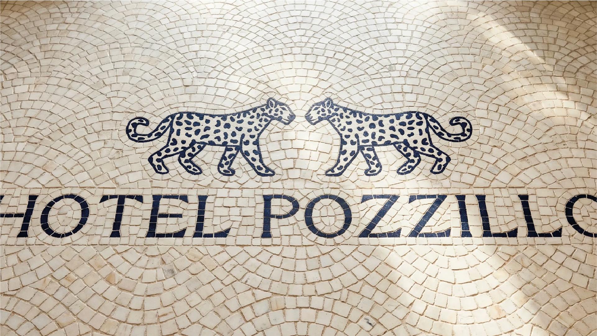
Hotel Pozzillo, a brand identity concept for a Sicilian luxury hotel by Hodge Studio, tells its threshold story differently: a vintage-style crest logo, hand-drawn palm and leopard illustrations, a serif typeface pulled from regional heritage rather than hospitality convention. Nothing about it says "boutique hotel template." It says: this could only be Sicily.
Same job — announce the story fast — two completely different materials doing it.
The Objects: Where the Story Gets Repeated in the Details
Past the threshold, the story has to survive contact with hundreds of small physical decisions: the key card, the matchbook, the check presenter, the water glass. This is where a lot of hospitality images lose the thread, because these objects usually get sourced last and designed least.
The places that hold together treat these objects as extensions of the same narrative, not afterthoughts. A heritage-driven concept like Pozzillo would carry its crest and dark palette onto stationery, room keys, even packaging for in-room amenities — every object reinforcing "this hotel has always been here." A nostalgia-driven concept like Carbone's carries its mid-century Italian-American references onto printed menus, matchbooks, and staff uniforms — small objects that, individually, are easy to overlook, but collectively make the story physically inescapable.
The Image (Literally): Where the Story Travels Beyond the Room
Most guests never write about a stay or a meal. Almost all of them photograph it, or see someone else's photograph of it first. That makes photography and content direction one of the highest-leverage touchpoints in the whole system — often more consequential than the logo itself.
Carbone's photographic language — warm tungsten light, a captain mid-gesture, a table shot just above eye level — is disciplined enough that a single cropped image, with no text at all, still reads unmistakably as Carbone. That's not a coincidence; it means the same brief that shaped the graphic identity also shaped how the space gets lit and shot. The object and the photograph are telling the same story, just in different media.
This is where a lot of hospitality images quietly break: strong print and space design, then whatever photography happens to get posted, with no direction connecting the two. The story stops traveling the moment it leaves the building.
Hotels vs. Restaurants: Same Story, Different Clock
The discipline is identical across categories, but the timeline changes what's at stake. A hotel's image has to hold together across days and dozens of separate touchpoints — signage, amenities, digital, staff — so inconsistency shows up slowly, as a gap between what was promised and what day three actually feels like. A restaurant's image has maybe ninety minutes to make every touchpoint land at once: the room, the first plate, the first photo someone takes. There's no time for the story to build gradually, which is exactly why the small, fast-read details — the sign, the light, the glass — carry so much weight.
If You're Building a Hospitality Image, Start Here
If you run a hotel, restaurant, or hospitality group, here are three things worth reviewing tomorrow:
- Name the story in one sentence, without mentioning your logo or colors. If you can't, none of your touchpoints have anything real to align to.
- Walk your own space and count contradictions. Menu, signage, uniforms, photography — find the one material that's telling a different story than the rest.
- Check who's directing your photography. If it's whoever happens to have a phone out that night, your most-seen touchpoint has no brief at all.
The hospitality brands that feel inevitable aren't the ones with the best single logo — they're the ones where the story survives every handoff, from the sign over the door to the photo someone posts three years later.