July 30, 2026
WHAT IS A MOODBOARD AND HOW TO BUILD ONE THAT ACTUALLY WORKS
A moodboard isn't a Pinterest board with extra steps — it's a decision-making tool. Here's how to build one that actually shapes a project instead of just decorating it.
What a Moodboard Actually Does (Beyond Looking Nice)
Ask five designers what a moodboard is and you'll get five slightly different answers. Most of them will circle around the same idea: a moodboard is a collection of images that captures the "vibe" of a project. That's not wrong, but it's incomplete — and it's why so many moodboards end up being pretty and useless at the same time.
A moodboard's real job is to align perception before anyone touches a design tool. Before a logo gets sketched or a color gets picked, everyone involved — designer, client, team — needs to be looking at the same mental image. Without that, you get a familiar problem: the designer presents a concept, and the client says "it's nice, but it's not us." Nine times out of ten, that gap didn't happen in the design phase. It happened earlier, when nobody agreed on what "us" actually looked like.
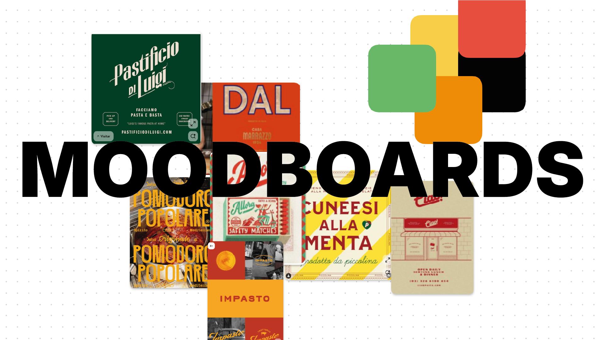
This is where it's worth separating a real moodboard from what we'd call a mood dump: a folder of images someone liked, saved without much filtering, and pasted into a grid. A mood dump reflects taste. A moodboard reflects a decision. The difference is curation with a purpose — every image earns its place because it supports a specific direction, not because it looked good scrolling through Pinterest at midnight.
The Core Ingredients of a Working Moodboard
A moodboard that does its job usually pulls from three main ingredients, each carrying its own kind of information.
Color
Color is rarely just "pretty." Every palette carries associations — warmth, trust, energy, restraint — before a single word of copy gets read. When building a moodboard, the question isn't "do these colors look good together?" but "what does this palette make someone feel, and does that match what the brand needs to communicate?" A muted, earthy palette says something very different from a high-contrast neon one, even if both are technically well-balanced.
Typography
Type shows up on moodboards more than people expect, and for good reason: typography is already doing brand work before anyone reads the actual words. A rounded, friendly sans-serif signals something different than a sharp, high-contrast serif. Including type samples early — even loosely, even before a typeface is chosen — starts shaping the tone of the whole project.
Texture & Imagery
Photography, illustration style, materials, even the way light is used in reference images — all of this builds a visual language. The goal isn't to find images that are individually beautiful. It's to find images that, placed together, start telling a consistent story. A moodboard mixing polished studio photography with grainy analog film isn't automatically wrong — but it needs to be a deliberate contrast, not an accident of what got saved along the way.
Quick glossary, since these terms get thrown around loosely:
- Mood — the emotional read of the visual direction (calm, bold, playful, austere).
- Tone — how that mood gets expressed consistently across elements (a "bold" mood might come through in color, in type weight, or in imagery — tone is the how).
- Visual language — the full system of choices (color, type, imagery, texture) working together to communicate something specific.
How to Build a Moodboard That Makes Sense (Step by Step)
Start With Words, Not Images
The instinct is to open a new board and start pinning. Resist that. The strongest moodboards start with a short emotional brief — three to five words that describe the feeling the project needs. Confident but approachable. Quiet luxury. Playful without being childish. Every image that goes onto the board afterward has to answer to those words. If an image is beautiful but doesn't support the brief, it doesn't belong — no matter how good it looks in the grid.
Curate With Criteria, Not Volume
A common mistake is treating a moodboard like a mood inventory — the more references, the more thorough it feels. In practice, the opposite is true. A board with thirty loosely-related images says less than a board with eight tightly-curated ones. Fewer references, chosen with intention, communicate direction far more clearly than a wall of "kind of related" visuals.
Look for Coherence, Not Variety
Every image on the board should be able to coexist with the others in the same imagined project. If you can't picture all the references living inside one final design, the board hasn't found its direction yet — it's still in exploration mode, which is fine, but it's not ready to guide decisions until that coherence shows up.
Common Mistakes That Make Moodboards Useless
A few patterns come up again and again in moodboards that don't end up going anywhere:
Mixing references with no conceptual thread. A minimalist Scandinavian interior next to a maximalist streetwear graphic might both be "cool," but without a reason they're on the same board, they cancel each other out instead of building toward something.
Confusing personal taste with project needs. It's easy to fill a board with what you find beautiful. The harder, more useful question is what the project needs — which isn't always the same thing.
Never connecting the board back to real decisions. This might be the biggest one. A moodboard that gets built, presented, approved, and then quietly ignored for the rest of the project wasn't a tool — it was a formality. If the final palette, type choices, and art direction don't trace back to the board, the board didn't do its job.
From Moodboard to Real Design Decisions
A moodboard earns its place when it stops being a mood and starts becoming a set of decisions. That earthy palette on the board becomes the actual brand colors. That grainy photography style becomes the direction for the brand's real photoshoot. That confident, slightly oversized typography becomes the actual type system.
Think of the moodboard as the first visual contract of the project — the point where everyone agrees, before anything is designed, on what "right" is going to look like. It's not a decorative warm-up before the real work starts. It's where the real work starts.