September 14, 2026
WHAT IS JAPANESE DESIGN? THE PRINCIPLES THAT STILL SET THE STANDARD
What separates "Japanese design" from a Muji-inspired mood board? A set of principles most people borrow without ever naming, and that keep setting the standard for how the rest of the world designs.
Japanese Design Is a Philosophy, Not a Look
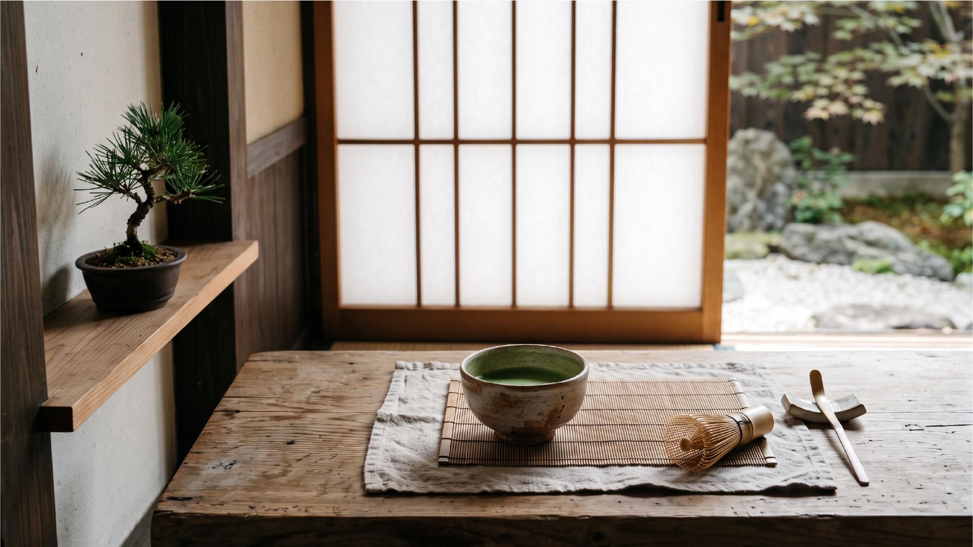
Scroll through enough mood boards and you'll see it: pale wood, generous white space, a single ceramic bowl placed off center. It gets tagged "Japanese minimalism" and treated like a color palette you can lift and paste into a brand deck.
That's the surface. Japanese design is not a look you copy, it's a set of design principles built over a century of thinking about material, space, and time. The same way Nordic design is a school with its own logic (function first, honest materials, light as a design problem), Japanese design is a coherent tradition with its own vocabulary, its own history, and its own answer to a question every designer eventually asks: what earns a place in the final composition, and what doesn't.
Understanding that vocabulary is what turns "inspired by Japan" from a mood into a method.
The Principles Behind Every Japanese Design Decision
Japanese design theory doesn't reduce to one word like "minimalism." It runs on a handful of specific concepts, each with a job the others don't do. Here are four worth knowing by name.
Space and Imperfection: Ma and Wabi-sabi
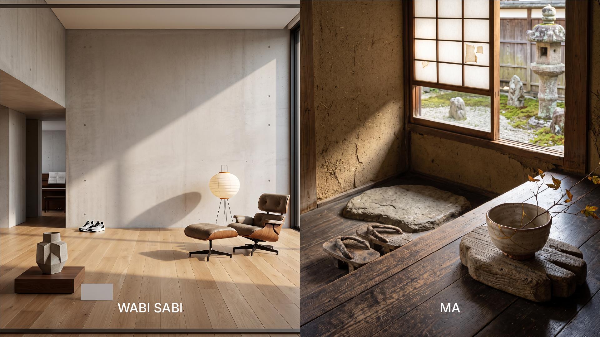
Ma (間) is usually translated as "space between things," but that undersells it. Ma treats empty space as an active part of the composition, not the leftover after you've placed everything else. The pause between two notes in music, the blank margin around a poem, the walkway between rooms in a traditional house: all of that is ma, and all of it is doing design work. In a layout, ma is the difference between white space that happens by accident and white space that was drawn on purpose to control where the eye rests.
Wabi-sabi (侘び寂び) is the acceptance of imperfection and impermanence as sources of beauty rather than flaws to correct. A hand-thrown ceramic bowl with a slightly uneven rim, a wood surface that shows its grain and its wear: wabi-sabi finds these more honest, and often more beautiful, than anything machined to a perfect finish. It's the opposite instinct of a brand system built to look flawless at every scale.
Restraint and Quiet Beauty: Kanso and Shibui
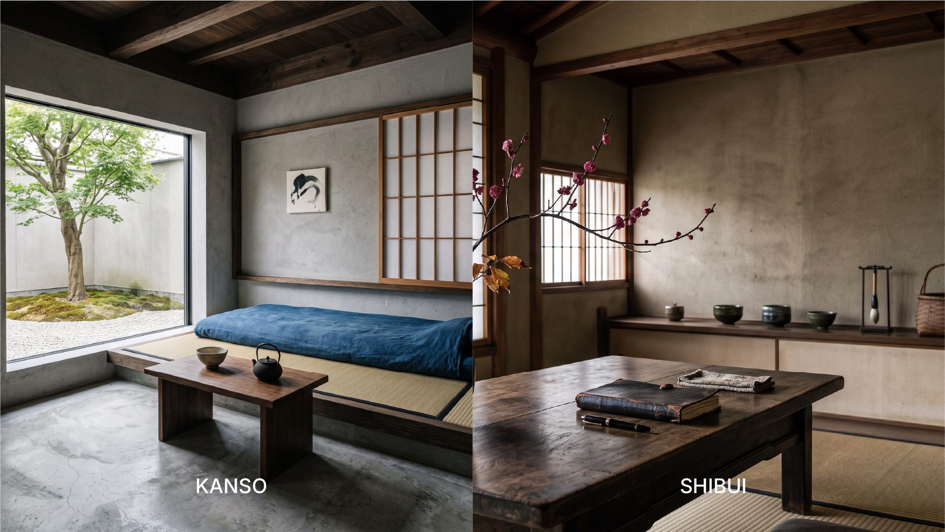
Kanso (簡素) looks like minimalism from a distance, but the practice behind it is different. Minimalism, in its Western, gallery-born sense, is often about reducing a form to its most essential shape as a conceptual statement. Kanso is a working question applied to every element: does this make what remains stronger, or is it just occupying space? It's a filter, not a style, and it's why Japanese product design so often feels edited rather than empty.
Shibui (渋い) describes a beauty that doesn't perform for attention. It's understated on first contact and reveals more the longer you spend with it, closer to a well-worn leather bag or a matte glaze than to anything shiny or loud. Shibui is what keeps kanso from tipping into coldness: the restraint is deliberate, not accidental.
A Short History: From Handcraft to Global Standard
These ideas didn't arrive from nowhere, and they didn't stay purely theoretical for long.
In the 1920s, philosopher Soetsu Yanagi led the Mingei movement, arguing that everyday, handcrafted objects made by anonymous artisans carried more genuine beauty than fine art made for display. Around the same time, a different current was taking shape: the Industrial Arts Research Institute, founded in 1928, brought European modernist thinking into Japan through figures like Bruno Taut and Charlotte Perriand, both of whom spent time studying and working there. For a few decades, Japan had two design philosophies running in parallel, one rooted in craft, one in Bauhaus-style functionalism, and much of what we now call Japanese design comes from the tension between them.
That tension resolved into some of the most recognizable industrial design of the twentieth century. Sori Yanagi, who later founded the Association of Japanese Industrial Designers, created the Butterfly stool in 1954, an object that reads as sculpture and functions as furniture. In 1961, designer Kenji Ekuan gave the world the Kikkoman soy sauce dispenser, a piece of tableware so precisely resolved that it's barely changed since. These weren't abstract expressions of ma or kanso. They were those principles, built and put on a table.
Why It Still Sets the Standard Today
Emptiness, Not Minimalism
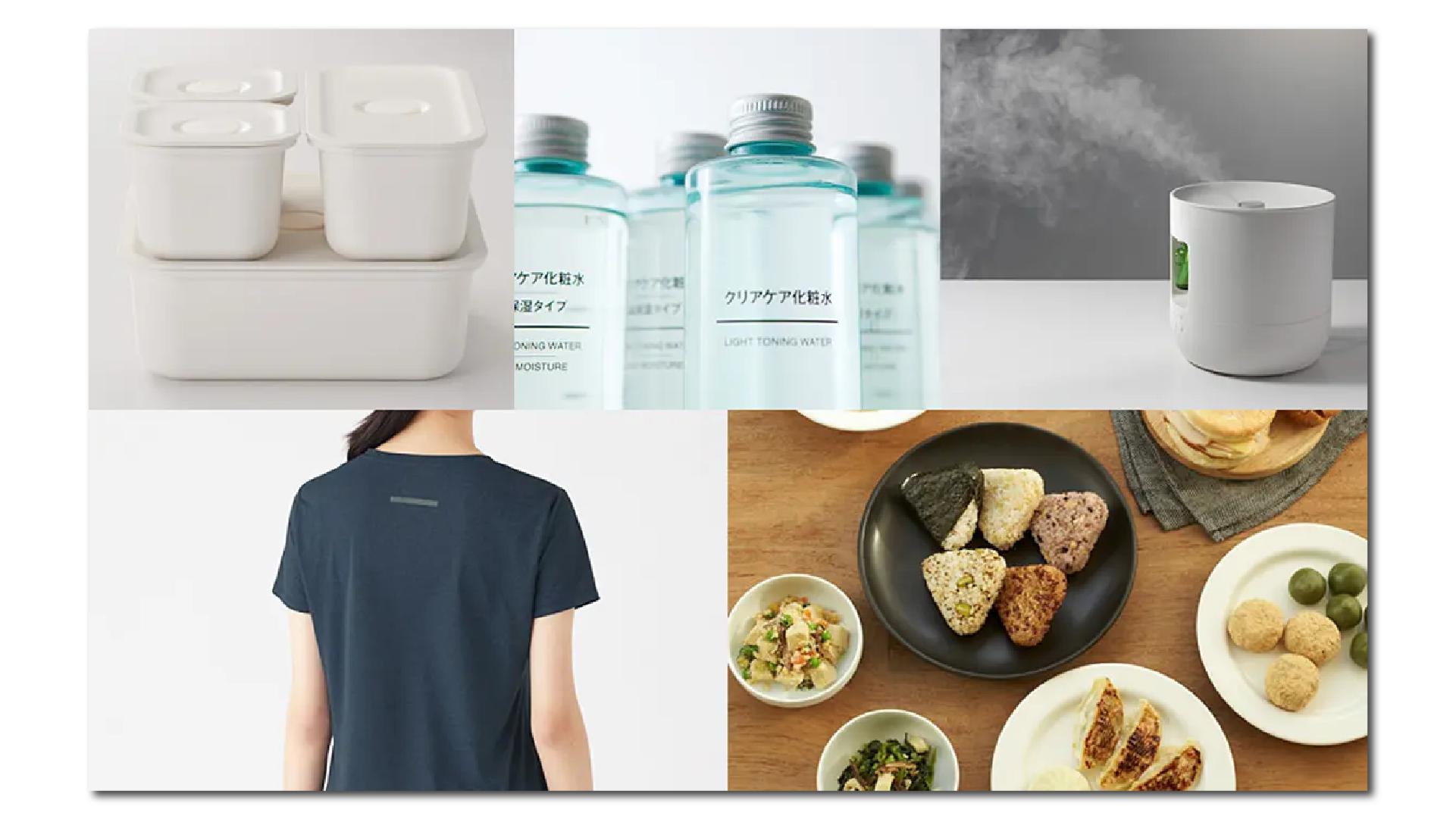
MUJI is the clearest modern case study, and its longtime creative director, Kenya Hara, has repeatedly drawn a distinction that matters for anyone doing this work today: MUJI isn't designed by subtraction, it's designed around emptiness. Subtraction implies you started with more and took things away until you hit a minimum. Emptiness is a starting condition, a deliberately open form that lets the person using the product or the space bring their own meaning to it. That's a genuinely different design brief, and it's why MUJI's aesthetic feels calm rather than austere.
The Quiet Influence: From Product Design to UX and Branding
Designer Naoto Fukasawa describes his own practice as designing things that dissolve into behavior, objects so aligned with how people already move and act that using them stops feeling like a decision. That idea maps directly onto UX design: the best interface is the one nobody has to think about. It also maps onto branding: the identities that last are rarely the loudest ones, they're the ones that fit so naturally into a business that people stop noticing the design and start trusting the brand.
You can see the same instincts, translated, in products that never mention Japan at all. The restraint in Apple's product and interface design, the growing appetite for interfaces that do less but do it more precisely: none of it is a coincidence. Japanese design principles became a working method that other design cultures absorbed, often without crediting the source.
What Designers Can Actually Take From This
None of these principles require using Japanese materials or aesthetics to be useful. What they offer is a sharper set of questions. Before adding an element, ask what it's earning its place by doing, that's kanso. Before filling a blank area, ask what the emptiness itself is communicating, that's ma. Before polishing something to a uniform finish, ask whether some of its texture is actually part of the message, that's wabi-sabi. And before shipping the loudest version of a design, ask whether a quieter one might hold up better over time, that's shibui.
Japanese design has kept setting the standard for a century not because it looks a particular way, but because it starts from better questions. That's a method any designer can borrow, no mood board required.