July 24, 2026
MEXICO'S SOCCER EMBLEM REBRAND: A CASE STUDY IN HOW NOT TO TOUCH AN ICON
Modernizing a national crest isn't the problem. Modernizing it without understanding what made it iconic in the first place is.
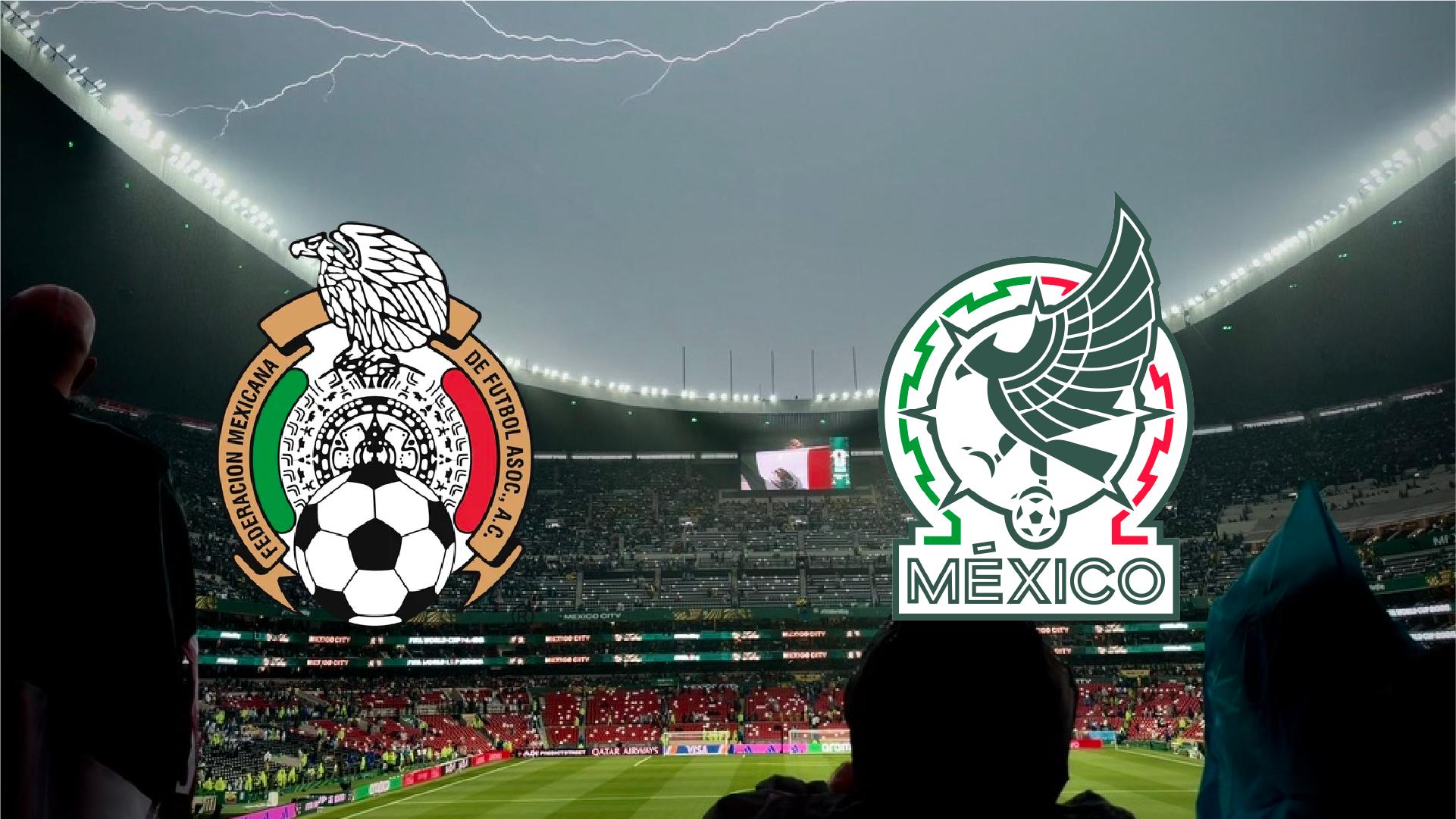
In December 2021, Mexico's soccer federation unveiled a new crest for El Tri. It had been 33 years since the badge last changed, and the timing made sense on paper: Mexico is co-hosting the 2026 World Cup, sponsors wanted something more "contemporary," and every federation eventually feels the itch to modernize. The initial reaction wasn't even hostile. But four years later, the debate has resurfaced with a vengeance, and the direction of that debate tells you everything: fans aren't asking for more updates. They're asking for the old one back.
That's the real story here — not a bad launch, but a badge that never earned its place. And Mexico isn't even the only federation that made this mistake. It's just the clearest recent case of a much bigger design problem: confusing "clean" with "empty."
The Escudo Before the Reset
The pre-2021 crest had been in place since the late 1980s, which in football-badge years is basically an eternity. It was dense, almost baroque by modern logo standards — a detailed eagle rendered with real illustrative weight, structured around the imagery of the Aztec sun stone, clutching a ball modeled after the 1970s Telstar that had anchored the design since the 80s. Every element was doing something. The eagle wasn't a generic mascot; it was pulling directly from Aztec and Mayan visual language. The ball wasn't decoration; it tied the crest to Mexico's World Cup hosting history.
That's what made it a system, not just an image. The illustration, the ball, the typography — they reinforced each other. You could look at that crest and read decades of context into it without needing a caption.
The push to change it wasn't unreasonable on its face. Heading into a home World Cup, federations feel pressure to look "current," and Adidas — Mexico's kit sponsor — backed the redesign heavily, running focus groups that reportedly came back positive. None of that is a red flag by itself. Plenty of good rebrands start from the same brief. What matters is what happened to the actual design.
What Actually Got Lost in Translation
Here's the part that gets flattened in most takes on this: the new crest isn't just "simpler." Simplification, done well, is subtraction with intention — you keep the load-bearing elements and cut the noise. What happened to Mexico's badge is closer to vaceptamiento: the illustrative eagle became an abstract, mostly flat silhouette, and a lot of the symbolic texture that connected it to the sun stone and to Aztec and Mayan art got smoothed away in the process.
The symmetry issue is where this really shows. The old crest had an organic asymmetry to it — the eagle in a dynamic, almost mid-strike pose, the ball sitting off-axis at the talon, breaking the visual balance in a way that read as movement and tension. The new version resolves into something much more centered and static, more app-icon than engraving. That's not a neutral choice. You gain order; you lose the sense that something is happening in the image. A crest that used to feel like a moment now reads like a settings menu.
Then there's the "México" wordmark, which launched in outline — hollow letters, unfilled — sitting next to a solid eagle. It read as unfinished from day one, and it threw off the visual weight of the whole composition: a dense, solid symbol paired with a ghost of a word. In 2025, the federation quietly filled the letters in. On its own, a small tweak. But it's also an admission. You don't patch a deliberate design decision unless it never actually worked, and the fact that the fix added visual weight rather than removing it suggests the "airy" version was a problem from the start, not a stylistic choice that just took getting used to.
What's most telling, though, is the shape of the backlash. This wasn't a design that got dragged the week it launched and then settled in, the way most rebrands go. The initial read was mildly positive. The resentment built slowly, resurfacing years later with more intensity, not less. That's a worse signal than a bad launch. A logo that flops on day one at least generates a strong reaction — people are engaging with it, even negatively. A logo that fans grow to miss the old version more over time never actually replaced what it removed. It just occupied the space where an icon used to be.
Mexico Isn't Alone (And That's Not an Excuse)
Spain's version of the same mistake. In 2021, Spain's federation, the RFEF, retired a crest built on artwork by Joan Miró — genuinely singular, instantly recognizable, tied to one of the country's most important artists — and replaced it with a white circle on a red field. The federation called it "elegance and simplicity." Fans and designers called it, more or less unanimously, a downgrade. It's the same core error as Mexico's: treating "less detail" as automatically synonymous with "more modern," without asking whether the detail being removed was actually the thing people connected with.
France shows you can modernize without resetting. The Gallic rooster has been redrawn dozens of times since the 1910s — sharper here, flatter there, a star added after each World Cup win — and it has never once disappeared. That's the opposite instinct from a reset: evolve the mark, but treat the archive as a source, not as a version to erase.
England shows sometimes the move is doing nothing. The Three Lions on the actual match shirt have barely changed since 1949, when the only real edit was removing the crown to avoid confusion with the cricket badge. The lion-family "England Football" crest that caused a stir in 2021 is a separate grassroots brand — it was never meant to replace the shirt crest, and the fact that so many people assumed it had says something about how much equity the real badge still holds. Restraint, in that case, wasn't a lack of ambition. It was the design decision.
So What Should Mexico Have Done?
This isn't an argument for nostalgia. Going back to the old crest wouldn't undo four years, and "just bring back the old logo" is rarely as satisfying in practice as it sounds in a comment section. The point isn't the specific artwork — it's the criteria that should sit behind any decision to touch a symbol with decades of built-up meaning.
Heritage isn't a decorative layer you can strip out to look cleaner. It's brand equity, earned the slow way, over generations of people associating a shape with a feeling. You can absolutely evolve that shape — France proves it every few years. You can even leave it almost entirely alone — England proves that works too. What you can't do is treat the erosion of that equity as a sh*t you don't have to deal with just because the new version tests well in a focus group. Mexico didn't fail because it changed its crest. It failed because it changed the parts that were actually carrying the meaning, and kept the parts that weren't.
The lesson scales past football. Any brand sitting on real heritage — a legacy product mark, a founder-era wordmark, an identity system people have quietum internalized — is going to face this exact decision eventually. The federations that get it right ask a harder question before touching anything: which of these elements is the reason people recognize us, and which is just how it happened to look in whatever decade we last redrew it. Get that distinction wrong, and no amount of "modernization" will make the new version feel earned.