October 9, 2026
HOW MICROSOFT'S MICHELANGELUS FONT TURNED MICHELANGELO'S HANDWRITING INTO TYPE
Michelangelo once begged his nephew to stop writing to him because his letters gave him a fever. Now his own handwriting is the Michelangelus font, Microsoft's new free serif, and the way it was built isn't what the headlines told you.
Michelangelo had a pen pal problem. His nephew Lionardo kept sending him letters, and Michelangelo kept telling him to stop: every new one, he complained, gave him a fever just from the effort of reading it.
So there's a certain irony in where his own handwriting landed this week: in your font menu. The Michelangelus font, commissioned by the Fabbrica di San Pietro and designed by studiogusto for Microsoft, turns the artist's letters and signature into a full type family. But the people who drew it didn't set out to copy his hand. They set out to decode it.
What the Michelangelus font actually is
Michelangelus is a serif typeface family inspired by the handwriting of Michelangelo Buonarroti. It was commissioned by the Fabbrica di San Pietro, the institution that looks after St. Peter's Basilica, to mark 400 years since the basilica's consecration in 1626. The letterforms were designed by studiogusto, an independent studio based between Italy and Germany. Microsoft licenses and distributes it, and handled the legal clearances and technical reviews needed to ship a font inside its products.
The project was first announced in February 2026, and the font itself was released in October. It comes in four styles (Regular, Italic, Bold and Bold Italic) and is available as a free download for Windows 10, Windows 11 and Mac. Microsoft says it will also arrive in Microsoft 365 apps like Word, PowerPoint and Excel by the end of the year.
Two things the early coverage got wrong are worth clearing up. First, many February headlines credited Microsoft engineers with the design. The letters were actually drawn by studiogusto. Second, Michelangelus is not a handwriting font. Microsoft describes it as a humanist serif, a text face meant for paragraphs and headlines, not a loopy script for wedding invitations. In fact, studiogusto's creative director Stefano Calandro has said the team's very first decision was not to imitate Michelangelo's handwriting.
Which raises the obvious question: if you're not copying a hand, what exactly are you doing with it?
How a handwriting becomes a typeface
Handwriting and type solve opposite problems. Handwriting is a performance: every letter comes out slightly different because the hand is moving, tiring, rushing. A typeface is a system: every "a" has to be identical to every other "a", and it has to sit comfortably next to every other letter in the alphabet. Turning one into the other means deciding which irregularities are personality and which are just noise.
Reading the manuscripts for patterns, not accidents
The studiogusto team went to the source: Michelangelo's documents held in the archives of the Fabbrica di San Pietro, the Vatican Apostolic Archives and Casa Buonarroti in Florence. The studio says it studied more than 300 of his manuscripts, from letters and notes to signatures.
The job wasn't to find the prettiest letter. It was to find the recurring ones. A blot of ink or a rushed stroke shows up once; a habit shows up hundreds of times. The team looked for what Michelangelo did consistently: how he built his capitals, how much space he left inside and between letters, the angle of his slant, the shape of his stroke endings, the overall rhythm of a line. Those habits became the design rules.
Italic first, then a week on one g
Most type families are designed regular first, with the italic added later as a companion. Michelangelus went the other way. Project manager Alessandro Grandinetti explained that the team began with the italic because italic hand was simply how people wrote in Michelangelo's time. Starting there kept the whole family anchored to its source.
The lowercase letters come largely from his letters and his signature, and some of them took serious negotiation. The designers spent a full week on the lowercase "g" alone, trying to keep its historical character while making it feel at home in a modern document. If that sounds excessive, it isn't. The "g" is one of the most complex shapes in the Latin alphabet, and in a text face, one awkward letter repeated across a page is all it takes for a reader to feel that something is off.
Capitals borrowed from stone
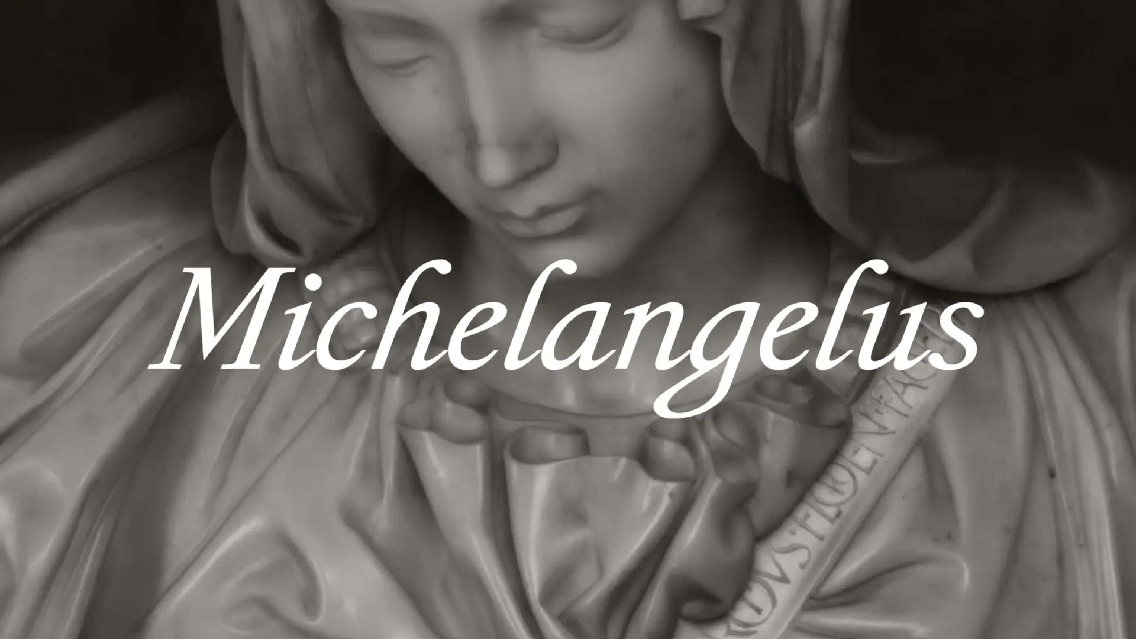
Here's the catch: no complete uppercase alphabet in Michelangelo's handwriting survives. So the team turned to his public work instead. The capitals draw on inscriptions like the Roman capitals carved on the sash of the Pietà, Latin inscriptions inside St. Peter's and lettering in the Sistine Chapel.
The result is a nice split personality. The lowercase carries Michelangelo's personal voice; the uppercase carries his monumental one. Letters to family on one side, marble and domes on the other.
The invisible grid holding it together
The most useful discovery was structural. Michelangelo tended to lift his pen between letters instead of joining them, so each letter already behaved like an independent unit. And beneath the apparent spontaneity, the designers found what they describe as an invisible grid: consistent proportions and slants that gave his writing an almost architectural order.
That's exactly what makes a font possible. Digital type is built from separate glyphs placed side by side on shared measurements, so a handwriting that already worked as modular blocks on a hidden grid was halfway to being a typeface. Not a huge surprise, coming from someone who also designed buildings.
What makes the Michelangelus typeface look the way it does
To read Michelangelus properly, a little vocabulary helps:
- Typeface vs. font: the typeface is the design (Michelangelus); a font is one specific style or file of it (Michelangelus Bold Italic).
- Glyph: any single character the font contains, including letters, numbers, punctuation and alternates.
- Stress: the axis along which a letter's strokes get thicker and thinner.
- Terminal: the end of a stroke that doesn't finish in a serif, like the tip of a "c" or the top of an "f".
Humanist serifs are the oldest branch of the roman type tradition. They take their cues from Renaissance pen writing, which is why they typically show modest contrast between thick and thin strokes and an angled stress that echoes a broad-nib pen held at a slant. That calligraphic DNA is what makes them feel warm and readable at text sizes, and it's why a Renaissance hand was a natural fit for this classification.
What sets Michelangelus apart within that family is its proportions. The letters run slightly narrow. Calandro has said the face isn't technically condensed, but you can feel something condensed in it, and that's a real difference from wider, rounder serifs like Garamond. Narrower letters fit more words per line and give a page a taller, more vertical texture. Think columns rather than arches.
The character set deserves attention too, because a lot of a typeface's personality lives in what's inside the file beyond A to Z. Michelangelus includes ligatures (two letters joined into a single glyph, like "fi"), stylistic alternates (optional versions of a letter), contextual forms that swap in automatically depending on neighboring letters, plus fractions, arrows, currency symbols and historical marks. The italics add initial forms and alternate letters for a more handwritten feel at the start of words. These are OpenType features, and they're how a modern font can carry some of the variety of real handwriting without breaking its system.
A quick note on numbers: you'll see different glyph counts depending on the source. Microsoft mentions more than 2,000, the Vatican's announcement says more than 500, and studiogusto lists a core set of 455. They're most likely counting different things (one style versus four, core characters versus alternates), so read them as different measures rather than a contradiction.
What nobody has published yet is readability testing. Our read: Michelangelus will shine in editorial layouts, cultural and institutional work, headlines and anything that benefits from a sense of history. For long reports or dense interfaces, we'd test it at real sizes before committing.
What Michelangelus teaches about how every font gets made
Strip away the Renaissance and Michelangelus followed the same path every serious typeface does. It started with research and a clear brief: a source to study and a reason to exist. Then came sketching and decisions about what to keep, followed by drawing each glyph as vector outlines built from points and curves. After that, the unglamorous part that separates amateur fonts from professional ones: spacing every letter (its sidebearings, the built-in space on each side) and then kerning, the fine adjustments for awkward pairs like "AV" or "To". Then expanding the glyph set, programming OpenType features, testing at small and large sizes across apps, and finally the technical review and production Microsoft handled before shipping. A week on one "g" sounds romantic, but it's a pretty normal week in type design.
If you want to try it now, you can download it for free and install it on Windows or Mac. Keep in mind it's free to use but not open source, so the license comes with conditions. And until it reaches Microsoft 365, anyone who doesn't have it installed will see a substitute in your documents, so embed the font or send a PDF when it matters.
As for Lionardo, the story reportedly gets worse for him. At one point, Michelangelo threw one of his letters into the fire and told him not to write again until his penmanship improved. Lionardo kept writing anyway, and Michelangelo kept complaining.
It's a funny footnote, but it's also the whole lesson of Michelangelus. A beautiful hand is not the same as a readable one, and Michelangelo knew it. That's why studiogusto didn't trace his letters: they found the order underneath them and built the Michelangelus font as a system anyone can read at 11 points in a Word document. Five hundred years later, the man who burned his nephew's mail finally has a font he'd approve of.