July 4, 2026
MICROGRAPHICS IN BRANDING: WHEN DETAIL BECOMES IDENTITY
Micrographics started as functional shorthand for machines — now they're one of the most quietly powerful tools in modern branding. Here's why the smallest details on a brand are starting to carry the most weight.
What Micrographics Actually Are
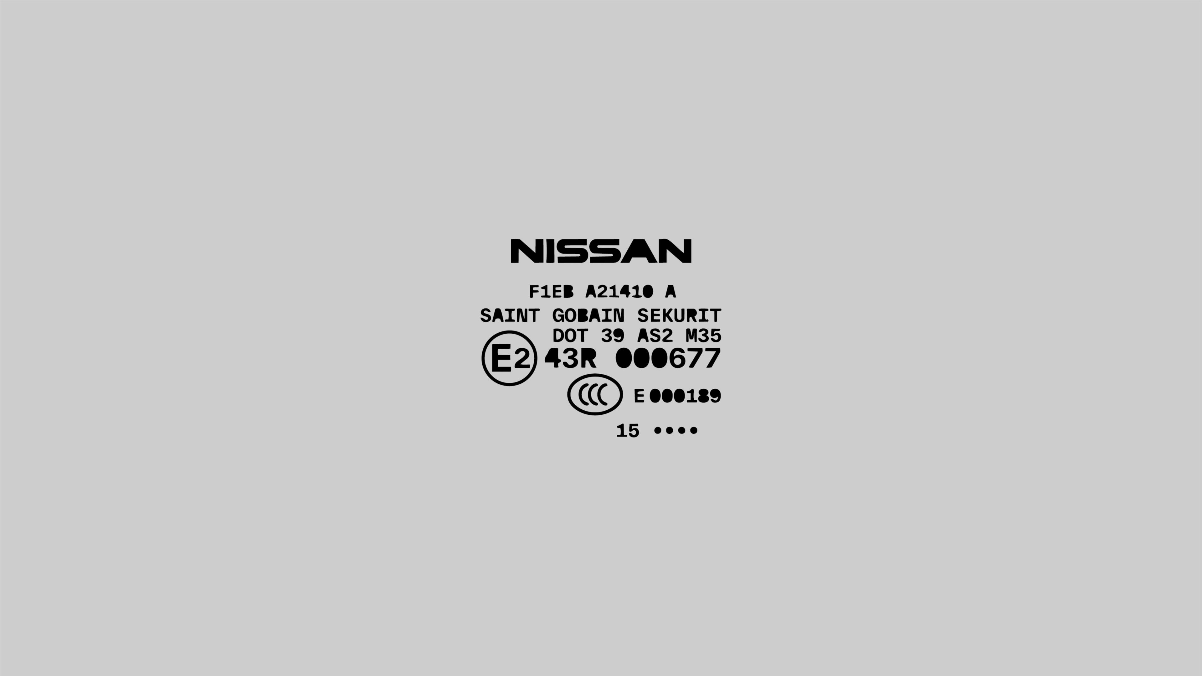
Micrographics are the small stuff: technical specs, measurement marks, barcodes, care instructions, stitched serial numbers, tiny diagrams explaining how something works. For decades, this was purely functional language. A factory needed to communicate load capacity, material composition, or assembly instructions, and it did so in the most efficient visual format possible — dense, gridded, monospaced, almost cold.
None of it was designed to be beautiful. It was designed to be precise.
That precision is exactly what makes micrographics so interesting to brands today. In a landscape saturated with soft gradients and friendly rounded logos, a brand that speaks in tiny technical marks reads as competent, engineered, considered. It borrows the credibility of manufacturing without needing to manufacture anything.
From Factory Floors to Mood Boards
Micrographics didn't start in a design studio — they started on workwear tags, industrial packaging, tool casings, and military gear. Think stenciled stock numbers on shipping crates, or the tiny diagram on a fire extinguisher explaining exactly how to use it. This was information design in its most utilitarian form: no ornamentation, just clarity under pressure.
What changed is that brands started noticing the aesthetic residue of that utility. A worn tag with faded technical printing doesn't just communicate specs anymore — it communicates history, durability, and authenticity. Streetwear picked this up first, treating garment tags and screen-printed technical callouts as a style signature rather than a compliance requirement. From there it spread into product packaging, then into full brand systems: sneaker brands, outdoor gear, even skincare lines started layering micrographic elements — small diagrams, coordinate marks, technical typography — into identities that had nothing to do with actual manufacturing specs.
The shift is simple but important: micrographics moved from communicating function to performing function. The detail is now the message.
Why Micrographics Work as a Branding System
There are a few design principles that explain why this trend has staying power instead of fading as a gimmick:
Contrast creates hierarchy. A dense field of micro-detail next to clean negative space makes both elements stronger. The micrographic becomes a texture that rewards close attention without competing with the primary logo or message.
Specificity signals authenticity. Vague design reads as generic; specific design reads as considered. A brand that includes what looks like real technical information — even if it's stylized — implies rigor. It says someone thought this through, whether or not the viewer ever reads the fine print.
Scale creates discovery. Micrographics reward proximity. Someone has to get close to a product, a tag, or a page to notice the detail, which turns packaging or print collateral into a small moment of delight rather than a static surface.
This is the same logic that makes a well-considered brandbook feel premium: it's not the big gestures that build trust, it's the fact that even the smallest, least-noticed element was clearly intentional.
Where Micrographics Show Up in Modern Brand Systems
A few places this plays out in real brand work:
- Packaging — coordinate marks, batch-style numbering, or diagrammatic call-outs on boxes and labels that mimic industrial printing.
- Apparel and product tags — technical-looking fabric composition, wash instructions, or size charts treated as a design feature instead of a legal requirement.
- Print collateral — brandbooks, lookbooks, or business cards that use micro-typography, technical grids, or spec-sheet layouts as a stylistic base layer.
- Digital touchpoints — footer details, loading states, or "under the hood" sections of a website that echo the same aesthetic in miniature.
None of these need to be literal. Most brands using this well aren't printing real technical specs — they're borrowing the visual grammar of specs: the grid, the monospace type, the small marks, the sense that everything on the page has a reason to be there.
Does Micrographics Fit Your Brand?
Micrographics work best for brands that already have some claim to precision, craft, or engineering in their story — apparel, tools, tech-adjacent products, anything with a physical, tactile quality. They tend to work less well for brands built around warmth, softness, or emotional simplicity, where too much technical detail can read as cold or overworked.
The real test isn't whether a brand can use micrographics — almost any brand technically can — it's whether that level of detail matches the story the brand is actually telling. If your brand is about precision, durability, or craftsmanship, micrographics aren't decoration. They're proof.
That's the real shift this trend represents: identity used to live almost entirely in the logo and the color palette. Now, some of the most convincing brand signals live in the smallest, most overlooked corner of the page — which means the detail isn't secondary to the identity anymore. It is the identity.