July 8, 2026
THE WEBSITE ARCHITECTURE BEHIND SELLING JUST ONE PRODUCT (OURA EDITION)
Most single-product sites either say too much at once or too little. Oura's does neither, and the reason isn't the visuals, it's the sequence.
Oura sells rings — a few generations, a few finishes, one core decision underneath it all: is this the health tool you're going to wear every day. No shoes, no unrelated categories, nothing to pad a catalog. And yet the site never reads like a landing page stretched thin. It reads like a brand with real depth, sitting behind a purchase decision that never feels rushed.
A Different Kind of Problem
A catalog site solves for breadth — if one page underdelivers, there's always another product to redirect attention to. A single-product site doesn't get that safety net. There's one thing to explain, and no second option to fall back on if the visitor gets bored or skeptical. So the architecture has to do something different: instead of organizing many things into a browsable structure, it has to unfold one thing in sequence, revealing more depending on how far into the decision someone already is.
Most single-product sites fail in one of two directions — cramming everything onto one page with equal weight, or oversimplifying into a hero and a CTA with nothing underneath for a visitor who isn't ready to buy on vibes alone. Both are architecture failures. Oura's site avoids both, and it's worth seeing exactly how.
The Illusion of One Product
Oura technically sells three ring lines — Ring 5, Ring 4, and Ring 4 Ceramic — each in several finishes. That's a small catalog. But the site never presents it as one. The store page groups every generation under a single framing ("Not sure which Oura Ring to choose?") followed by one soft comparison prompt, not a spec-by-spec grid. The navigation does the same work: four labels organized around what the product does, not around SKUs. A visitor never has to think "which product," only "which version of the same decision." That's the first move — collapsing what could be a catalog into what feels like one continuous choice.
One Promise, Then Depth on Demand
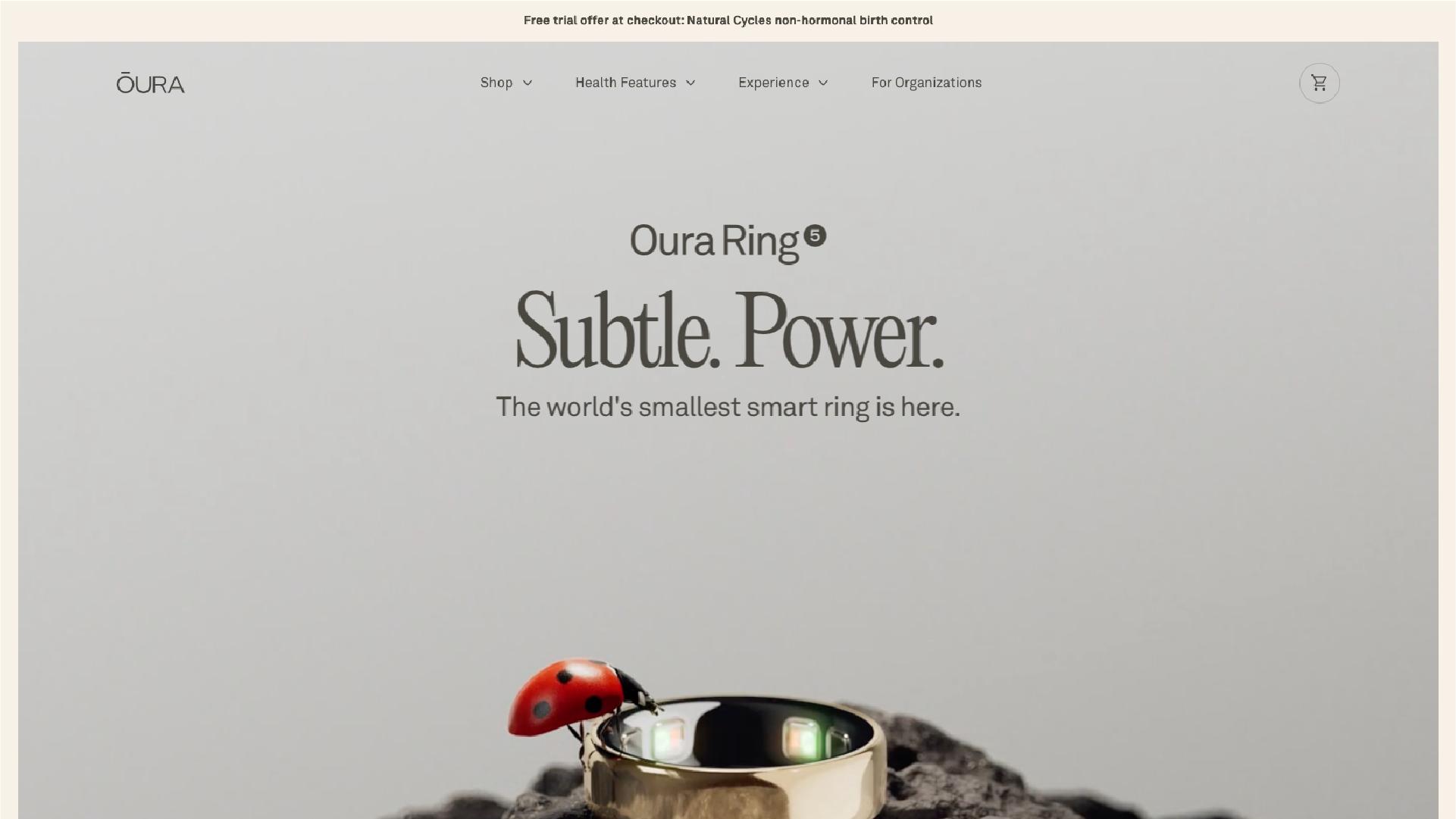
The product page opens on a single line — one promise, one call to action. No spec sheet competing for attention above the fold. A quiet "See Tech Specs" link sits underneath, pointing to a details section much further down. It tells the skimmer they don't need the spec sheet to understand the product, and tells the researcher exactly where to find it.
That same logic repeats down the page. Features arrive in small groups of three — sensing, comfort, battery — never a full technical dump in one breath. The membership section further down uses a tabbed layout across categories like sleep, activity, and heart health, so a visitor opens only the category they care about instead of scrolling past the rest. It's one principle, applied twice: match the detail on screen to how far into the decision the visitor already is, and give the ones who want more a clear way to ask for it.
Variants Live Inside the Decision, Not Beside It
This is where most single-product sites go wrong when they do have options. Oura's finishes show up as a swatch carousel embedded directly in the product story — you're still reading about the ring, just now choosing what it looks like. It's framed as personalization, not a fork in the road. Even the store page, listing every generation and finish together, resists becoming a real catalog grid: each generation gets its own short section, and the page still funnels back to one soft prompt for anyone unsure. The variants exist, but they never compete with each other for attention — they sit inside one decision, not beside it as alternatives.
Where Trust Gets Placed
Right before checkout — after the story, the finish selection, the specs — sits a block that has nothing to do with the ring itself: returns, warranty, a free trial month, support. It's placed exactly where hesitation peaks, not buried in a footer. By that point in the page, the visitor already understands the product. What's left is the last bit of doubt — fit, preference, what happens if something goes wrong — and Oura's site answers all three in one block, right where the decision is actually being made.
What This Means If You're Building One
Strip the ring away, and what's left is a set of questions that apply to almost any single-product site: What's the one thing a first-time visitor needs to feel before anything else? What deserves a link to "more" instead of a paragraph nobody asked for? Where does doubt live right before checkout — and is anything on the page actually built to answer it?
Those are structural questions, not visual ones, and they need answers before a single mockup gets opened — which is usually where we start with clients, before design enters the conversation at all. A one-product site doesn't need less to say. It needs to know exactly when to say it.