August 27, 2026
THE WEBSITE IS THE FRAME: WHAT PRODUCT-LED WEBSITE DESIGN ACTUALLY MEANS
A great frame doesn't make a mediocre product look good. But when the product underneath is already strong, the right website is the frame that makes it look even bigger.
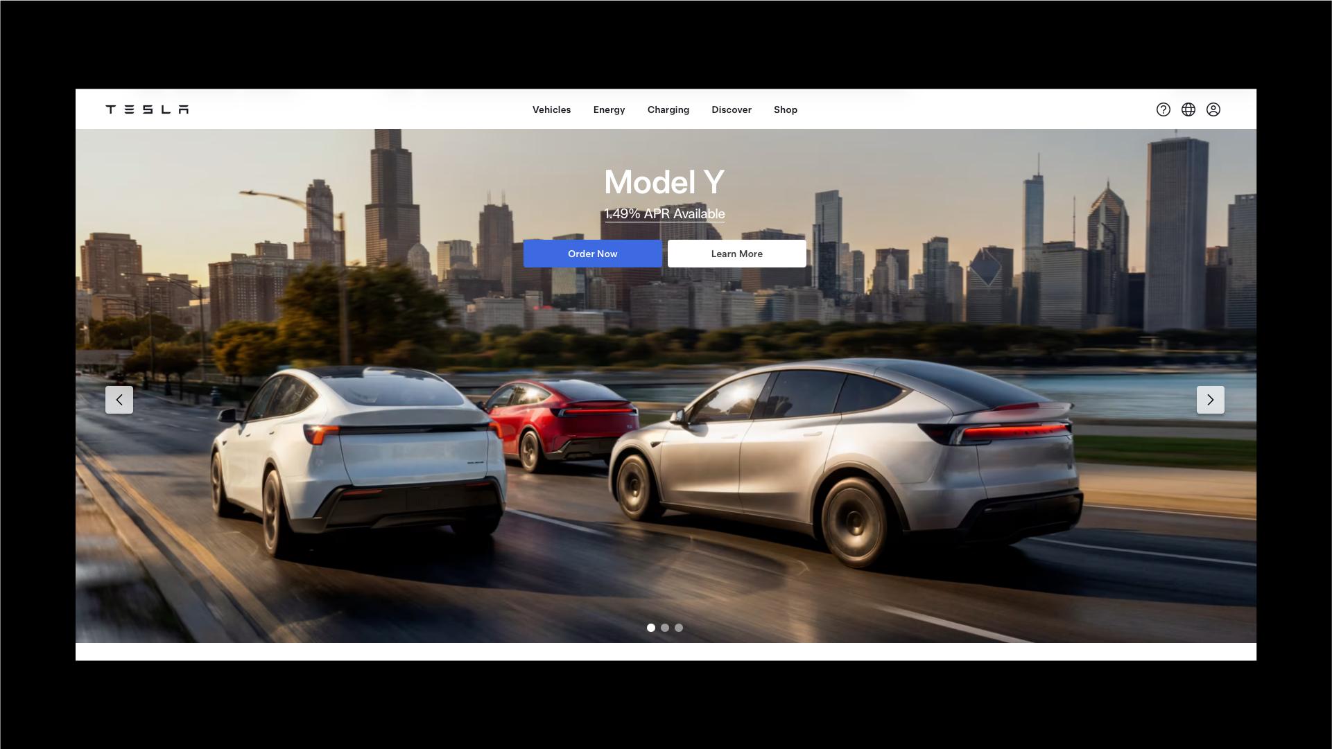
Every agency pitch eventually arrives at the same instinct: add something. A parallax section here, a scroll animation there, a hero video that autoplays before anyone asked for it. It reads as effort, and effort reads as value. But look at the handful of brands whose websites actually make their product feel bigger than it is, and the pattern runs the other way. Their homepages barely try. Tesla's site is the clearest example: no carousels, no scroll-jacking, almost no copy. Just the product, lit well, with a website that gets out of its own way.
That's the whole idea behind product-led website design: the site's job isn't to entertain, it's to frame. And a frame, done right, doesn't decorate the art. It multiplies it.
The website's only job is to be the right frame
A frame's function is narrow: hold attention on what's inside it. A frame with gold leaf, carvings, and a matching pedestal pulls the eye away from the painting; it starts competing with the thing it's supposed to support. A lot of business websites do exactly that. A hero banner, a rotating carousel, three trust badges, a chat widget, and a newsletter popup, all stacked on top of a product that would have been fine standing on its own.
Tesla's site skips almost all of it. No carousel to sit through, no exit-intent popup, no scroll-triggered fade-ins piling on top of each other. The web page isn't the star. It's the frame, and it knows it.
This matters for a business reason, not just an aesthetic one: every extra element on a website is competing with your product for the same limited attention. Add enough of them, and the product stops being the main character of its own site.
What a good frame looks like in practice
A well-built frame isn't empty. Tesla's homepage still carries real information: model names, starting price, a clear next step (configure, order, book a demo drive). What's missing is decoration, not content, and that's the actual definition of product-led website design: a site built around what the product needs to say, and nothing it doesn't.
A few decisions show up consistently on websites built this way:
- Product photography large enough to be the layout, not an illustration sitting next to the layout.
- One primary call to action per section, instead of three competing buttons in three different colors.
- A type scale with two or three sizes total, doing the hierarchy work that boxes, dividers, and background colors usually do instead.
- Fast load times, because a website that takes several seconds to reveal the product has already lost part of the effect before anyone sees it.
Compare that to the more common version of the same homepage: a rotating hero carousel most visitors never wait to see past slide one, a wall of icon-and-text blocks explaining "why choose us," a stock photo of people laughing at a laptop, and the actual product buried below the fold. Same product, same price, same team behind it. The difference in perceived quality comes entirely from what the website removed, not from what it added. That's less is more web design working as intended, and it's also why a well-framed homepage tends to function like a sales tool instead of a brochure.
The multiplier only works one way
Here's the part that's easy to miss: a good frame doesn't create a good product. It reveals one.
When the product underneath is genuinely strong, a website built as a clean frame works like a magnifying glass. There's nothing distracting from the thing that's actually good, so the whole site reads as more confident and more finished than a competitor saying the same thing through twice as many page elements. That's the multiplier behind product-led website design: gran producto más el frame correcto, y el producto se ve más grande de lo que ya es.
But put the same website treatment around a mediocre product, and it doesn't get rescued. It gets exposed faster. Without a carousel, extra copy blocks, and reassurance sections doing the work of explaining why anyone should care, there's nothing left standing between the visitor and the product itself. If the product doesn't hold up on its own, that becomes obvious in a few seconds instead of thirty.
So this isn't a universal fix, and a stripped-down website isn't automatically the right call for every brand. It's a bet that the product can carry the page by itself. When that bet is right, the website multiplies what's already working. When it's wrong, the empty space just makes the gap easier to see, faster than a busier site ever would have.
What to check on your own website
Before building a homepage this restrained, it's worth answering a few questions honestly:
- Can our product be understood and evaluated from a single strong image, or does a visitor genuinely need paragraphs of context first?
- If we removed every reassurance element from the homepage (badges, testimonials stacked everywhere, FAQ blocks), would the product still make its case on its own?
- Is our current website adding elements because the product needs that extra support right now, or purely out of habit?
If the product can carry the weight, a better frame is very likely worth building, and it will probably do more for conversion than another redesign full of new sections. If it can't yet, that's useful information too: the fix isn't a busier website, it's a stronger product story first, and a cleaner frame to hold it once that story is ready. That's the real test behind product-led website design: not whether the site looks impressive, but whether what's inside the frame can carry the attention on its own.