October 2, 2026
RAFAEL NADAL'S LOGO: HOW A BULL BECAME A BRAND
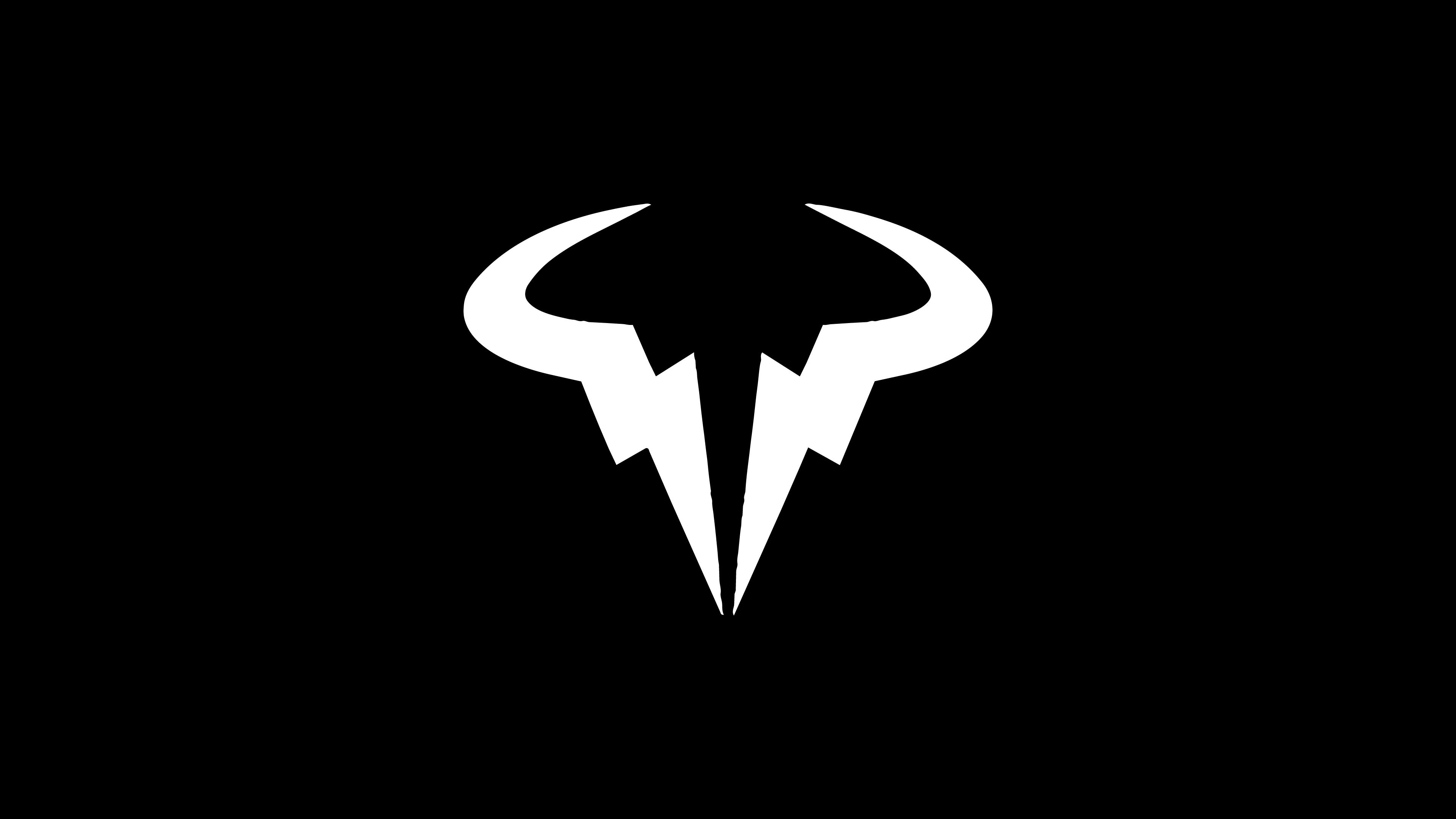
Rafael Nadal's logo has no initials, no name and no racket. Just a bull drawn with two lightning bolts. Here's why it works, and why its real test came after he stopped playing.
Most athlete logos start with a name. Initials stacked on top of each other, letters fused into a monogram, a signature turned into a mark. The Rafael Nadal logo skips all of that. There's no R, no N, not even a hint of "Rafa." Just a bull, built out of two lightning bolts.
And yet, nobody looks at it and wonders who it belongs to.
That's a strange thing for a logo to pull off, and it didn't happen because of the drawing alone. It happened because the bull existed long before anyone sat down to sketch it.
Before the Bull Was a Logo
Nadal became a Nike athlete at 13, and by the time he was winning on clay as a teenager, people already had a name for him: the Raging Bull. It wasn't marketing. It was a description of how he played. Every ball chased, every point fought like it was match point, the same intensity in the fifth set as in the first.
The first place the bull showed up wasn't a shirt. It was a shoe. Earlier pairs carried "VAMOS" on one heel and "RAFA" on the other, and by the late 2000s the bull had taken over the left heel. In 2013, Nike formalized it as his personal logo across his apparel.
This order matters more than it seems. In most branding projects, we design the mark first and then spend years filling it with meaning. Here, the meaning had already been built match by match, and the logo only had to catch up. That's the dream brief. It's also a very rare one.
Reading the Rafael Nadal Logo: Two Bolts, One Bull
Look closely and there's technically no bull. There are two lightning bolts, mirrored along a vertical axis and angled so they leave a gap in the middle. Step back, and your brain fills in the rest: horns, a narrow face, a head lowered and ready to charge.
That's a Gestalt principle called closure: our perception completes unfinished shapes into familiar ones. Logos that use closure tend to stick because the viewer participates. You're not just shown a bull, you assemble it yourself, and things we help build are things we remember.
Symmetry does the other half of the work. Bilateral symmetry reads as stable, frontal and a little confrontational. The bull doesn't run past you, it faces you. The mark mixes hard angles with soft curves and nothing overlaps, which keeps the figure-ground relationship clean: the shape and the empty space around it never fight for attention.
There's also a practical reason this matters. Tournament rules limit how much branding a player can wear during a match, so the bull spent most of its life small, on a sleeve or a heel. A single-color silhouette with no crossing lines survives that easily. Scalability is the quiet test every athlete logo has to pass, and plenty of them fail it without anyone noticing.
If we had one reservation, it would be the lightning bolts. They live dangerously close to sports cliché territory. But here they get away with it because they do double duty: on their own they say speed and force, and together they say bull. It's a cliché used as a building block, not as the whole idea.
Why a Symbol Works Better Than Initials Here
The obvious comparison is Roger Federer's RF. A monogram works like a signature: elegant, personal, focused on who the athlete is. Nadal's bull is focused on how the athlete plays. One logo is a name. The other is a temperament.
Symbol-only logos are the riskier bet, because they depend on the person behind them being extremely legible. Give a bull to a quiet, tactical player and it feels like a costume. Give it to Nadal and it's almost documentary.
Our take: this is one of the few athlete logos that genuinely earned its shape. It's not the most refined piece of drawing in sports, but it might be the most honest. It describes something you could watch on court every single week.
Who Owns the Bull?
Here's the part fans tend to forget. The bull is widely seen as Nadal's personal logo, but it's Nike that registered the trademark and holds the rights to it. That's common in sports: sponsors often design and register these marks, which means a "personal" brand doesn't always belong to the person.
Federer learned this the hard way. When he moved to Uniqlo in 2018, the RF stayed behind with Nike, and it took four years before it returned on new merchandise in 2022. Nadal never had that problem for a simple reason: he never left Nike. Loyalty ended up working as an IP strategy, almost by accident.
The lesson goes well beyond tennis. If you build a personal brand with a partner, who owns the mark matters as much as how the mark looks.
What We Can Learn From a Logo That Outlived the Career
Nadal retired in November 2024 with 22 Grand Slams, 14 of them at Roland Garros. The logo didn't retire with him. The bull still identifies the Rafa Nadal Academy and the Rafa Nadal Museum, which means it now works as the symbol of a legacy rather than of a player who's still competing.
His foundation, interestingly, uses a different mark: a silhouette of Nadal on his knees, celebrating. That's brand architecture done right. The bull carries competition and legacy; the foundation needs warmth, not ferocity. Each mark has its own job, and neither one is stretched to do the other's.
And that's probably the biggest takeaway. The strongest personal logos encode behavior, not names. Initials tell you who someone is; a symbol like this tells you what they did, and what they did is what people remember long after the last match. It's the same principle we apply when a brand is built around a founder: design for what the person does, not just for the name on the door. That's why the Rafael Nadal logo still works with no matches left to play.