July 26, 2026
SNAPPLE PROVES THE BEST REBRAND CAN BE A RESTORATION
Snapple just proved that the boldest rebrand move isn't always a new concept — it's knowing exactly which part of your history was never actually broken.
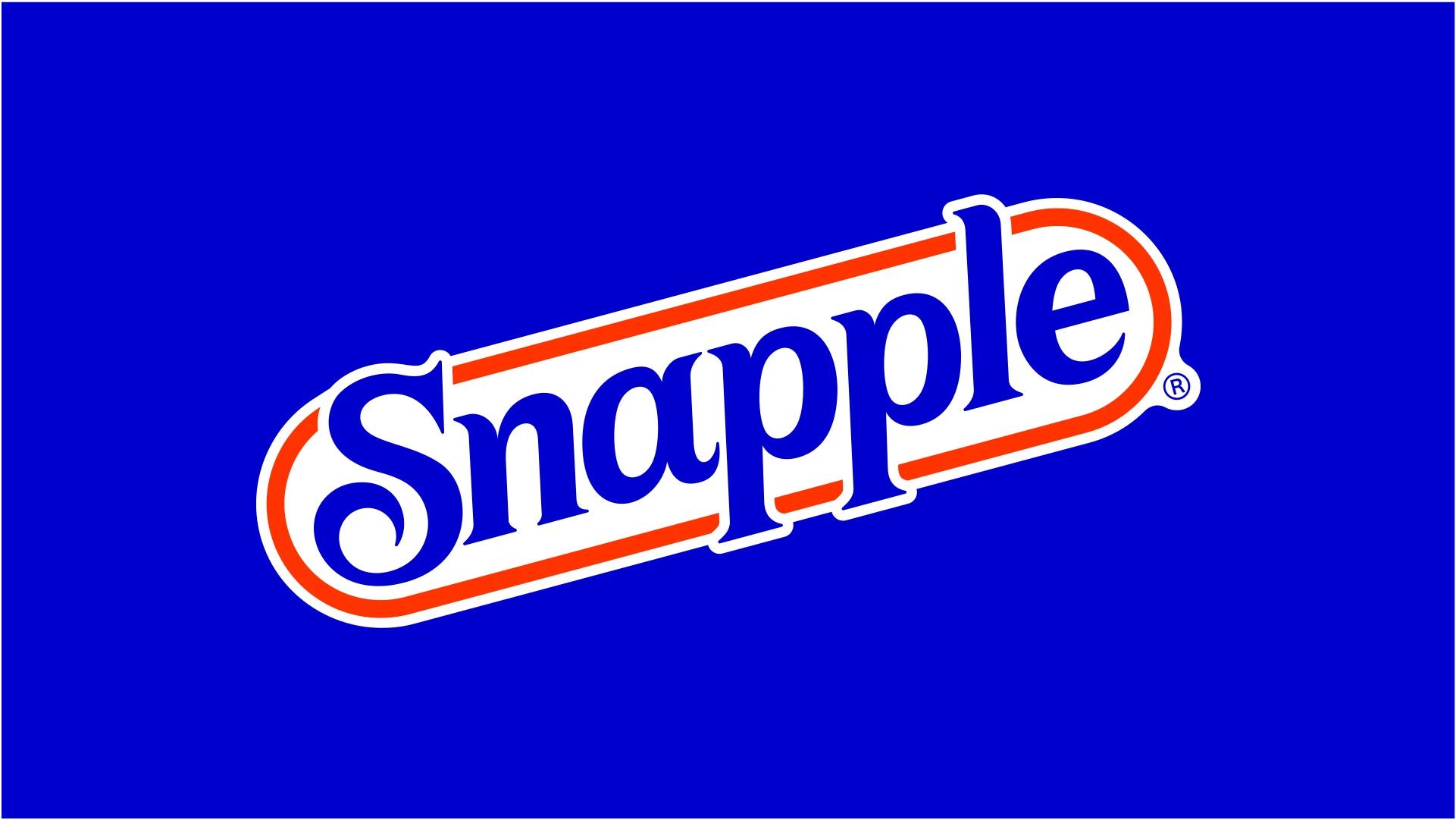
There's a version of "rebrand" that means tearing everything down and starting from zero. And then there's the version Snapple just pulled off: bringing back the racetrack shape long associated with the brand, with lettering redesigned to be more geometric and better arranged within the logo. No reinvention. No trend-chasing. Just a brand finally admitting what its fans knew all along — the equity was already there, it just needed better execution.
The Years Snapple Spent Looking for Itself
Every legacy brand hits this moment eventually: the identity that made it iconic starts to feel "dated" to whoever's in the marketing chair that year, and a new design team gets a mandate to modernize. Sometimes that's the right call. Sometimes it's how you spend a decade drifting further from the thing people actually loved.
Between the mid-2010s and 2021, Snapple went through several rebrands that gradually erased a significant part of its familiar identity. None of these were catastrophic on their own — the most recent packaging before this update wasn't a failure, just imprecise: an unconventional layout with oversized ingredient imagery and a centered logo that had energy but lacked focus. That's usually how brand erosion actually happens. Not one bad decision — a slow accumulation of "fine" ones that, stacked together, quietly dissolve what made a brand recognizable from ten feet away.
This is the part worth sitting with if you're managing a brand with real history: the biggest threat to a legacy identity is rarely a single disaster. It's a string of small, defensible tweaks that each seemed reasonable on their own.
What Deutsch Design Actually Brought Back
In January 2026, Deutsch Design unveiled the revamped identity, and the smartest decision they made wasn't stylistic — it was diagnostic. They correctly identified that Snapple's real brand asset was never the specific logo lockup from any one era. It was the shape.
The oval racetrack outline — the silhouette people associate with Snapple even before they can read the wordmark — was rebuilt from scratch with custom letterforms: more geometric, less condensed, and structured to hold up at any scale, from a bottle cap to a delivery app icon.
Here's the design principle worth understanding if you're evaluating your own brand's core assets: shape recognition happens faster than text recognition. A distinctive silhouette gets processed by the brain before anyone reads a single letter — which is exactly why a wordmark trapped inside a forgettable rectangle is wasting its most valuable real estate. Snapple's racetrack shape was never generic; treating it like disposable packaging in past updates was the actual mistake, not the choice to eventually modernize it.
Modern Without Losing the Wink
The color palette got recalibrated for a digital-first world — bolder, more vibrant, higher contrast — while keeping the warmth generations of fans already recognized. That distinction matters more than it sounds. "Modernizing" a palette usually means one of two things: shifting the whole system toward something unrecognizable, or simply pushing the existing colors to work harder. Snapple did the second, and it's the harder discipline of the two — restraint dressed up as boldness.
On the bottle itself, each flavor now gets its own visual world, with more explosive fruit imagery that makes the taste feel immediate and alive. On a beverage shelf packed with 40 other SKUs fighting for a half-second of attention, that's not decoration — it's a functional upgrade. Flavor differentiation at shelf-level is one of the most underrated jobs a packaging system has to do, and it's exactly where a lot of "clean, minimal" rebrands quietly fail: they get so obsessed with cohesion that every flavor starts looking sh*t-close to identical, and shoppers lose the visual shortcut that used to tell them "this one's mango" from six feet away.
Snapple avoided that trap by keeping brand-level consistency in the logo and structure, while letting each flavor genuinely look and feel different. That's the actual balance most packaging systems get wrong — treating consistency and distinction as if you have to sacrifice one for the other.
What We Can Learn From This
The instinct to "modernize" a heritage brand usually gets framed as a binary: either you respect the past and risk looking stale, or you break from it and risk losing what made people love you in the first place. Snapple's 2026 identity is a useful reminder that this binary is mostly false.
What actually needed to change wasn't the concept — it was the execution: sharper letterforms, a more confident color system, better differentiation at the product level. The racetrack shape, the personality, the sense of humor were never the problem. They were the whole reason the brand had something worth restoring.
If you're sitting on a brand with real history and real recognition, the question worth asking before any rebrand isn't "what should we replace?" It's "what have we been executing badly that we mistook for something broken?" Sometimes the most modern move a brand can make is finally doing right by the identity it already had.