July 6, 2026
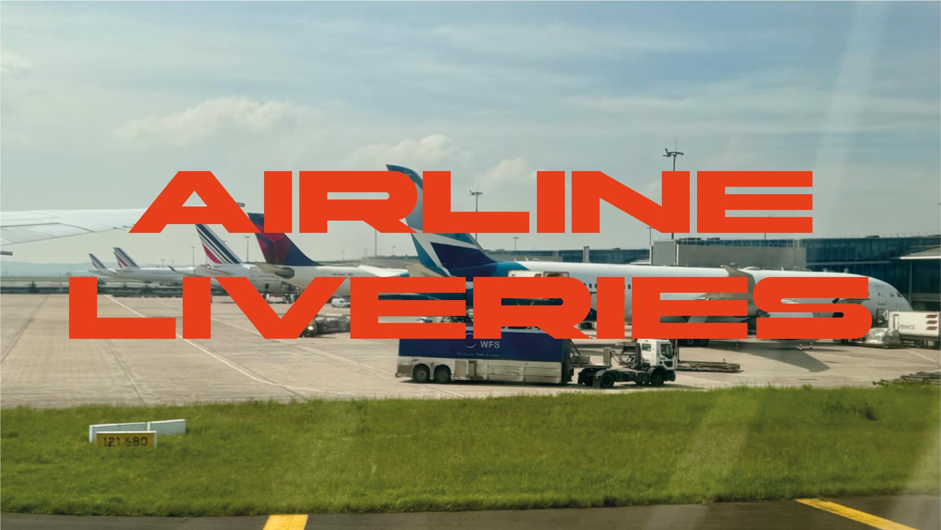
AIRLINE LIVERIES: MOST ARE A STICKER. A FEW ARE ACTUALLY DESIGN
Most special liveries are a logo stretched over a fuselage and called "design." A handful actually understand what they're working with — and the difference is bigger than a paint job.
Airlines love announcing a "special livery" like it's some act of creative bravery. Most of the time it's a mascot slapped on a tail, a press release, and a livery that looks exactly like every other special livery from the last decade. We're not here for that. We're here for the ones that actually understood the brief: a plane is not a billboard, it's the hardest canvas in design, and if you don't respect that, you end up with a very expensive sticker.
The Ugliest Canvas in Design
Nobody hands a designer a blank rectangle when they say "design an airplane." They hand you a compound curve covered in rivets, panel lines, doors, sensors, and an engine that's going to eat your composition whether you like it or not. Add to that: the thing has to read from the tarmac at 50 meters and from a passenger's window seat at cruising altitude, and it has to somehow not clash with whatever brand mark is already sitting on the tail.
That's three problems most liveries never solve:
- Scale legibility — does it read as a shape from far away, or does it turn into visual soup?
- Brand integration — does it work with the existing identity, or does it just sit on top of it like a decal?
- Surface translation — does the art survive being wrapped around curves, or does it warp into something the original artist wouldn't recognize?
Most airlines dodge all three by doing a "logo wrap": blow up the wordmark, add a gradient, done. It's safe. It's also boring as hell. The liveries that matter are the ones that picked a real idea and built the whole aircraft around that one decision.
Five Liveries That Actually Committed
Aeroméxico's Quetzalcóatl. Crowdsourcing a livery from 400+ submissions is a gamble — you're betting a jury can find one coherent piece of design language inside a pile of unrelated proposals. This is the rare case where it actually worked. The feathered-serpent motif holds together as a single mural instead of collapsing into a mood board, and the color work is genuinely some of the richest in commercial aviation right now — it reads as a myth painted onto metal, not a pattern applied to a template. It's dense, yes, but the density is intentional: this livery rewards a close look instead of punishing it, and that's a legitimate design choice, not a flaw. Easily the most emotionally ambitious livery on this list, and it earns it.
ANA's Flying Honu. Solid, not spectacular — and that's fine. A mascot face is one of the oldest tricks in design because it works: the turtle reads instantly at any distance, no interpretation required. What pushes it above "cute animal on a plane" is the systems thinking — three aircraft, three color variants, one unmistakable family. It's a well-run brand exercise more than a bold creative statement. Good fundamentals, nothing that's going to surprise you.
Lufthansa's Super Crane. This is the smartest livery on the list, full stop. Taking Otto Firle's 1918 crane and blowing it up to wingspan scale — letting the bird's wings visually become the aircraft's wings — is the kind of idea that looks obvious only after someone's already done it. It doesn't invent a new mascot or borrow outside imagery; it finds a mark that was already latent inside a century-old identity and lets the aircraft's own geometry finish the metaphor. That's what a centennial livery is supposed to do: communicate exactly what's being celebrated, with nothing extra. Simple on paper, genuinely elegant in execution — this is brand systems thinking at its best.
Qantas' Yam Dreaming. A harder design problem than it looks, handled well. Adapting a sacred, existing painting means you don't get to simplify or "improve" anything — Balarinji had to translate Emily Kame Kngwarreye's Yam Dreaming onto a curved fuselage without flattening what made it hers, and the result respects the source. The real tell that Qantas took this seriously is the tail: letting the kangaroo mark shift color to match the artwork is a bigger deal than it looks, since tail marks are usually the one thing brand guidelines never touch. Not the flashiest entry here, but a genuinely well-executed one.
Alaska Airlines' Xáat Kwáani. The odd one out, in a good way. Where Quetzalcóatl fills every surface it can, Worl's formline salmon design leaves most of the fuselage untouched, and that restraint is deliberate — formline art relies on negative space carrying as much meaning as the linework itself. It's the least immediately "readable" livery on this list; it asks more of the viewer than a mascot or a mural does, and it doesn't try to be liked at first glance the way the others do. That makes it harder to love instantly, but it's also the one doing the most interesting things with the medium once you actually sit with it.
When It's Not Design, It's Just a Bit
Not every collab livery is trying to make a design argument, and that's fine — some of them are just marketing having fun. JetBlue's Dunkin'-branded plane, the various Star Wars liveries floating around different carriers, ANA's Pokémon jets, Hello Kitty on an EVA Air fuselage — none of these are trying to solve the scale-legibility-brand-integration problem. They're ads, and pretty charming ones. We're not critiquing them the same way; they exist in a different category, closer to a promotional wrap than an identity decision.
What Actually Separates a Livery From a Wrap
Put the five real cases side by side and the pattern is obvious: the good ones commit to one idea — a mascot, an existing brand mark, a piece of fine art, or a deliberate absence of detail — and build the entire aircraft around that single decision instead of decorating it. The bad ones try to do everything at once and end up looking like a livery-generator output. Whether you're painting a 787 or building a brand system for a client that will never leave the ground, the lesson holds: pick the one idea worth committing to, and let the canvas — however impossible it is — do the rest of the work.