July 29, 2026
WHY LUXURY WEBSITES FEEL EXPENSIVE (IT'S NOT THE BUDGET)
Louis Vuitton, Dior, and Loewe aren't spending their way into good design. They're editing their way into it, and the editing decisions are things any site can copy for free.
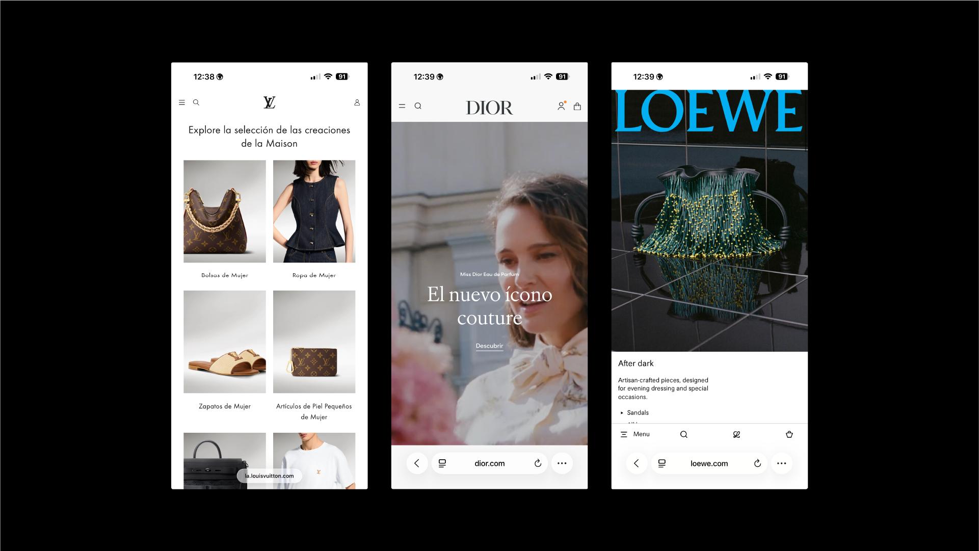
We tend to assume luxury websites work because luxury brands have unlimited budgets. More developers, more custom code, more everything. That's part of it, sure. But if you actually look at what LV, Dior, and Loewe are doing on their homepages, the differences aren't really about budget. They're about editorial discipline: what gets left out, how much space type is given to breathe, and how little the navigation tries to do.
That's useful, because none of it requires a seven figure dev budget to apply.
Restraint Is a Design Decision, Not a Budget Constraint
Take Loewe. Its site runs on essentially two colors: ink black and a near white background. No accent color, no gradient, no "brand voltage" call to action button fighting for attention. The only color on the page comes from the photography itself.
That's not a limitation. It's a choice with a clear logic behind it: when the interface stops competing for attention, the product does the talking. A bag photographed against a neutral system reads as more considered than the same bag surrounded by banners, badges, and three different accent colors.
Most business websites do the opposite by default. Every plugin, every marketing tool, every "best practice" checklist adds one more visual element, until the homepage is negotiating with itself. Loewe's site is a useful reminder that a strong visual identity often means saying no to color, not adding more of it.
Takeaway for your site: before adding another banner, badge, or CTA color, ask what you'd need to remove to make the existing ones actually land.
Homepages That Let Motion Do the Talking
Louis Vuitton's homepage often leads with a full screen video rather than a static hero banner, a collection shown in motion instead of described in a headline. It's a different way of answering the same question every homepage has to answer in the first three seconds: what is this, and why should I keep scrolling.
Video used this way isn't decoration. It's doing the job that a paragraph of copy would otherwise have to do, and it does it faster. There's no "welcome to our new collection" line to read past. The visitor sees movement, texture, and scale, and understands the tone of the brand before a single word loads.
The lesson isn't "add a video to your homepage." It's that a well shot piece of motion or a strong still image can replace a surprising amount of homepage copy, and visitors tend to trust what they see over what they're told.
Takeaway for your site: before writing another homepage headline, ask whether a stronger visual could make the same point without asking anyone to read it.
Product Pages Built Around the Photography, Not the Specs
Dior's site opens into a clean split screen that separates categories through imagery and layout rather than explanatory text, and that same logic carries through to how these sites handle individual products further down the funnel. Descriptions stay short. Photography is treated as the primary content, not an accessory to a spec list.
This runs against the instinct most ecommerce sites have, which is to add more: more bullet points, more trust badges, more cross sells stacked next to the product. Luxury product pages tend to do the opposite. Fewer competing elements around the image means the product itself carries the argument for why someone should buy it.
For a site without a luxury catalog, this still translates directly. A product page that trusts one strong photograph over five mediocre ones, and one clear line of description over a wall of bullet points, usually reads as more credible, not less complete.
Takeaway for your site: audit your best selling product page and count how many elements are competing with the main image. Most of the time, half of them can go.
Navigation That Doesn't Compete With the Aesthetic
Across all three sites, the navigation bar is doing the least amount of visual work possible while still functioning. Clean, minimal, tucked out of the way until it's needed. It's scaffolding, not decoration.
Compare that to the mega menus common across mid market ecommerce: dropdowns stacked with category images, promotional banners, and secondary CTAs, all competing with the content of the page itself. That kind of navigation often exists because "more visibility" feels safer than "more restraint," even when it actively works against the rest of the design.
Takeaway for your site: navigation should help people move through the site, not pitch them on something new every time they open it.
What This Means If You're Not Selling €3,000 Bags
None of this requires a luxury budget to apply. It requires the same discipline luxury brands apply everywhere else: deciding what matters most on a page and removing everything that dilutes it.
If you're reviewing your own site this week, three things are worth an honest look. First, whether your color and accent choices are earning their place or just accumulating. Second, whether your homepage is leaning on strong visuals or on copy that's doing the work an image should be doing. Third, whether your navigation is helping visitors move through the site or competing with the content for attention.
None of that shows up on an invoice the way a full rebrand does. But it's often the difference between a site that looks considered and one that just looks busy, and that difference is available at any budget.