October 6, 2026
ZARA WEBSITE DESIGN: WHY IT DIVIDES OPINION
Zara's website gets shared by designers as a reference and criticized by shoppers as a maze, and both sides have a point. Let's unpack why this editorial approach to ecommerce divides opinion so sharply.
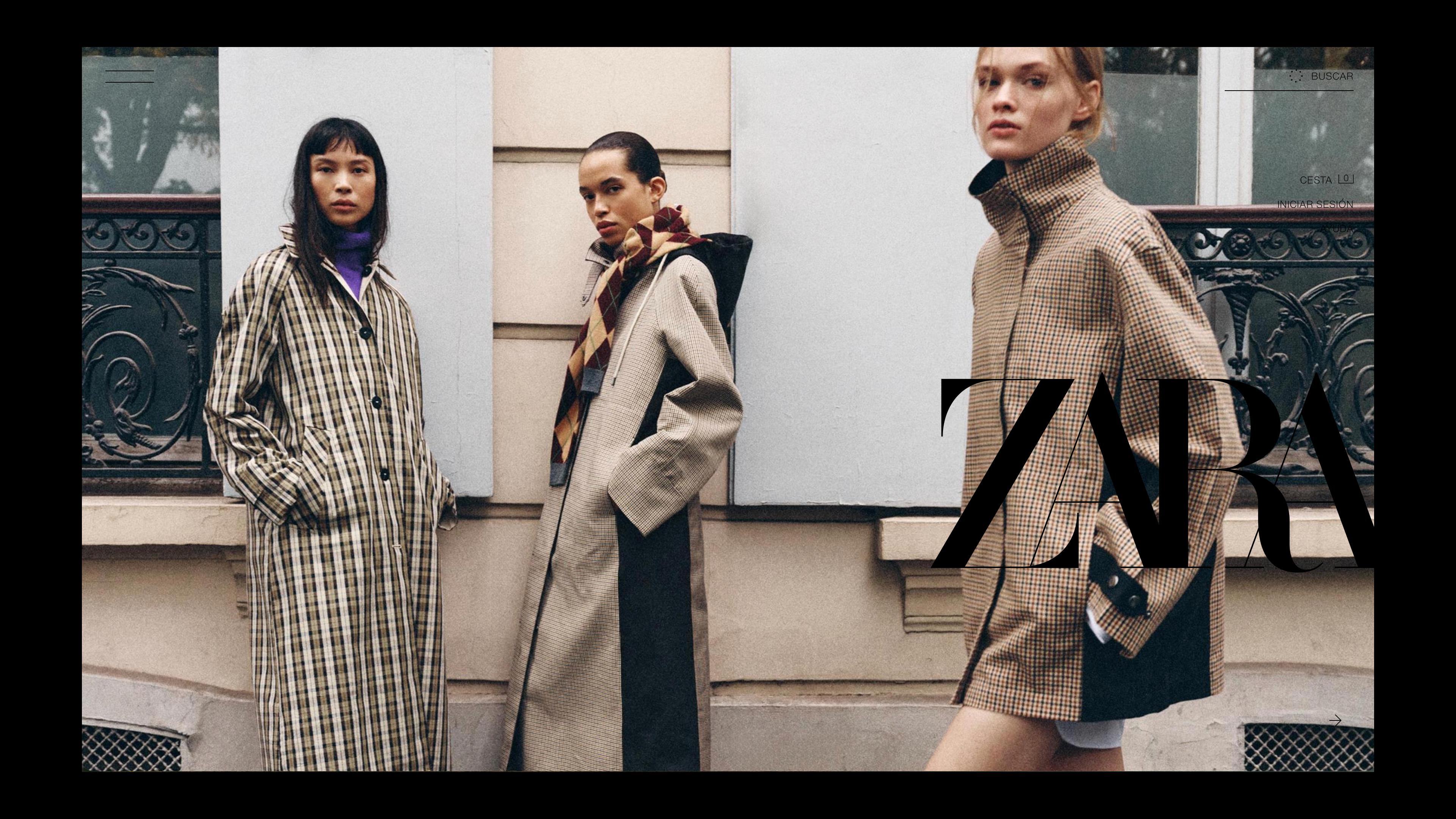
Open Zara's website and the first thing you notice isn't a product. It's an image. Large, full-bleed, with barely any text around it. No crowded menu, no banner announcing a sale. It feels less like walking into a store and more like opening a fashion magazine.
That first impression is exactly why the Zara website design has become one of the most debated pieces of ecommerce out there. Designers save it as a reference. Shoppers write long complaints about getting lost. UX students pick it as a case study, almost always to redesign it.
So who's right? Probably both. To understand why, we need to look at what the site actually does, what people love about it, what people struggle with, and why those two reactions keep living side by side.
What Makes the Zara Website Design So Different
Most online stores follow a shared set of ecommerce conventions: a visible navigation bar across the top, a search field, breadcrumbs that show where you are, and a product listing page (the PLP, where products appear in a grid) with three or four tidy columns and filters on the side. These patterns exist for a simple reason. There's a well-known UX principle, often called Jakob's Law, that says people spend most of their time on other websites, so they expect yours to work the same way. Conventions reduce the effort of figuring things out.
Zara breaks several of these on purpose. Navigation sits tucked behind a menu, even on desktop. Imagery takes over the screen. Product pages play with scale, sometimes giving a single photo the whole viewport and sometimes packing items into a tight grid. Text is kept to small uppercase labels, used more like captions than instructions.
None of this is random. In 2019, Zara introduced a new logo designed by Baron & Baron, the agency led by art director Fabien Baron, whose work is rooted in fashion magazines. The new wordmark used extremely tight kerning (the spacing between individual letters) so the characters overlap, echoing the typography Baron had used at Harper's Bazaar in the 1990s. That same editorial sensibility runs through the site.
This is the key idea to hold onto: Zara's website is built with an art direction mindset rather than a merchandising mindset. Merchandising thinking asks, "How do we show as many products as clearly as possible?" Art direction thinking asks, "How should this brand feel, page by page?" Most ecommerce leans toward the first. Zara leans hard toward the second.
What Designers and Brand People Praise
For people who work in branding, the site is often admired for its consistency. The campaign imagery, the store windows and the website all feel like one voice. That kind of coherence is what builds recognition over time: you could see a cropped screenshot without the logo and still guess it's Zara.
There's also the restraint. A limited palette, generous negative space (the empty areas around elements that let them breathe) and very little visual noise. In a category where many retailers look interchangeable, with the same badges, pop-ups and discount banners, that restraint makes the site stand out immediately.
Photography does a lot of the work. Instead of treating images as product thumbnails, the site treats them as the interface itself. The image is what pulls you in, not a headline or a promotion.
And on mobile, many people find the experience surprisingly natural. Full-screen images stacked vertically match the way we already scroll through social apps, one thumb, one swipe at a time. The editorial idea seems to sit more comfortably on a phone than on a large desktop screen, where the same choices can feel more like a lookbook projected on a wall.
What Shoppers and UX Audits Point Out
On the other side, the Zara site shows up again and again in heuristic evaluations. A heuristic evaluation is a review where experts check an interface against established usability principles, most commonly Jakob Nielsen's ten heuristics, which include ideas like "recognition rather than recall" (people shouldn't have to remember where things are) and "visibility of system status" (people should always know what's happening).
Over the years, these audits have flagged a recurring set of issues. Navigation can be hard to find at first. Breadcrumbs and clear page titles have often been missing, which hurts wayfinding, the user's sense of where they are and how to get back. Some reviewers have pointed to limited filtering and sorting options, which matter a lot in a catalog this large.
Readability comes up too. Small type and text placed over photography can create contrast problems, an accessibility concern since low contrast makes text harder to read for many people. And the artistic, heavily posed photography that designers love can make it harder for shoppers to judge how a garment actually fits.
Underneath many of these critiques is one concept: information scent. It describes the cues (labels, categories, previews) that tell users they're on the right path toward what they want. When labels are minimal and categories have evocative rather than descriptive names, the scent gets weaker, and people start guessing.
Why the Zara Website Design Sparks So Much Debate
Here's what makes this case interesting: the two sides are mostly measuring different things. One group evaluates the site as a piece of brand expression. The other evaluates it as a tool for completing a purchase. Judged by the first yardstick, it scores very high. Judged by the second, it loses points. Both readings are valid; they just don't answer the same question.
A few other factors make a simple verdict even harder.
The first is the difference between first-time and returning visitors. UX designers talk about learnability: how quickly someone gets comfortable with an interface after repeated use. A first-time visitor bumps into every unconventional choice. Someone who checks new arrivals regularly, which fits the constant flow of new product Zara is known for, learns where things live, and the friction fades.
The second is device. As we saw, the same design decisions read differently on a phone and on a laptop, so two people can honestly describe very different experiences of the same site.
The third is the business itself. In fiscal 2025, Inditex (Zara's parent group) reported online sales of around €10.7 billion, about 26.7% of total group sales. That complicates the idea that the site is simply broken. It doesn't prove the design is driving those numbers either, since brand strength, stores, pricing and speed to market all do heavy lifting.
Finally, there's the aesthetic-usability effect, a well-documented tendency for people to perceive attractive designs as easier to use and to be more forgiving of small problems. It cuts both ways: beauty can buy patience from loyal customers, and it can also mask friction that a newer visitor will feel right away.
What the Debate Reveals About Editorial Ecommerce
It helps to picture a spectrum, with brand expression on one end and pure usability on the other. Every ecommerce site sits somewhere along that line. Most cluster near the usability end, which is why so many stores look alike. Zara sits far toward expression, backed by a level of recognition and repeat traffic that very few brands have.
That's why the conversation around Zara is useful for anyone building or rethinking a fashion ecommerce website. It turns an abstract trade-off into something concrete. How familiar are your visitors with your brand before they arrive? How often do they come back? Which device do they mostly use? And what does it cost you when someone can't find what they came for? When we work on ecommerce projects, these are the questions that end up deciding how editorial a site can afford to be.
In the end, the Zara website design is less a model to copy or a mistake to avoid than a clear, very visible example of a choice every brand makes, whether it notices or not: how much of the experience belongs to the brand's voice, and how much belongs to the shopper's task.