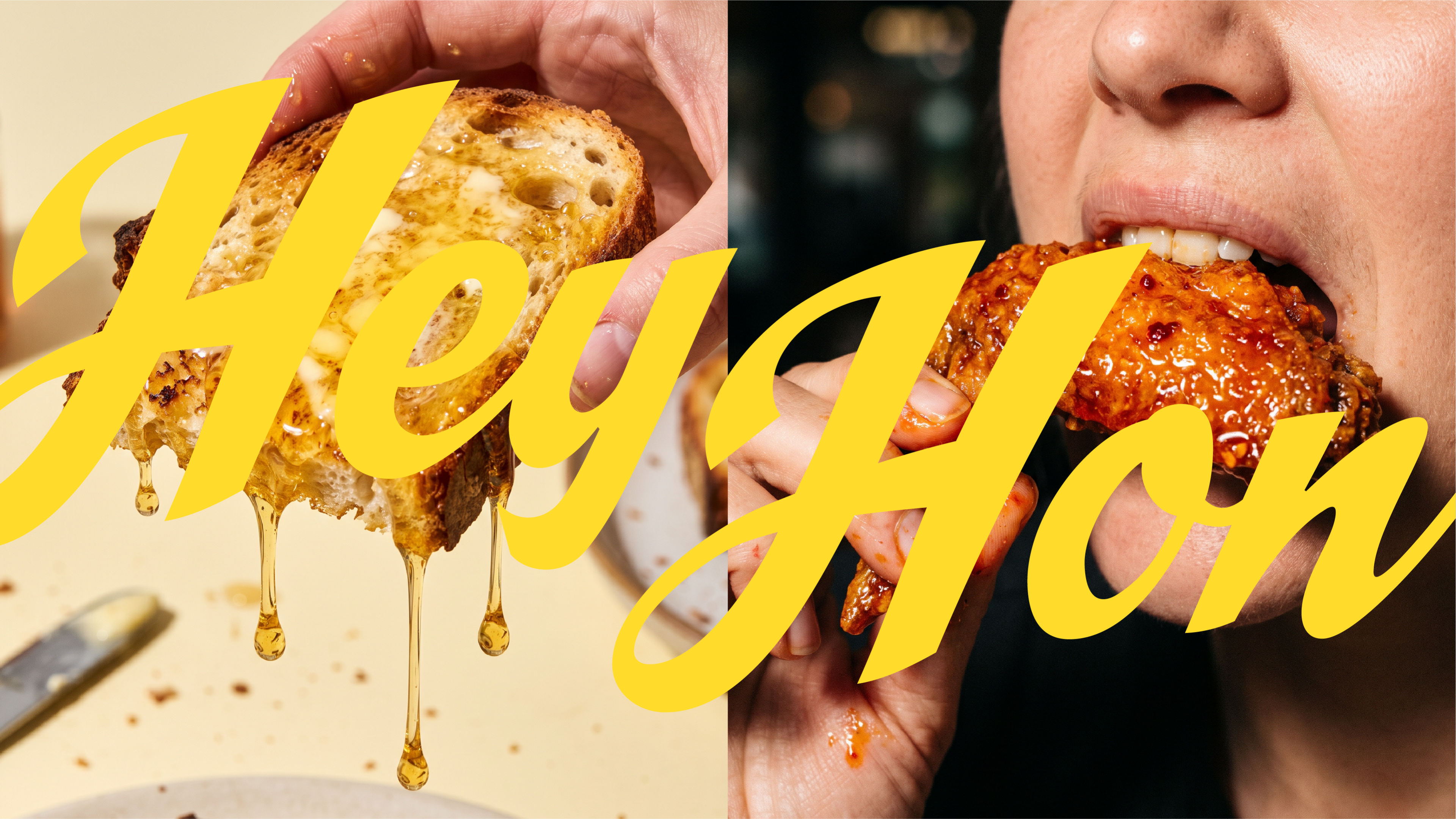
Hey Hon
A little sweet, a little spicy, and full of attitude. We created the brand identity for HEY HON., a playful honey brand that turns a familiar expression into two distinct personalities: classic honey and hot honey. Through expressive typography, vibrant colors, witty messaging, and bold art direction, we challenged the conventions of traditional honey branding to create something unexpected, memorable, and unapologetically fun.
- Year
- 2026
- Location
- Tennessee, USA
- Services
- Brand Identity
- Industry
- Food & Drink
Challenge
Honey has a familiar visual language. Rustic packaging, golden palettes, botanical illustrations, and traditional references to nature have long defined the category. Our challenge was to move beyond those conventions and create an identity that felt contemporary, playful, and full of character. With two contrasting varieties, classic and hot honey, the brand needed to express both sweetness and heat without losing its sense of unity. The goal was to make an everyday pantry staple feel less ordinary, creating a brand that could stand out through personality rather than convention.
Solution
We built the identity around the playful duality of “Hey Hon.” and “Hot Hon.”, transforming a familiar term of affection into a flexible brand concept. An expressive wordmark, vibrant yellow palette, and contrasting red accents establish a recognizable visual language, while each variety develops its own attitude. Flash-driven photography, candid food moments, cheeky copywriting, and deliberately imperfect compositions bring a spontaneous, almost mischievous energy to the brand. From packaging and graphic elements to campaign imagery and outdoor advertising, every touchpoint was designed to feel conversational, bold, and unmistakably HEY HON.
Results
The result is a distinctive brand identity that gives honey a completely different kind of personality. By combining expressive design, playful storytelling, and unconventional art direction, HEY HON. transforms a familiar product into a recognizable visual world. The identity brings classic and hot honey together under one cohesive system while allowing each to express its own character, creating a brand that feels equally at home on a kitchen table, a supermarket shelf, or a larger-than-life billboard.
A PLAYFUL BRAND IDENTITY FOR A HONEY BRAND THAT KNOWS HOW TO BE SWEET AND WHEN TO TURN UP THE HEAT.
Chanel "The 11.12"
Next project


