October 21, 2026
THE APPLE MUSIC REBRAND WAS FILMED, NOT RENDERED
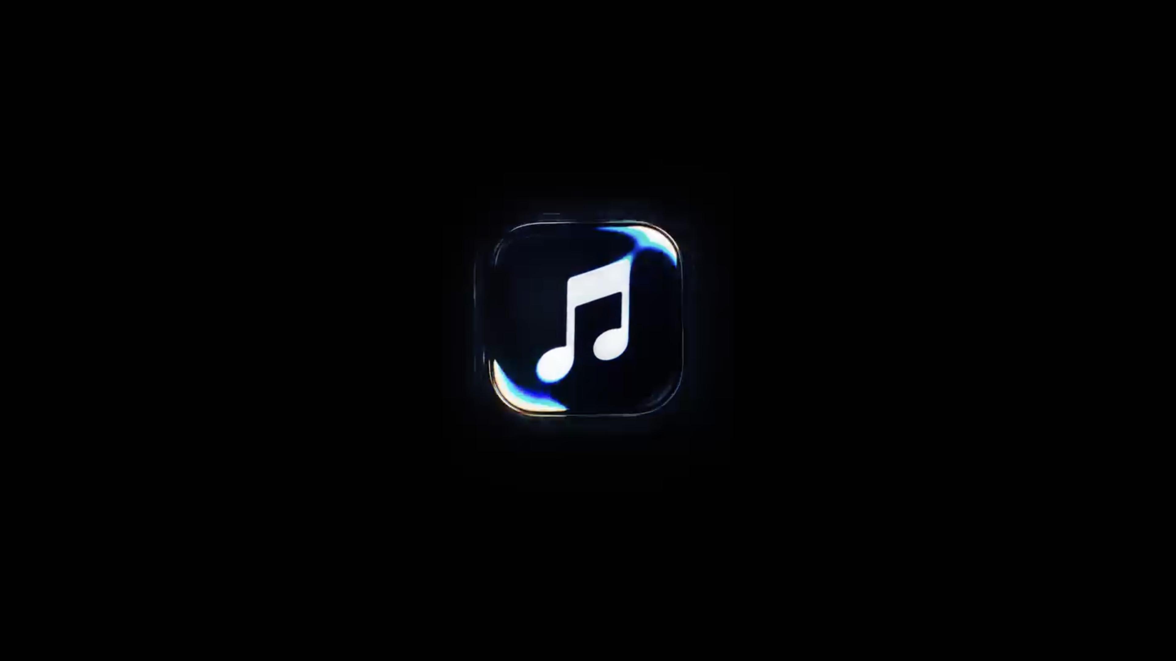
Apple Music has a new logo, and it wasn't designed on a computer. It was shaped by sound rippling through a tray of oil and filmed in camera, and how they pulled it off says a lot about where branding is heading next.
Somewhere in a studio, a small device sat under a shallow tray of oil. Every note it played bent the Apple Music logo into a new shape. A camera caught it, and nobody pushed it around in 3D software afterward.
That's the core of the Apple Music rebrand. It's also the second time in a year Apple has built a brand this way. Last year it was glass for Apple TV. Now it's sound and liquid. Once is a stunt. Twice starts to look like a position.
Before we decide whether it works, it helps to know exactly what happened.
What actually changed in the Apple Music rebrand
The project is called Made by Sound. Apple developed it with TBWA\Media Arts Lab (its longtime agency), the British producer Fred again.., and the sound design studio NEST Acoustics.
The process is the whole story. The team wrote a short composition and split it into individual notes. Each note was played through a transducer, which is any device that converts one form of energy into another. Here it turned an audio signal into physical vibration, sitting in a shallow bath of mineral oil. Every note became ripples, rings and refractions over the logo, and the camera recorded it all. Getting it right took months of experimentation.
What comes out of it:
- A mnemonic. In branding, a mnemonic is a short audiovisual signature that identifies a brand in seconds. Think of a sound logo with a moving image attached. The same composition now works as Apple Music's sonic signature.
- A new wordmark. The Apple symbol sits next to "music" in bold lowercase, set in a heavier, customized version of SF Pro, Apple's own typeface.
- A monochrome icon. The red is gone, replaced by a black-and-white system that arrives with iOS 27.2.
- Motion stings. One opens Apple Music videos. A note-only version sits over footage like concerts.
The identity quietly debuted at Apple Music Hall, Apple's new venue in London, before the official reveal. And if the whole process sounds familiar, it's because Apple has done this before, almost step by step.
Apple TV went first, with real glass
In late 2025, Apple TV+ dropped the plus and got a new intro. Instead of rendering a glossy logo, the team cut large glass versions of it, lit them in a studio and moved the camera around them. Finneas wrote the sound. The sequence comes in three lengths, from a one-second sting for trailers to a longer cut before films.
Put both projects side by side and the formula is obvious. A physical object, real light or real vibration, everything captured in camera, a musician on the sound, and a behind-the-scenes film to prove it.
That last element matters more than it seems. The making-of video isn't a bonus. It is the campaign. Which raises the obvious question: why would a company built on screens go to this much trouble to stay away from them?
Why analog design is coming back into brand identity
Here's our read. Today, a convincing liquid logo takes a prompt and a few minutes. When anything can be rendered, rendering stops signalling effort. Proof of process becomes the premium.
It's the same logic as luxury. A handmade bag isn't better because a machine couldn't stitch it. It's better because someone chose to do it by hand, and you know it. Apple's marketing leadership has spoken openly at Cannes Lions about valuing human creativity, and these two rebrands are that speech turned into footage. After the 2024 iPad ad that crushed instruments (and that Apple apologized for), it's hard not to see a little repair work with the creative community here too.
There's also a technical reason it works. The visual effect of sound moving a medium has a name: cymatics. Designers and artists have played with it for decades, using sand on vibrating plates or water over speakers. Physical systems produce small irregularities that simulations tend to smooth out, and our eyes read those irregularities as real. That's why the oil footage looks f*cking great in a way a clean render rarely does.
And crucially, the concept comes from the product itself. Light and glass for cinema. Sound for a music service. It doesn't feel like a gimmick because it isn't borrowed.
But a great concept and a great everyday brand aren't the same thing, and that's where this rebrand gets more complicated.
Where the magic gets thinner
Most people will never see the oil. They'll see a small static icon on a home screen, many times a day. The idea is rich at the mnemonic level and much thinner at icon size, where all that motion collapses into a black square.
The red was doing real work. Color is usually the fastest recognition cue on a crowded screen. Apple traded a distinctive asset for coherence with its Liquid Glass design language, and on a home screen full of dark and white icons, that trade has a cost.
It's a new face on the same app. The launch doesn't promise new features. A beautiful sonic signature won't fix a playlist that keeps serving you the same twelve songs.
None of this kills the work. It just reminds us that a rebrand lives mostly in small, boring places, not in the launch film. And that tension, between the story and the everyday, is exactly where the useful lessons are.
What we can learn from Apple's analog turn
The lesson isn't "go analog." Analog is a method, not a medium. Everything here was still edited, graded and delivered digitally. The lesson is that when production gets cheap, the story of how something was made becomes part of the brand.
The second lesson is fit. Made by Sound works because the material comes straight from what Apple Music is about. A brand that films ink in water just because it looks nice is doing decoration, not identity.
And the third is that you don't need Fred again.. on the payroll. Paper, ink, a phone on a tripod and a bit of patience can produce textures no template will give you. What made the Apple Music rebrand stand out wasn't the budget. It was deciding that the process mattered enough to show it.