November 19, 2026
WHAT MAKES A GREAT BAKERY WEBSITE? LESSONS FROM JUNO THE BAKERY
A neighborhood bakery in Copenhagen built a website that barely raises its voice. Somehow, that quiet is exactly what keeps you scrolling.
In a quiet corner of Østerbro, Copenhagen, there’s a bakery that people cross the city for. Juno the Bakery began as a small neighborhood spot run by Emil Glaser, a former pastry chef at Noma, and grew into one of the most sought-after bakeries in a city that takes its pastry very seriously. Its cardamom buns have a cult following. Its butter cookies come in round tins that now ship well beyond Denmark.
Most bakery websites try to show you everything at once: the full menu, the catering form, the newsletter pop-up, the seasonal promo, the Instagram feed. Juno’s site does almost none of that. And yet it’s one of the best examples of bakery website design we’ve come across.
To understand why, you have to stop looking at it as just a website.
Simple Websites Are Rarely Simple to Make
There’s a common belief that a website is a development project. You pick a template, someone builds it, you upload some photos, done. In reality, a website is closer to a well-edited book: it only works when several disciplines pull in the same direction. Branding, photography, interaction and UX are not separate layers stacked on top of each other. On a good site, they’re one thing.
The name for what holds them together is art direction. Art direction is the set of decisions about how everything looks, sounds and feels, so that no part of the experience seems to have been made by a different team. It decides which photo goes where, how big the type is, how much empty space surrounds each element, and, just as important, what the brand never does.
Juno is a great case study because its art direction didn’t start online. The bakery’s interiors, designed by Frama, are famously restrained: pale surfaces, honest materials, the bread as the main event. The cookie packaging by Studio Morfar uses clean blocks of color and minimal type. The bakery’s cookbook, photographed by Petra Kleis, keeps the same calm, clear tone. The website doesn’t invent a new personality. It continues the one that already exists, and you feel it from the first scroll.
A Homepage That Reads Like a Magazine
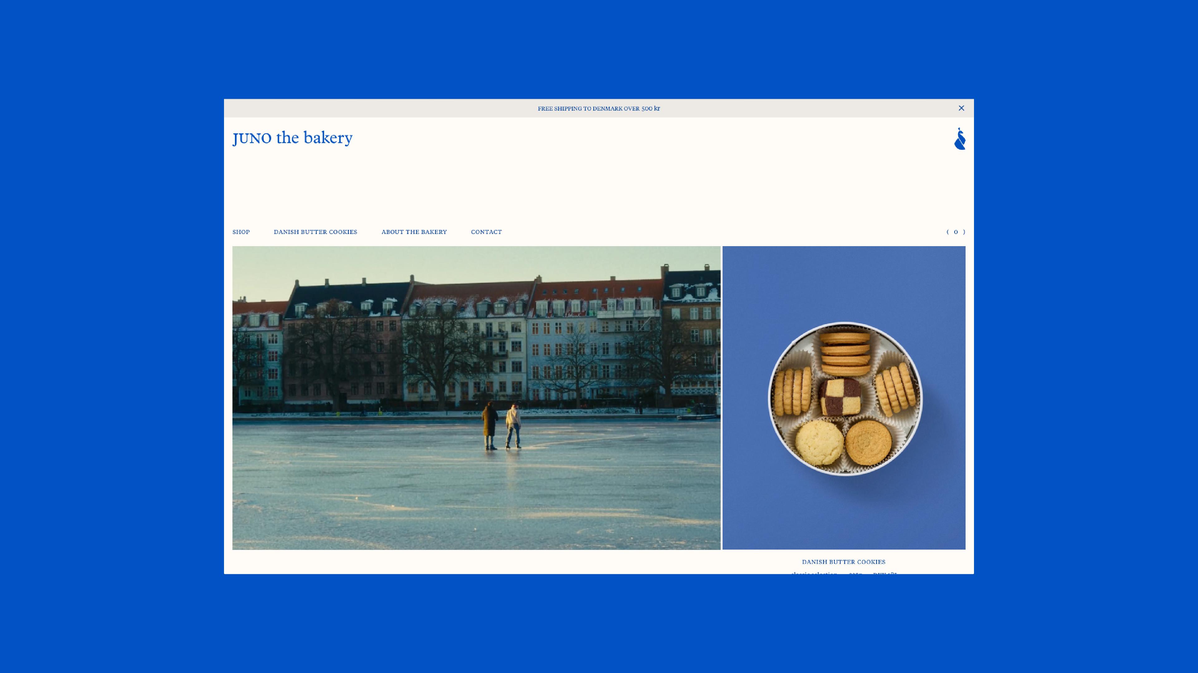
The homepage opens with two images side by side. On the left, a winter scene: two people on a frozen lake in front of a row of Copenhagen apartment buildings. On the right, a tin of butter cookies shot from above on a deep cobalt background. One is atmosphere, the other is product. Neither has a headline shouting over it.
Then comes a short paragraph about the bakery, a row of bestsellers, a line listing what goes into the cookies (butter, sugar, flour, eggs, vanilla, a pinch of salt) and a small section of seasonal pastries. It reads less like a store and more like a magazine spread.
This approach is often called editorial commerce: selling through storytelling and layout instead of banners and urgency. Its main tool is pacing, the rhythm between moments where you’re invited to look and moments where you’re invited to buy. A good magazine alternates full-page photos with denser text so your eye never gets tired. Juno does the same thing with a scroll. Mood, product, story, product, ingredients, product. You never feel pushed, but you’re always one click away from the cart.
None of this would work without the photography, and the photography is where Juno is strongest. The product shots follow strict rules: the same cobalt background, the same overhead angle, the same soft and even light, the product always centered and always the hero. Designers call this a photographic system, a fixed set of decisions about background, light, angle and framing that makes ten different photos read as one family.
For food brands, this matters even more than usual. On a screen, a photo has to do the job of smell, texture and taste. When every image follows the same system, the brand feels considered and the product feels trustworthy. When every image looks different, the whole thing feels improvised, no matter how good the cookies are.
There’s also a smart business move hidden in the homepage. The seasonal favourites (raspberry slices, lemon cake, an apple cream bun) are labeled as available only at the bakery. They can’t be bought online, yet they get the same visual care as everything that can. The website isn’t only an online shop. It’s also a reason to walk into the physical one.
The Product Page Says Almost Nothing, and That’s the Point
Click on any product and the restraint becomes almost radical. The page for the classic cookie selection shows a large photo on one side and, on the other, just this: the product name, the flavor, the weight and price separated by a small dot, one sentence of description, a collapsible line that reads “details & ingredients”, and a button that says “add to cart”. That’s all.
Two design principles are doing the work here. The first is information hierarchy, the order in which a page reveals what matters. Juno’s hierarchy feels obvious once you notice it: what is it, how much is it, why should I care, buy it. The second is progressive disclosure, a UX technique where secondary information exists but waits until the user asks for it. The full ingredient list and nutritional details are there, but they sit behind a single plus sign instead of crowding the page.
Now picture the typical product page: six bullet points, three trust badges, a review widget, a “frequently bought together” carousel and a discount pop-up that appears just as you start reading. That page makes you think. Juno’s page lets you decide. In practice, less friction means a shorter path between wanting something and clicking the button, which is the entire job of a product page.
What keeps all this from feeling empty is the detail work. The typography is a serif set mostly in lowercase, which feels gentle and handmade rather than corporate. Navigation items sit in small uppercase. The page you’re on is wrapped in parentheses in the menu, “( about the bakery )”, and the cart follows the same logic, “( 0 )”. The whole interface runs on two colors: cobalt blue and a warm off-white.
This is microtypography, the small type decisions most users never consciously notice but always feel. It’s also what separates minimal from bare. When you remove almost everything, whatever remains has to be perfect, because there’s nothing left to hide behind.
What Any Food Brand Can Take From Juno
Juno’s website looks simple, but its simplicity isn’t a lack of content. It’s an excess of judgment. Someone decided what every photo would look like, how much a product page needed to say, which two colors were enough, and which pastries deserved a place online even though they could never be shipped.
That’s the real lesson in bakery website design, and in web design for any food brand. When branding, photography, interaction and UX are designed together from the start, a website can afford to be quiet. It can let the food do the talking. Honestly, that’s the kind of work we enjoy most: not adding more, but deciding very carefully what stays.