Photo: Destination Calcio
October 13, 2026
THE COMO 1907 VISUAL IDENTITY WAS BUILT FROM A TOWN, NOT A LOGO
In seven years, a bankrupt club from a lakeside town went from Italy's fourth division to the Champions League, and its visual identity got there before the team did. The interesting part isn't the logo; it's what they chose to build instead.
Como 1907 opened its first ever Champions League campaign by beating RB Leipzig 4-1. Seven years earlier, the club was in Serie D, coming off three bankruptcies in a decade, and almost nobody outside Lombardy could have picked its crest out of a lineup.
Plenty of clubs have climbed fast. What makes this one worth studying is the order of operations. Most football brands are built after the trophies: the team wins, the attention arrives, and the merch department catches up. The Como 1907 visual identity was built before any of that, and it was built from something the club didn't technically own.
Before chasing a single star signing, the new owners did something much simpler. They looked out the window.
Nobody Knew the Club, but Everybody Knew the Lake
When the Hartono brothers bought the club in 2019, the plan wasn't even a football plan. They wanted to produce documentaries about Italian football for their TV business in Indonesia. When that content found an audience far bigger than expected, the owners realized people weren't really watching a fourth-tier team. They were watching a place.
That insight shaped everything. Nobody knew Como 1907, but everybody knew Lake Como: the villas, the boats, the light every travel magazine has photographed a thousand times. So instead of building a football brand from zero, they anchored the club to one of the most recognizable images on the planet.
In branding, this is called borrowed equity: using associations that already live in people's heads instead of spending years (and a lot of money) creating new ones. It connects to an idea from brand architecture, the master brand, which is the parent that lends its meaning to everything underneath it. At Como, the master brand isn't the club. It's the lake. The club lives inside it.
But borrowed equity only buys attention. Having a beautiful place nearby is not a visual identity, the same way living next to the Alps doesn't make you a watchmaker. The real work was translating a postcard into a language.
Turning a Landscape Into a Visual Language
The first serious translation happened on the shirt. For the 2022/23 season, Indonesian couturier Didit Hediprasetyo designed the kits and brought in artist Golnaz Jebelli to paint the lake: the moving texture of the water, the density of local marble. That painting became the shirt. Fans could pre-order by buying a print of the original oil painting, and the club promised to keep the design for at least two seasons, which in football merchandising counts as restraint bordering on the radical.
That decision matters more than it looks. Most kits are assembled from a template: base color, sponsor, a pattern pulled from the supplier's catalog that year. Como turned the lake into a distinctive brand asset, a visual element so tied to one brand that people recognize it even without the logo. Since then, each home kit has carried lake-inspired artwork in some form, refined but never abandoned. The blue stopped being "club blue." It became water.
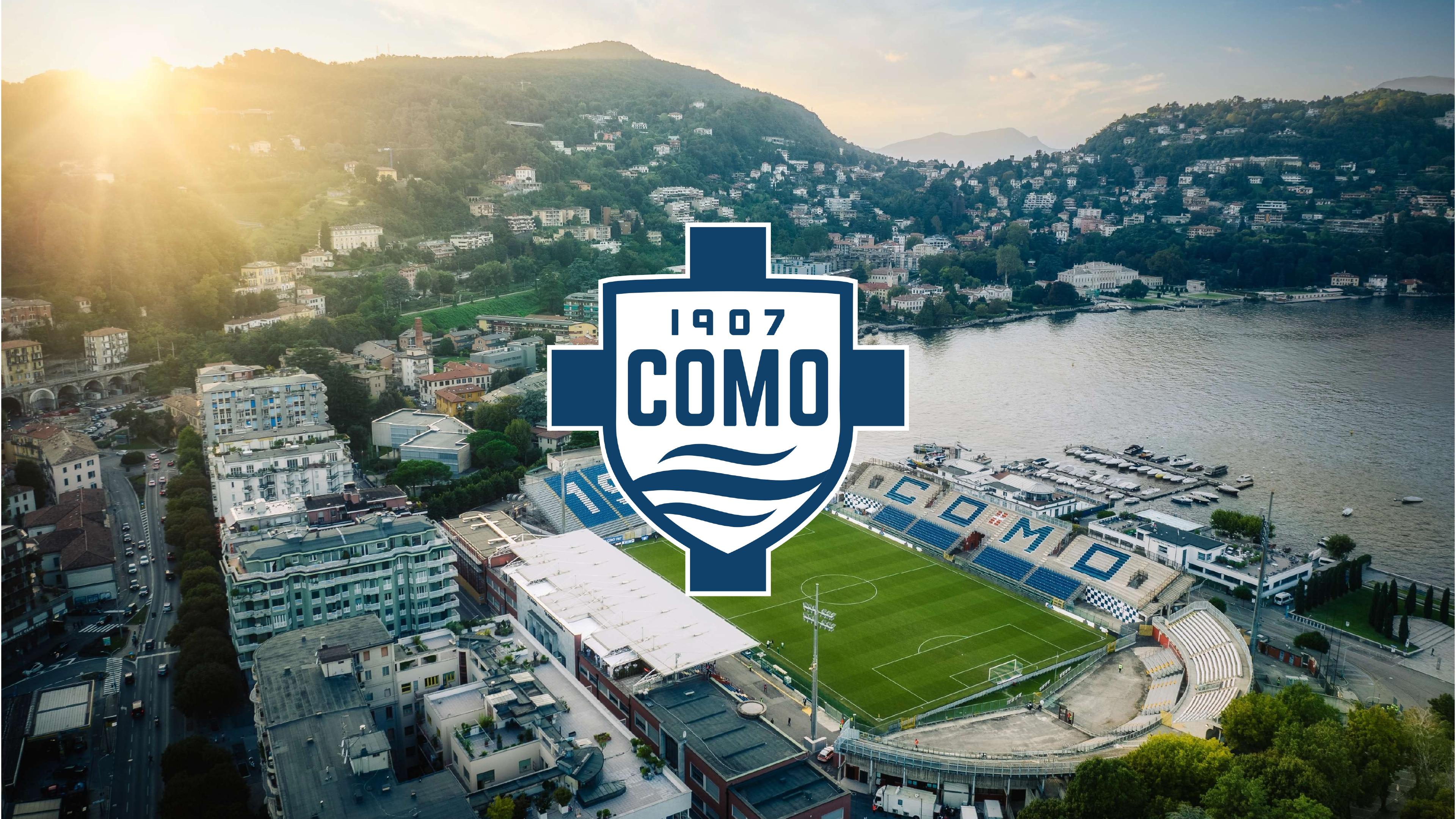
The same logic runs through the imagery. The Stadio Giuseppe Sinigaglia sits right on the shore, so every broadcast is quietly a tourism film: mountains behind the stands, water a few steps from the pitch. The club leans into it with content that looks closer to a travel magazine than a sports feed. Its Discover Como series follows players driving a vintage Fiat 124 Spider along the lake to a villa for coffee. Premium matchday experiences begin with arrivals by wooden boat at Villa del Balbianello.
This is the difference between sports photography and editorial art direction. Sports photography freezes action: tight crops, peak moments, sweat. Editorial art direction builds a world: wide frames, negative space, a slower rhythm, and a consistent color grade (the treatment that gives every image the same temperature and mood). Como's images care less about the goal and more about the afternoon around it. That's how people who have never watched a Serie A match end up following a Serie A club.
A visual language still needs a voice, though. And Como had one centuries before anyone kicked a ball there.
Back to the Roots, Where Como Was Already Dressing the World
Long before football, Como was a silk town. The area has been a center of luxury Italian silk since the 16th century, weaving, printing and dyeing fabric for fashion houses around the world. So when the club leaned into fashion, it wasn't playing dress-up. It was going home.
The clearest signal is who holds the pen. Rhuigi Villaseñor, founder of the LA luxury label Rhude, is the club's Chief Brand Officer, a role most clubs don't even have. His framing is revealing: Como has history, but not the crushing pressure to win that bigger clubs carry, and that freedom turns the brand into a blank canvas. His brief is that a Como shirt should look right with tailoring, on the lakefront, or with everyday clothes. That's a fashion brief, not a matchday brief.
Technically, this changes how a kit gets designed. A uniform is built for function and recognition at a distance: high contrast, big numbers, bold placement. A garment is built for how it's seen up close: collar construction, trim, proportion, the way fabric falls. Como's recent shirts obsess over that second set of details, from clean button plackets to polo collars to tonal pinstripes you only notice at arm's length. When the Rhude x adidas fourth kit dropped in black and gold, with "MMXXV" stitched near the collar, it was priced like a fashion piece and behaved like one: limited, collectible, authored.
The rest of the system follows collection logic rather than merch logic. Instead of stamping a crest on everything, the club builds capsules with a point of view: a Hiking Club line inspired by the mountains, a Running Club, a Hotel 1907 edition, a collaboration with Gabel, Como's historic home textile maker. The squad travels in double-breasted Brioni suits. Even the club's concept store has lived behind the Vitrum shopfront on Piazza Duomo, originally designed by Giuseppe Terragni, one of the key names of Italian rationalist architecture. Every touchpoint says the same thing in a different material.
And once a brand world is that solid, it earns a privilege most young identities don't have. It can look backward without looking old.
The System Holds When the City Wears It First
For 2026/27, the season of its first Champions League campaign, Como made a counterintuitive move. On the home shirt, it replaced the modern wave logo introduced in 2019 with a refined version of its historic crest, the shield used from the 1950s to the early 1990s. Under the collar, in local dialect: "Semm Cumasch." We are from Como.
From an identity perspective, the smart part is that the wave logo didn't disappear. It still runs the club's corporate, digital and media life, while the historic crest lives on the shirt. That's a dual-mark system: a functional mark built to work small, on screens and in apps, and a heritage mark built to carry emotion on a garment. Plenty of brands end up with two logos by accident. Como uses them on purpose, each where it performs best. It only works because everything around them (the palette, the tone, the lake) is consistent enough that neither crest feels like a different club.
Then came the launch. No studio, no pitch, no slow-motion smoke. Restaurant staff and ferry-terminal workers wore the new jersey first, serving customers and greeting passengers before any player put it on. Then three players showed up at a local pizzeria to hand it to fans in person.
This is the moment the system proves itself. The people in those photos aren't models; they're residents. The jersey isn't styled against the lake; it's lived in front of it. After years of borrowing the landscape's beauty, the club handed the identity back to the people who make the place feel like the place. That's a visual identity confident enough to stop posing.
What the Como 1907 Visual Identity Teaches About Borrowed Beauty
It would be easy to turn this into a fairy tale, so let's not. Building a brand on a landscape has a real tension: a lake can become a luxury postcard that sells the view to visitors and slowly edges out the people who live by it. Around 40% of the club's ticket revenue comes from international visitors, which is great business and a fair question about who the stadium is for. And the lake is an asset nobody can redesign. If its image ever cools, the club inherits that problem too.
Still, the reason this works (and the reason it will survive the extra scrutiny the Champions League brings) is coherence. The kit, the photography, the stores, the suits, the crest, the launch: every decision comes out of the same place. That's exactly where most brands fail. They borrow a beautiful association, put it on a few posters and call it identity. Como did the slow, unglamorous sh*t: translating the lake into a palette, a texture, a way of photographing and a way of dressing, then holding that line season after season.
That's the real lesson of the Como 1907 visual identity. Almost every brand has something that already lives in people's heads: a place, a craft, a history, a material. The job isn't to invent meaning from scratch. It's to find what people already love, codify it into a visual system, and be disciplined enough to let it lead. The football came later. The identity had already done the travelling.