September 9, 2026
WE NEED TO TALK ABOUT COCA-COLA'S NEW FONT
Coca-Cola's 2026 rebrand left its iconic script untouched and quietly shipped a new secondary typeface that the internet immediately clocked as a Marlboro lookalike. We think everyone is arguing about the wrong layer of this story, and that's actually the more useful problem to unpack.
What Actually Changed
On July 20, 2026, Coca-Cola rolled out a refreshed global visual identity system across more than 200 markets. The headline fact, and the one most coverage buried, is this: the Spencerian script, Coca-Cola's handwritten signature logotype, didn't change at all. The company reinforced it instead, alongside the Dynamic Ribbon and the Arden Square, two brand assets most people couldn't name but instantly recognize on a can.
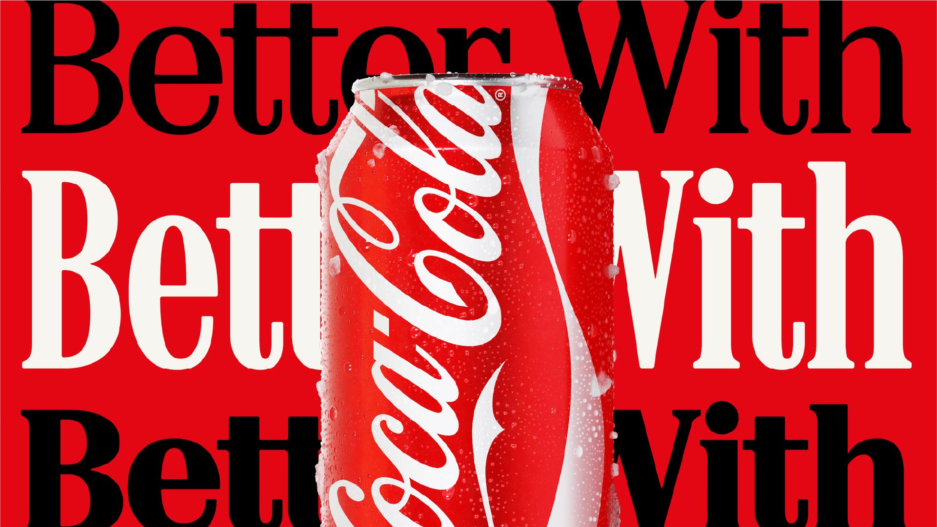
What's actually new is a secondary typeface called "Better With," designed by Brody Associates. It shows up in packaging, retail environments, and campaign communications, never in place of the logo, always around it. A secondary typeface exists for one job: carry a brand's tone into the spaces the primary mark can't reach on its own, headlines, product copy, signage. That distinction, primary mark versus secondary type system, is the piece of the story that got lost the moment someone posted a side-by-side with a Marlboro pack.
Why It Reads Like Marlboro
Here's the part worth understanding instead of dismissing: the resemblance is real, and it comes down to specific, nameable choices, not vague vibes. Bracketed serifs, the small curved connections between a letter's stroke and its serif rather than a sharp right angle, read as warmer and older. Moderate stroke contrast, a stroke that thickens and thins without extreme swings, reads as hand-cut and vintage instead of digital. Slightly condensed letters with confident, blocky terminals complete a look that decades of American tobacco and roadside advertising leaned on hard to signal trust and tradition.
None of those choices is a mistake by itself. Together, they form a package that a large share of people have absorbed, mostly without noticing, as "tobacco brand" specifically, because that industry ran this exact typographic playbook for most of the last century. That's the actual lesson buried under the memes: typefaces carry cultural memory, not just geometry. Every letterform choice comes pre-loaded with whatever that shape has already meant somewhere else.
Is Coca-Cola's New Font Actually Good?
Yes, and it's a sharper piece of type design than the joke cycle gave it credit for.
Judge the craft on its own terms. The stroke contrast is controlled without turning fragile. Letterspacing holds up cleanly at can-label size and scales fine on a billboard. The bracketed serifs bring warmth without tipping into costume-vintage. That balance is harder to hit than it looks: most retro serif revivals either overplay the nostalgia until they read as parody, or play it so safe they lose all personality. "Better With" lands in the middle, confident enough to anchor a headline, restrained enough to never fight the script logo it sits beside.
The pairing logic is the sharpest part of the decision. Coca-Cola's script is fluid, loose, almost handwritten, the visual equivalent of a signature. Setting a structured, upright serif next to it isn't a stylistic accident, it's contrast doing deliberate work: the script stays the emotional signature, the serif becomes the steady, legible voice for everything else the brand needs to say, packaging copy, campaign headlines, in-store signage. That's the textbook function of a secondary typeface, and it's executed with real discipline here.
Does "Better With" share ancestry with Marlboro's typographic territory? Yes, for the reasons above. But one shared branch in a crowded typographic family tree doesn't undo genuinely competent letterform work. Designers noticed the echo because designers notice everything down to the bracket radius. Most people across those 200-plus markets will simply experience it as warm, confident, and unmistakably Coca-Cola within a week of seeing it on shelf.
What We Can Learn From This
A secondary typeface doesn't need to reinvent letterforms from scratch. It needs to do one job extremely well: hold a distinct personality while staying in service of the primary mark. "Better With" does exactly that, and the pairing against the Spencerian script is the strongest evidence of it.
The transferable lesson isn't "avoid any typeface with a cultural echo," because at this point almost every typographic style carries one somewhere. It's this: when the craft and the pairing logic are strong enough, the echo becomes a footnote instead of the headline. Coca-Cola's team got the harder part, the actual type design and system logic, right. The internet just found the footnote before most people found the font.