September 20, 2026
THE PUBLISHER DOING WHAT PINTEREST CAN'T: VICTIONARY BOOKS
In a design world running on infinite scroll, one Hong Kong publisher still believes the best references come in a book you can hold, edit, and actually finish. Let's see what that looks like up close.
We spend most of our design lives inside boards we never finish. A Pinterest tag here, a saved post there, a folder of screenshots that keeps growing and never gets edited down. None of that is bad. Digital moodboards are fast, searchable, and genuinely useful when we need volume. But somewhere along the way, "collecting references" quietly replaced "having a point of view."
That's the gap Victionary design books have been filling since 2001, and it's why, twenty-plus years in, this small Hong Kong publisher is still worth paying attention to.
Who Victionary Actually Is
Victionary is the publishing brand of viction workshop ltd, founded by Victor Cheung in Hong Kong in 2001. From the start, the studio positioned itself as a bridge between East and West: a place where design references from both hemispheres could sit on the same page without one dominating the other.
Over more than two decades, Victionary has produced hundreds of titles across graphic design, illustration, typography, packaging, fashion and product design. What ties them together isn't a house style (there isn't one, visually), it's a house method: pick a narrow theme, gather work from around the world, and edit it into something a designer can actually use, not just admire.
That method is worth a moment of technical attention. In publishing, this is closer to curatorial editing than to archiving. Every Victionary book has a scope statement, whether stated or implied: this book is about serif type, or chocolate packaging, or birds in illustration, and nothing else. That scope is what makes the book usable instead of overwhelming.
What a Curated Object Actually Does
Here's where it gets interesting for anyone who works in branding or design day to day. A digital board rewards volume: the more references you save, the more "complete" it feels. A Victionary book does the opposite. It rewards editing.
Take a volume from the Palette series. Victionary's team doesn't just gather colourful projects; they sort them by hue, decide what counts as "gold and silver" versus "multicolour," and cut everything that doesn't earn its spot in a fixed page count. That constraint, the fact that the book has to end somewhere, forces a kind of decision-making that an infinite board never requires. Someone had to say no to hundreds of projects so the ones that made it in could actually teach us something.
This is not a knock on Pinterest, and we mean that. Open boards are great for early-stage, high-volume exploration. But a Victionary book does a different job: it hands us someone else's finished judgment. We're not browsing raw material, we're reading a curated argument about what good color, type or packaging looks like right now. That's a different kind of reference, and honestly, most design educations could use more of it.
Inside Victionary's Collections
Once we look past the studio's identity, the real value shows up in how consistently this editorial logic plays out across its different series.
Palette and Palette Playbook
The original Palette series launched in 2012 as a colour-themed reference, later relaunched as a flip-friendly Palette mini series and, more recently, expanded into Palette Playbook, which groups colour combinations by mood (radiant, natural, and so on) rather than by hue alone. For anyone building a brand palette from scratch, this is less "look at pretty colours" and more "here's how professionals actually combine them."
Type in Use
Sans in Use, Serif in Use and Display in Use make up Victionary's typography-focused line, collecting real type specimens and, just as importantly, showing how those typefaces get paired and applied across branding, editorial and digital work. It's one of the more technically dense parts of the catalog, and one of the most quietly useful for anyone still developing an eye for type pairing.
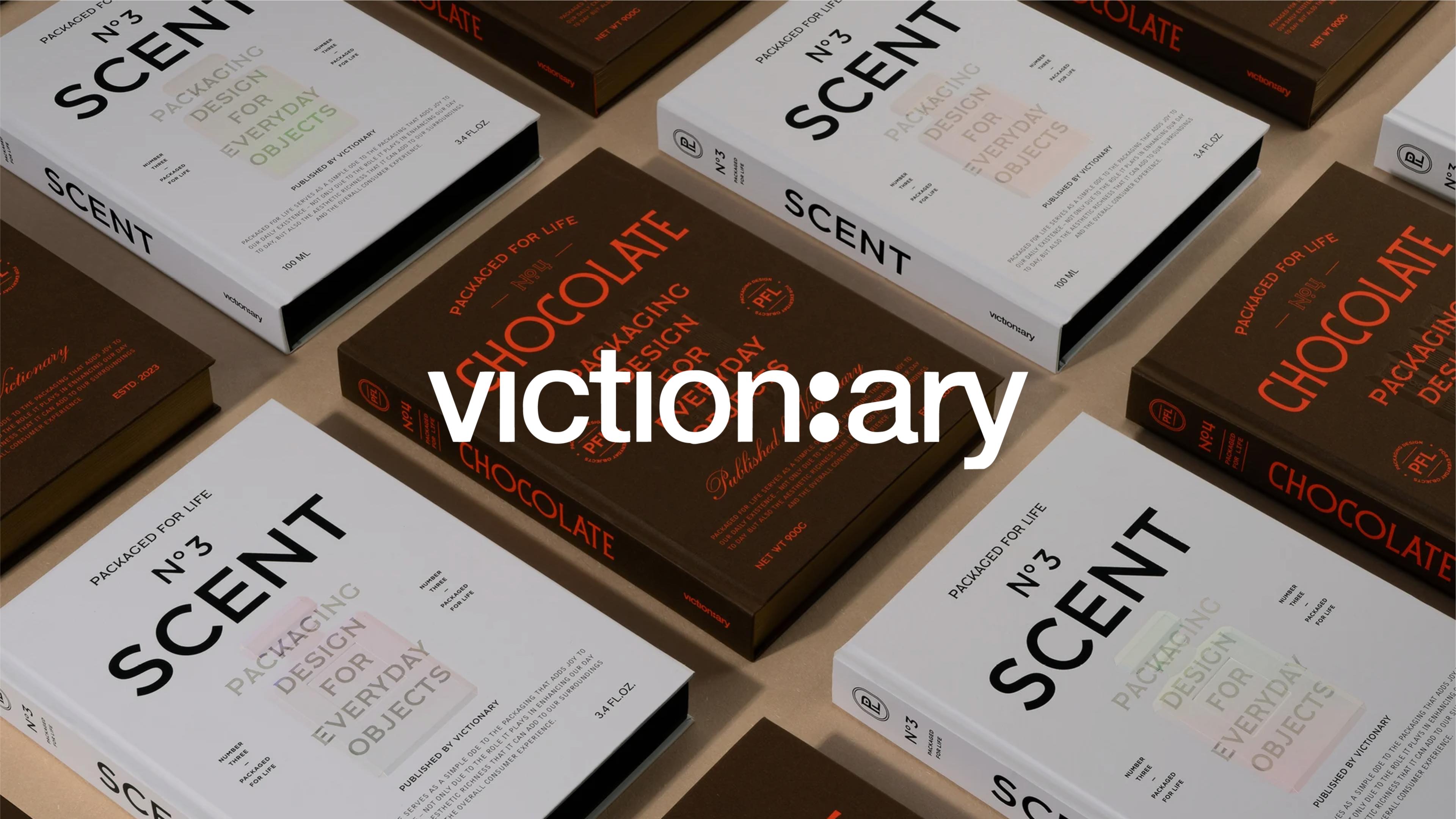
Packaged for Life
This series takes one everyday product per volume, chocolate, coffee, beer, and shows how dozens of studios around the world have approached its packaging. It's a masterclass in constraint: the product barely changes, but the creative range across brands is enormous.
The Inspiration Series
Slightly outside the branding-and-typography core, the Inspiration series (Botanical, Fungal, Insectile, Avian, and the newer Marine Inspiration) leans further into art and illustration, collecting contemporary interpretations of the natural world by category. It's proof that Victionary's editorial logic, pick a narrow theme and curate it properly, works just as well outside pure graphic design.
Why This Kind of Publishing Still Matters
Here's our honest take: in an industry drowning in "inspo," the studios and designers who stand out aren't the ones with the biggest reference libraries. They're the ones who've actually developed taste, which means they've made decisions about what's good and what isn't, over and over, until it becomes instinct.
Victionary's books are, in a way, a shortcut to watching that process happen. Someone already did the sorting, the rejecting, the sequencing. We just have to sit with the result long enough to absorb why those specific projects made the cut. That's harder to do on a screen we can scroll past in two seconds, and it's exactly why a physical, edited object still earns a place next to the digital board, not instead of it.
We don't think Victionary design books are a replacement for Pinterest, Are.na, or whatever tool keeps our early research moving fast. We think they're what happens after the research: the point where someone has to commit to an opinion about what's actually good. That's a different kind of value, and it's one worth keeping on the shelf, literally.