October 12, 2026
COOKBOOK DESIGN STARTS WHERE THE READING CHAIR ENDS
Most books are designed to be read sitting down. A cookbook gets read standing up, out of order, with butter on your fingers, and the best ones solve problems you never noticed you had.
Somewhere right now, a cookbook is lying open on a kitchen counter. There's flour on the corner of the page, a splash of oil near the ingredient list, and someone is squinting at it from a step away while stirring something that can't be left alone. Then the page flips shut.
That moment is the whole brief. Cookbook design is editorial design under pressure: the same tools we use for any book (grids, type, photography, sequence), tested in a room full of heat, mess and divided attention. And the books that handle it well tend to do it so quietly that you only notice when one doesn't.
What Makes Cookbook Design Different From Every Other Book
A cookbook is three books at once: an instruction manual, a reference work and an object people want on their shelf. Most books only have to be one of those.
The difference becomes clear when you compare how each type of book actually gets read:
Reading book → read in order, usually seated, with typography designed to disappear so the story takes over.
Photobook → read as a sequence, where the pacing between images is the main design tool.
Cookbook → consulted out of order, often mid-task, from arm's length, and returned to again and again.
This is what we mean by context of use: the real conditions in which a page gets read. A novel's context is a chair and a lamp. A cookbook's context is a counter, a timer and two busy hands. Every good decision in cookbook design starts from accepting that.
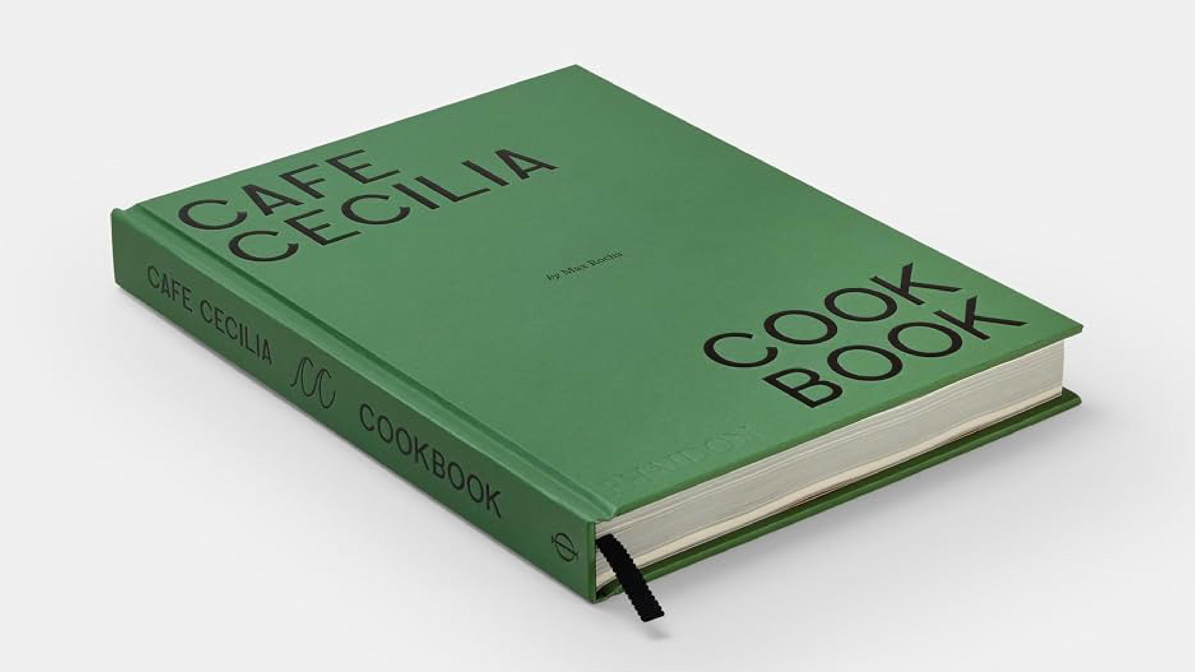
The two books we'll use throughout this piece sit at opposite ends of that problem. Café Cecilia Cookbook, published by Phaidon, collects 100 recipes from Max Rocha's East London restaurant, from breakfast to dinner, and has to carry the identity of a place people already love. Cookies & Crumbs, by Kaja Hengstenberg of the Stockholm cookie shop Krümel, has the opposite challenge: 34 recipes about one single thing, and the job of making each one feel distinct.
The Recipe Page Is the Real Unit of Cookbook Layout
In cookbook layout, the basic building block isn't the chapter or even the spread. It's the recipe, and every recipe follows roughly the same anatomy: a headnote (the short text that gives context, a story or a tip), the yield and timing, the ingredient list and the method.
The trick is that these parts are read at different moments. The ingredient list gets read first, at the shop or while setting things out. The method gets read during cooking, one step at a time, in quick glances. That's why so many cookbooks use a simple two-column grid: a narrow column for ingredients, a wider one for method, so each has its own territory and the eye always knows where to land.
The other quiet rule is one recipe per spread whenever possible. Turning a page with wet hands is exactly the moment a cookbook fails. When a recipe has to run longer, the break should happen at a natural pause in the process, never in the middle of a step.
Our two examples show how differently this unit can be treated. A calm, understated recipe page suits Café Cecilia, whose food is meant to feel unfussy, so the layout gets out of the way. Cookies & Crumbs adds another layer: handy tips scattered throughout the book. For a designer, that's a real decision. Tips need a place on the page (a margin note, a box, a change in type style) where they help without interrupting the flow of the method.
Cookbook Typography Has to Work at Arm's Length
Cookbook typography is read from about a step away, often in imperfect light, by someone glancing back and forth between the page and a pan. That changes the rules compared to a novel.
Body text usually needs to be larger, with generous leading (the space between lines) so the eye can find its place again after looking away. Very light weights and delicate hairline serifs, beautiful in a novel, tend to fall apart at this distance.
Numbers deserve special attention. Many book typefaces default to oldstyle figures, numerals that rise and fall like lowercase letters and blend gracefully into running text. In a cookbook, where "250 g" or "180°C" has to be read in a split second, lining figures (all the same height) are often the clearer choice. In ingredient lists, tabular figures (numerals with equal widths) help quantities line up neatly in a column.
And the most useful typographic device in any cookbook might be the humblest one: the step number. It's how a cook finds their place again after cracking an egg.
A good way to think about this: personality goes where the reader browses, clarity goes where the reader cooks. A restrained book like Café Cecilia makes its typography part of the mood, a quiet page for quiet food. A playful, single-subject book like Cookies & Crumbs has more room for character in headings and section openers, as long as the method stays plain and easy to follow.
How Photography Sets the Pace of a Cookbook
In a cookbook, photography decides the rhythm of the book: how often the reader gets an image, how big it is and what kind of story it tells. Many people choose what to cook by the picture first, so the photo on the facing page works almost like a promise.
Designers have a few levers here. A full bleed image (one that runs to the edge of the page) feels immersive and generous. A framed image with white margins feels calmer and more like a reference. The ratio of photos to recipes changes the personality of the whole book: one photo per recipe feels practical, fewer photos feel more literary.
Café Cecilia is a great lesson in using two visual languages inside one book. The dishes were photographed by Matthieu Lavanchy inside the restaurant itself, while Jacob Lillis photographed the team and the suppliers. That gives the book two rhythms, food pages and people pages, so it reads less like a recipe collection and more like a portrait of a place.
Cookies & Crumbs faces the classic single-subject challenge. When every recipe is a cookie, photos can easily start to look alike. In a book like this, texture is the variable worth showing (the break, the crumb, the gooey center), because texture is exactly what separates one recipe from the next.
Navigation Is the Part of Cookbook Design Nobody Notices Until It Fails
Navigation in cookbook design is how a reader gets from a craving to a page number. It includes the way recipes are grouped, the section openers, the index and every small signal that tells you where you are, like the running head at the top of the page.
The way a book is organized says a lot about who it's for. Recipes can be grouped by meal, season, main ingredient, technique or something more unexpected.
Cookies & Crumbs is a lovely example of the unexpected. Its recipes are sorted by texture: gooey and chunky, gooey and soft, chewy and soft, plus vegan and gluten-free options and ideas for using up leftovers. That's organizing around what the reader wants to eat rather than how a chef might classify things. The book also opens with tips, ingredient advice and equipment before the recipes begin. That's front matter working as onboarding, preparing the reader before they ever turn on the oven.
Café Cecilia goes from breakfast through dinner, a structure that mirrors the day of a restaurant. It's a small decision, but it turns the table of contents into part of the brand: you move through the book the way you'd move through a day at the café.
Underneath any system, the index does the heavy lifting. In a cookbook it's often one of the most used pages, so indexing by ingredient (not just by recipe name) is a gift to anyone standing in front of the fridge wondering what to do with half a bag of hazelnuts.
The Cookbook Design Vocabulary Worth Keeping
If you're taking on your first editorial project in food, these are the terms worth having at hand:
Headnote → the short text before a recipe that gives context, a story or a tip.
Spread → two facing pages designed and read as one composition.
Full bleed → an image that runs to the edge of the page with no margin.
Running head → the small line at the top of the page that tells the reader where they are.
Folio → the page number, which matters more in a cookbook because the index sends you there.
Front matter → everything before the main content, like the introduction, tips and equipment guides.
Lining figures → numerals that share the same height, easier to scan in quantities.
Tabular figures → numerals with equal widths, so columns of numbers align.
Put Café Cecilia and Cookies & Crumbs side by side and you get two very different answers to the same question. One steps back and lets a restaurant, its people and its suppliers set the tone. The other builds a clear, playful system so a single subject never feels repetitive. Neither is more correct. Both work because every decision, from the grid to the order of the chapters, was made with the kitchen in mind.
Whenever we work on editorial projects, that's the test we keep coming back to: does the design hold up in the place the book will actually live? For cookbooks, the answer is visible in the small stuff. Good cookbook design is invisible at the stove and memorable on the shelf, and the best books manage to be both without ever making a fuss about it.