September 28, 2026
THE SAM'S CLUB REBRAND: WHY THE NEW LOGO WORKS
Sam's Club swapped an apostrophe for a diamond and quietly pulled off one of the smartest retail rebrands of the year. Here's why the smallest change in the system carries the most weight.
Most rebrands announce themselves with a brand new symbol. The Sam's Club rebrand did the opposite: its most important move fits inside a single piece of punctuation.
The new identity, designed by Turner Duckworth and launched at the end of May, has spent the last few months rolling out across the app, uniforms and the first new clubs. The internet's first reaction was mostly a shrug. Ours was different. We think this is a warehouse brand finally growing up, and the reasons are hiding in the details.
What Actually Changed in the Sam's Club Rebrand
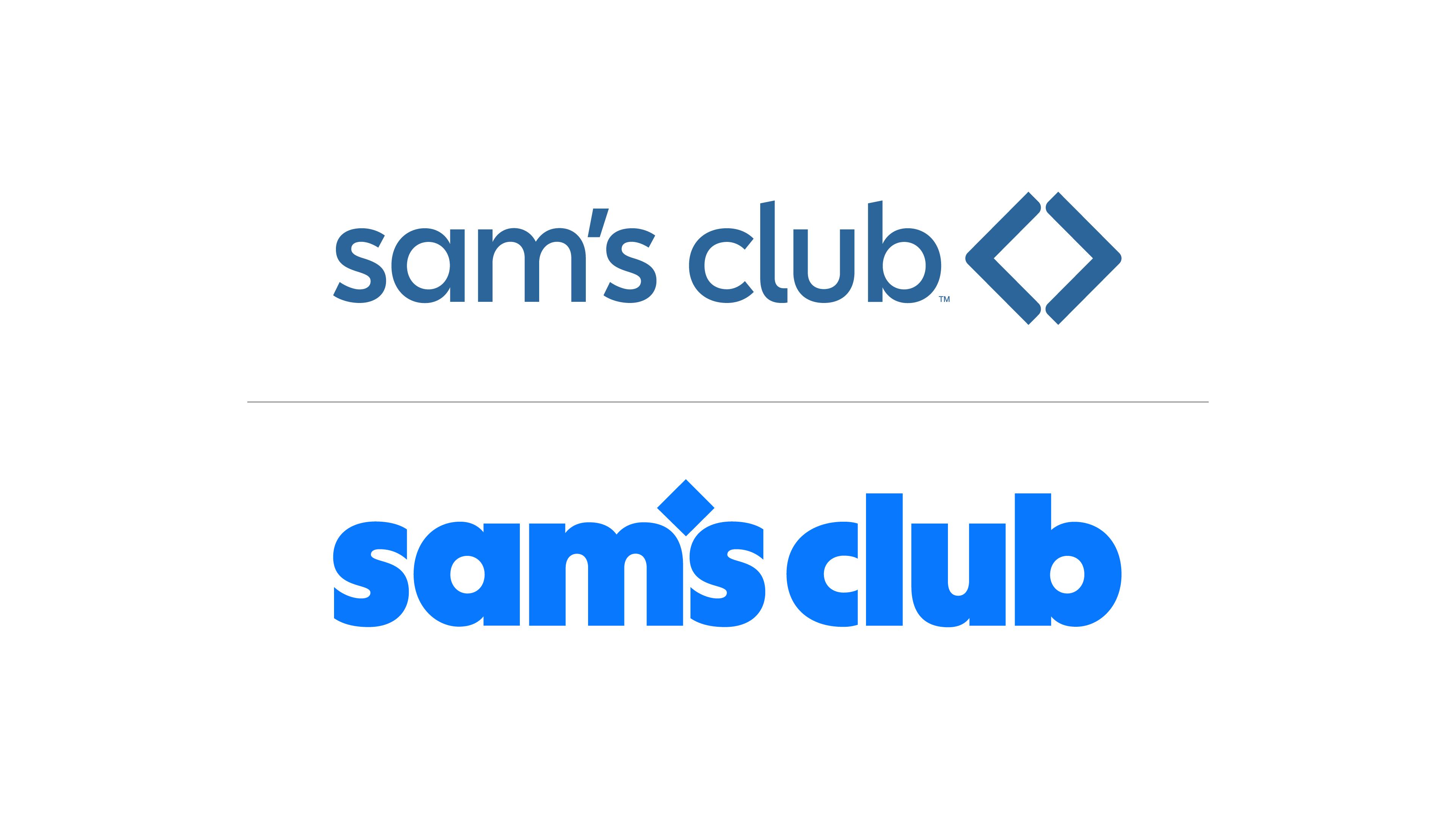
On paper, the list is short. The name is now set in lowercase, in a custom typeface called Sam Sans. The brand's diamond, which used to sit next to the name as a separate symbol, now replaces the apostrophe in "sam's." The blue got brighter and more saturated, the old green accent was retired, and there's a compact version that pairs the "S" with the diamond for the app and small digital spaces. All of it arrived alongside a campaign called "Come Join Us."
To read this properly, it helps to know three terms. A wordmark is the brand name set in type. A logomark (or symbol) is a standalone graphic, like the diamond on its own. A monogram is a compact mark built from initials. The previous identity was a combination mark: symbol and wordmark sitting side by side. The new one is a wordmark with the symbol built into it, plus a monogram for tight spaces.
That shift matters because a modern identity is a system, not a logo. A mark that looks great across a store façade will fall apart at 32 pixels, and vice versa. Having versions designed for each scale is what separates a logo from an identity. And the most interesting version starts with the smallest change.
The Diamond Comes Home
The diamond isn't new. The 2019 identity already turned it into the brand's first real standalone symbol. What's new is its job. It went from sidekick to protagonist.
The technique here is called glyph substitution: replacing a standard character (a letter, a number, a punctuation mark) with a brand element. It's easy to do badly. Swap the wrong glyph and you get a gimmick. Swap the right one and the symbol becomes impossible to separate from the name. We think Sam's Club picked the right one, for three reasons.
It solves a lockup problem. Combination marks come with rules: clear space between symbol and type, horizontal and stacked versions, alignment specs. Every rule is a chance for someone in one of hundreds of locations to get it wrong. When the symbol lives inside the word, there's nothing to misalign.
The apostrophe carries meaning. A possessive apostrophe literally signals belonging: this club is Sam's. Turning that mark into the brand's diamond quietly supports a message about membership and ownership, which is exactly what "Come Join Us" is trying to say. Form and message point in the same direction. That's rare.
It's heritage without nostalgia. Inventing a new symbol would have restarted recognition from zero. Going retro would have looked like a costume. Instead, the brand kept its most recognizable asset and gave it a better seat. In our experience, evolving what you already own almost always beats replacing it.
Sam Sans and the Case for a Heavier Voice
The second big decision is the typeface, and it's where the Sam's Club new logo earns most of its credibility.
Why stroke weight matters on a nearly 170,000-square-foot box
Stroke weight is the thickness of the lines that form each letter. It determines how much visual weight a word carries and how well it survives extreme conditions. At long distances, thin strokes fade and the small interior spaces of letters (called counters) start to close up. On low-resolution screens, the same thing happens in miniature.
A warehouse club lives at both extremes: read from a parking lot or a highway, and read as a tiny icon on a phone. The heavier Sam Sans handles both. The previous identity felt polite. This one can hold up a building. The brighter blue helps too, adding contrast in both environments.
What a custom typeface actually buys you
A custom font sounds like a luxury. It's usually a practical decision. It means ownership (no one else can use it, so even a headline without a logo feels like Sam's), consistency across hundreds of clubs and every digital touchpoint, and freedom from licensing limits as the brand expands.
But the smartest detail in Sam Sans is geometric. The letters include angular cuts inspired by the diamond's shape. That means the logo's DNA isn't just in the logo: it's distributed across every word set in the typeface. A price tag, an aisle sign, a push notification all echo the mark without showing it. That's how a custom typeface justifies its cost, and it's the most sophisticated decision in the whole system.
Lowercase, x-height and the friendliness question
Uppercase reads as announcement. Lowercase reads as conversation, which fits a brand that wants to feel less like a warehouse and more like a club. Lowercase also relies on x-height (the height of letters like "a" and "m") and on the ascenders and descenders that rise above or drop below it, giving words a recognizable silhouette.
Here's a detail we love: "sam's" has no ascenders. That means the diamond, sitting at apostrophe height, is the only element rising above the x-height in the first word. It becomes the highest point and the natural focal point. That's not luck. That's typography doing its job.
One Blue, No Green: A Simpler Color Story
Retiring the green is a small change with a big payoff. A single-color identity is easier to recognize and easier to reproduce: fewer colors to match across signage, uniforms, packaging and screens means fewer chances for the brand to look slightly off in the real world.
Two-color identities work when each color has a clear job. In our view, the green never really did. The new, more saturated blue reads vivid on screens; the challenge will be keeping it consistent in print and physical signage, where saturated blues are notoriously hard to match. That's an execution test, not a design flaw.
Where the New Sam's Club Logo Plays It Too Safe
Lowercase plus geometric sans is the uniform of this decade, and from far enough away, it could belong to almost any app. The weakest piece is the S and diamond monogram: in an app grid it feels awkward, and the diamond, so strong inside the word, loses its stage.
What We Can Learn From the Sam's Club Rebrand
The first lesson is about assets. Sam's Club didn't chase a new idea; it found the strongest thing it already owned and gave it a bigger role. Most brands have a diamond somewhere, a shape, a color or a detail people already recognize, and the best rebrands start by finding it before drawing anything new.
The second is about context. This identity was clearly designed for its hardest conditions (distance, scale, tiny screens) instead of for a pretty presentation slide. That's the difference between a logo that looks good and one that works.
The third is the one no designer can solve alone. Costco still leads the category and owns the cultural affection that comes with it, and a better logo won't change that by itself. The Sam's Club rebrand is a well-built front door. Whether people stay depends on what's behind it: the stores, the app and the experience that has to match the promise in that little diamond.