October 9, 2026
WHY HEALTHY DRINK BRANDING STOPPED LOOKING LIKE MEDICINE
Healthy drinks have been on shelves for decades, yet nobody wanted to be caught holding one. What changed wasn't inside the can, and once you see it, you'll spot it in every fridge.
Kombucha was fermenting in health food stores long before it had a fridge of its own. Green powders came in tubs that looked like they belonged next to the protein and the fish oil. Diet sodas, fiber drinks, vitamin waters: the "good for you" beverage is not a new idea. It's one of the oldest promises on the shelf.
What's new is that people actually want to be seen holding one.
Somewhere in the last decade, healthy drink branding stopped trying to look responsible and started trying to look delicious. And the category exploded. Same basic idea in the can, completely different reaction at the shelf. So what exactly changed?
Healthy Drinks Were Never the New Part
Every category speaks a visual language. Designers call these category codes: the colors, materials, typefaces and layouts that tell your brain "this is a soda" or "this is a supplement" in under a second, before you've read a single word. Codes are useful. They're also a trap.
For years, the codes of healthy drinks were borrowed from the pharmacy. White or pale backgrounds. A leaf, a sprout or a water droplet somewhere near the logo. Condensed sans serif type listing what's inside: probiotics, electrolytes, 12 vitamins, zero sugar. Sometimes the nutrition facts were basically the hero of the pack.
There's a reason brands did this. It taps into the health halo, the effect where one positive signal (green, natural, "with fiber") makes people assume the whole product is good for them. Cue the halo hard enough and you look trustworthy.
The problem is what that design says in the background. When the benefit is the first thing you read, the product reads like medicine. And medicine comes with an unspoken deal: this is good for you, so it probably won't taste good. Visual hierarchy (the order in which your eye reads a layout: first, second, third) was working against these brands. Proof came first, and desire never showed up.
The brands that broke out flipped that order. Two of them did it in very different ways.
How Olipop Made Health Taste Like Soda
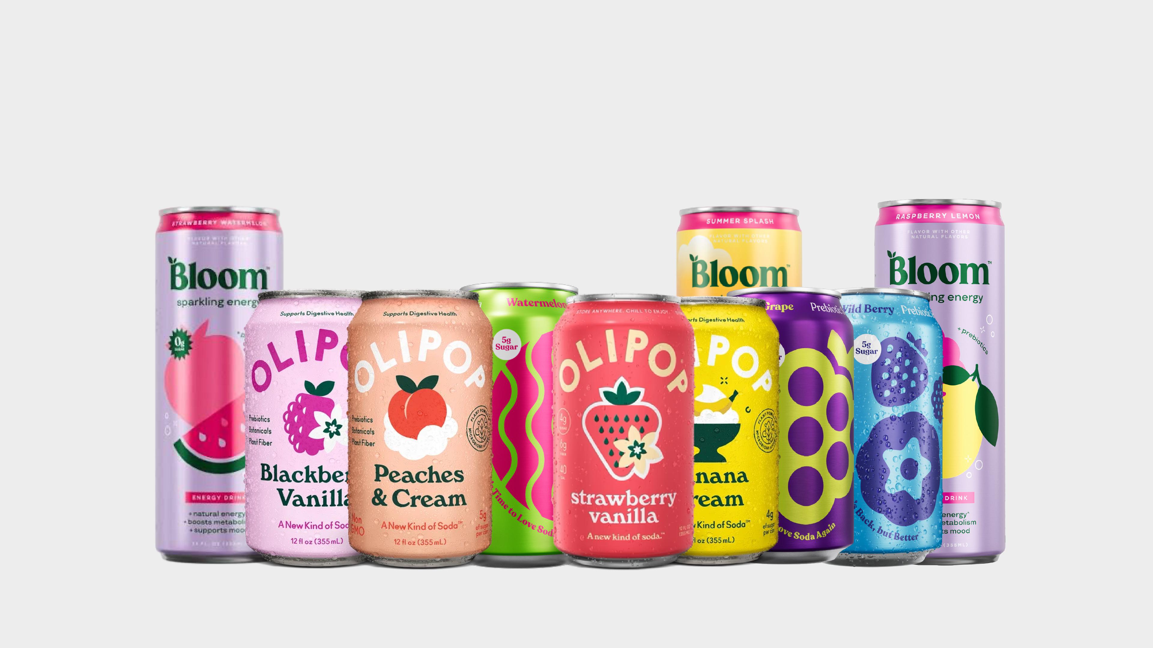
Olipop's smartest move was refusing to look like a health drink at all. Instead of borrowing codes from wellness, it borrowed them from the category it wanted to replace: soda.
Look at the flavor names: Vintage Cola, Root Beer, Orange Squeeze. These aren't invented superfood combos; they're the flavors people grew up with. The cans follow the same logic, with a nostalgic, colorful feel and a distinct color per flavor, so the lineup works like a candy wall on shelf. The founders have described the design intent as nostalgic, youthful and colorful, built to deliver the same pleasure as a soda. The industry noticed early, too: BevNET gave Olipop a Best Packaging Design award when the brand was barely a year old.
Even the name does quiet double duty. "Oli" comes from oligosaccharides, the prebiotic fibers in the formula, and "pop" is plain American slang for soda. That's good naming craft: the science is in there, but it sounds like fun, not like a lab report.
The benefit didn't disappear. It just moved down the hierarchy. A regular soda can carry around 39 grams of sugar, while Olipop sits at 2 to 5 grams with 9 grams of fiber. Those numbers are on the can, but they're the second thing you read: the reassurance after the craving, not the pitch.
Context matters here. Before Olipop, founders Ben Goodwin and David Lester had already built a probiotic soda called Obi, which was acquired in 2017. In other words, "healthy soda" wasn't a new idea even for them. What Olipop did was package that idea as soda first, health second. The brand now shows up both in the produce section and in the regular soda aisle, which is a pretty good summary of the whole strategy: one foot in wellness, one foot in pleasure.
How Bloom Made Wellness Look Like Beauty
If Olipop borrowed from soda, Bloom borrowed from beauty.
Bloom Nutrition started in 2019 as a direct-to-consumer pre-workout for women, built for people who felt intimidated by traditional supplement brands. And you can see why. Supplement branding usually means black tubs, aggressive type, flames and a vague sense of being yelled at. Bloom's audience didn't want any of that.
So the brand went the other way. Ahead of its retail launch, the studio Riser reworked the identity to feel fun, slightly feminine and modern. The old "B" mark became a curvy "Bloom" wordmark, the palette leaned into soft, sweet colors, and the whole thing started to look less like gym equipment and more like something that lives on a vanity next to skincare. That's a category code swap: the same functional product, dressed in the visual language of a completely different aisle.
The technical part people usually miss is the system. Riser later extended the look across more than 60 products. A brand system (logo, color logic, type, layout rules) only works if it can flex across flavors, formats and sizes without falling apart, and Bloom's had to perform in two very different places at once: a phone screen and a store shelf. Its Greens & Superfoods powder went viral on TikTok, then the brand landed in Target in 2022 and Walmart shortly after. Packaging that reads in a three second video and from two meters down an aisle is a design brief in itself.
That's why the jump into drinks felt natural. In 2024 Bloom launched Sparkling Energy, its first canned drink, exclusively at Target. A greens powder and an energy can are different products, but the brand traveled with zero friction. It's the clearest proof that in this category, people buy into the brand world, not the format.
If You Run a Beverage Brand, Here Are 3 Things You Could Review Tomorrow
Put Olipop and Bloom side by side and the pattern is hard to miss. Neither pretends the benefits don't exist; they just stopped leading with them. Pleasure first, proof second. And both got there by borrowing codes from a category people already crave (classic soda, beauty) instead of the category they technically belong to.
There's a catch, though. Walk down any beverage aisle today and you'll spot the next problem: retro type, pastel cans and bubbly illustrations everywhere. When every healthy drink looks "not clinical," not clinical stops being a differentiator. The wave has its own clichés now, and copying the winners just puts you in their shadow. This is usually where we push hardest on beverage projects: the goal isn't to look like Olipop, it's to find your own version of what Olipop did.
So if you run a beverage brand, start here. First, hold your pack at arm's length and notice what you read first. If it's a claim or an ingredient list, you're leading with proof, and that's the pharmacy talking. Second, ask which category you're borrowing your visual codes from. If the honest answer is "health," try sketching what your product would look like if it came from candy, beauty, coffee or soda, and see what that opens up. Third, cover the word "healthy" (and its cousins: clean, functional, gut friendly) and check whether your brand still has a personality. If it vanishes, you had a label, not an identity.
Good healthy drink branding doesn't hide the wellness. It makes wellness feel like something you'd choose even if it weren't good for you. That's the whole trick, and it's exactly why a very old idea suddenly feels brand new.