October 19, 2026
ICONIC MOVIE POSTER DESIGNS AND THE DESIGN LESSONS HIDING IN THEM
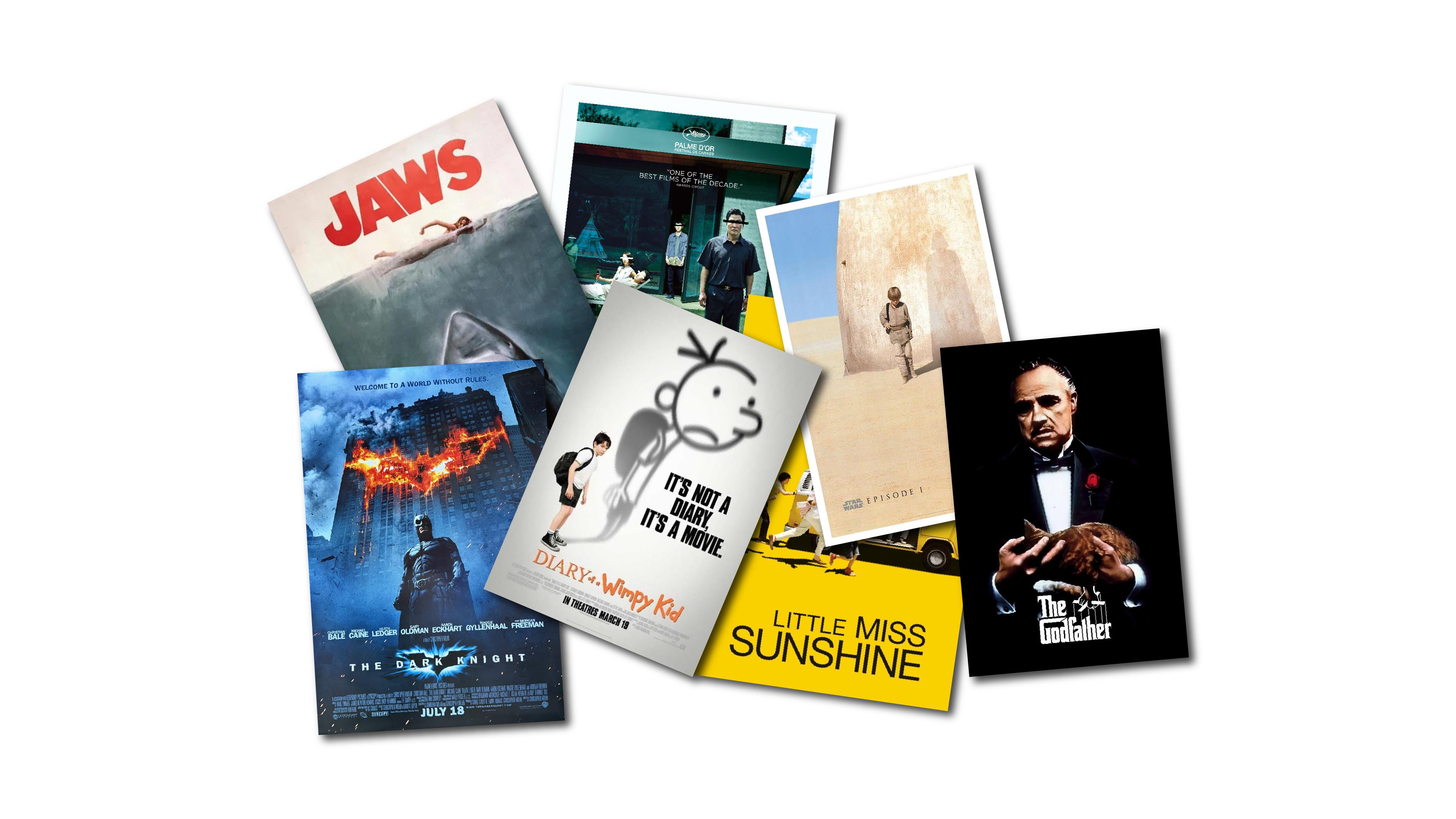
Five movie posters, five design decisions that still work decades after release. One of them hides the entire plot in a pair of legs lying on a lawn, and you probably never noticed.
A movie poster has a ridiculous job. It has to sell two hours of story to someone walking past a cinema wall or scrolling a feed, and it gets about three seconds to do it. No sound, no trailer, no second chance.
That's why movie poster design is one of the best classrooms we know. The constraints are brutal, the results are public, and the great ones are easy to study because we've all seen them a hundred times without really looking.
We're not ranking anything here. "Best" is a matter of taste. What we want is to take five posters apart the way a mechanic takes apart an engine and find the single decision that makes each one run. First, though, we need to know what the engine is supposed to do.
What a movie poster design actually has to do
Every poster industry has its own vocabulary, so let's get it out of the way.
The key art is the central image or concept the whole campaign is built around. The one-sheet is the standard vertical theatrical poster. The billing block is that dense stack of condensed credits at the bottom that nobody reads but everybody's lawyer does. The tagline is the short line of copy that sets the tone. And campaigns usually come in two phases: a teaser poster, which builds curiosity months before release, and a payoff poster, which closes the deal with stars, quotes, and a date.
Behind all of that sits one principle: visual hierarchy. A working poster answers three questions in a strict order. What is this? What does it feel like? Why should I care? The image or title answers the first, color and type and composition answer the second, and the names, quotes, and release date answer the third. When everything shouts at the same volume, nobody hears anything.
Keep that order in mind, because each of the five posters below breaks the problem in a different way.
The Godfather turns a title into a logo
Most posters lead with an image. The Godfather leads with a word.
The mark was designed by S. Neil Fujita for the jacket of Mario Puzo's novel in 1969, and Paramount later adopted it for the film. It sits on a field of black: heavy, almost gothic letterforms, with the top stroke of the G stretched over to the D. Fujita described that move as building a house for the word "God." Above the title, a disembodied hand holds a puppeteer's control bar, and the strings drop straight down to the letters.
This is a perfect lesson in the difference between a logotype (a word set in a distinctive way) and a lockup (the logotype and a symbol fixed together as one unit). Here, the lockup carries the entire concept: power, control, someone pulling strings from above. You don't need Marlon Brando's face to understand the movie, and that's the point.
It's also the toughest test you can apply to any identity: can it survive without a photograph? The Godfather mark works on a billboard, a paperback, or a T-shirt, because the idea lives in the type itself.
Jaws and the terror of what you can't see
The Jaws poster started as a book cover too. Paul Bacon designed the original hardcover with a shark rising toward a swimmer. For the paperback, the publisher asked illustrator Roger Kastel for something bigger and more realistic, and he went to a natural history museum to photograph shark specimens as reference. That paperback painting became the 1975 film poster.
The composition is almost absurdly simple. A horizontal waterline splits the poster into two worlds. Above it: a small swimmer, calm, unaware. Below it: an enormous shark, dark water, and a mouth full of teeth aimed straight up.
Three principles do the work here. Scale contrast makes the threat feel overwhelming, because the shark is many times the size of the swimmer. The horizon line acts as a compositional divider, creating tension between two zones. And the shark's body works as a giant directional arrow, pulling our eye from the danger below to the victim above.
But the real trick is narrative. The poster shows the moment before the attack, not the attack itself. We know what the swimmer doesn't, and that gap is where the fear lives. Implication almost always beats explanation.
Little Miss Sunshine makes negative space do the selling
Jump to 2006, and to a poster that looks like it took ten minutes. It didn't.
The campaign, created at BLT Communications under creative director Dawn Baillie, designed the teaser and the payoff at the same time, so the color yellow could become the identity of the whole film. Then came a practical problem: the client wanted a lot of review quotes on the poster. Quotes need room. So the designers pushed the family and their battered VW bus down to the very bottom edge, running horizontally across the frame, and gave each figure a stark, graphic shadow.
This is the clearest example we know of negative space working as an active element instead of leftover background. The empty yellow isn't empty. It holds the quotes, it sets the tone (sunny, slightly absurd), and it makes the tiny running family feel even more fragile and comic. The composition is deliberately bottom-heavy, which creates a little visual unease, exactly right for a film about a dysfunctional family trying very hard to look functional.
There's also a craft detail worth knowing: the image is a composite, assembled from different on-set photos rather than a single shot. Good poster design often means building the moment that the camera never actually captured.
The lesson is our favorite kind. A client constraint (more quotes!) became the idea itself.
The Dark Knight builds the symbol into the scene
By 2008, the bat symbol was one of the most recognizable marks on the planet. The Dark Knight poster uses that recognition in a clever way: Batman stands facing us, and behind him a skyscraper burns, the fire punching through the facade in the unmistakable shape of the bat.
Two concepts are at play. The first is figure-ground, the relationship between a shape and the space around it. The bat isn't drawn on the building; it's a hole in it, a negative shape defined by fire and darkness. The second is brand equity: when a mark is known well enough, you no longer have to stamp it on top of the image. You can embed it in the environment, deform it, even set it on fire, and people will still read it instantly.
The limited palette (black, ember orange, smoke gray) keeps everything focused. And the ambiguity is deliberate. Is that symbol a signal, or damage done in his name? The poster doesn't answer, and that unresolved question is basically the movie.
Parasite hides the whole plot in plain sight
The original Korean poster for Parasite, designed by Kim Sang-man, looks at first like a calm domestic scene. A modernist house, a green lawn, family members standing around in tasteful poses. Then you notice the bars over their eyes. Then you notice the pair of bare legs sticking into the bottom of the frame, the rest of the body cropped out.
Everything here rewards a second look. The bars are color-coded by family: black for the poor Kims, white for the wealthy Parks. That's redaction used as a storytelling device, and it does two jobs at once. It makes a sunny image feel wrong, and it encodes the class divide before you've seen a single scene.
The cropping of the legs is just as deliberate. By cutting the body off at the frame edge, the designer forces your imagination to complete the picture, and your imagination is always darker than anything a poster can show.
Even the typography plays along. The title is set in uppercase Gotham, a clean geometric sans serif, but customized with oldstyle serifs on some of its terminals. It's a hybrid letterform: polished at first glance and slightly off when you look closer. Exactly like the family.
What these five posters teach about movie poster design
Put the five side by side and a pattern appears. Each poster commits to one dominant idea and makes everything else serve it. The Godfather bets everything on type. Jaws bets on scale. Little Miss Sunshine bets on space. The Dark Knight bets on a symbol people already know. Parasite bets on details that only reveal themselves the second time you look.
None of them tries to show the whole film. That's the discipline behind great movie poster design, and it's the same discipline behind a strong brand identity, a packaging system, or the hero section of a homepage. In our studio, the hardest part of any project is rarely finding ideas. It's choosing one and having the nerve to let the rest go.
So the next time a poster stops you in a hallway, don't just admire it. Ask which single decision did that, and what the designer had to sacrifice to make it work.
Mini glossary
Key art: the core image or concept a film campaign is built around.
One-sheet: the standard vertical theatrical movie poster.
Billing block: the condensed credits at the bottom of a poster.
Visual hierarchy: the order in which the eye reads elements on a layout.
Negative space: the area around and between subjects, used as an active design element.
Figure-ground: the relationship between a shape and the space that surrounds it.
Lockup: a fixed combination of logotype and symbol used as one unit.