August 19, 2026
INSTAGRAM'S QUIET REBRAND: A REAL LESSON IN RESTRAINT AND PROCESS
Instagram changed its wordmark for the first time in a decade, with no campaign and no fanfare. Here's what a real, disciplined rebrand process actually looks like.
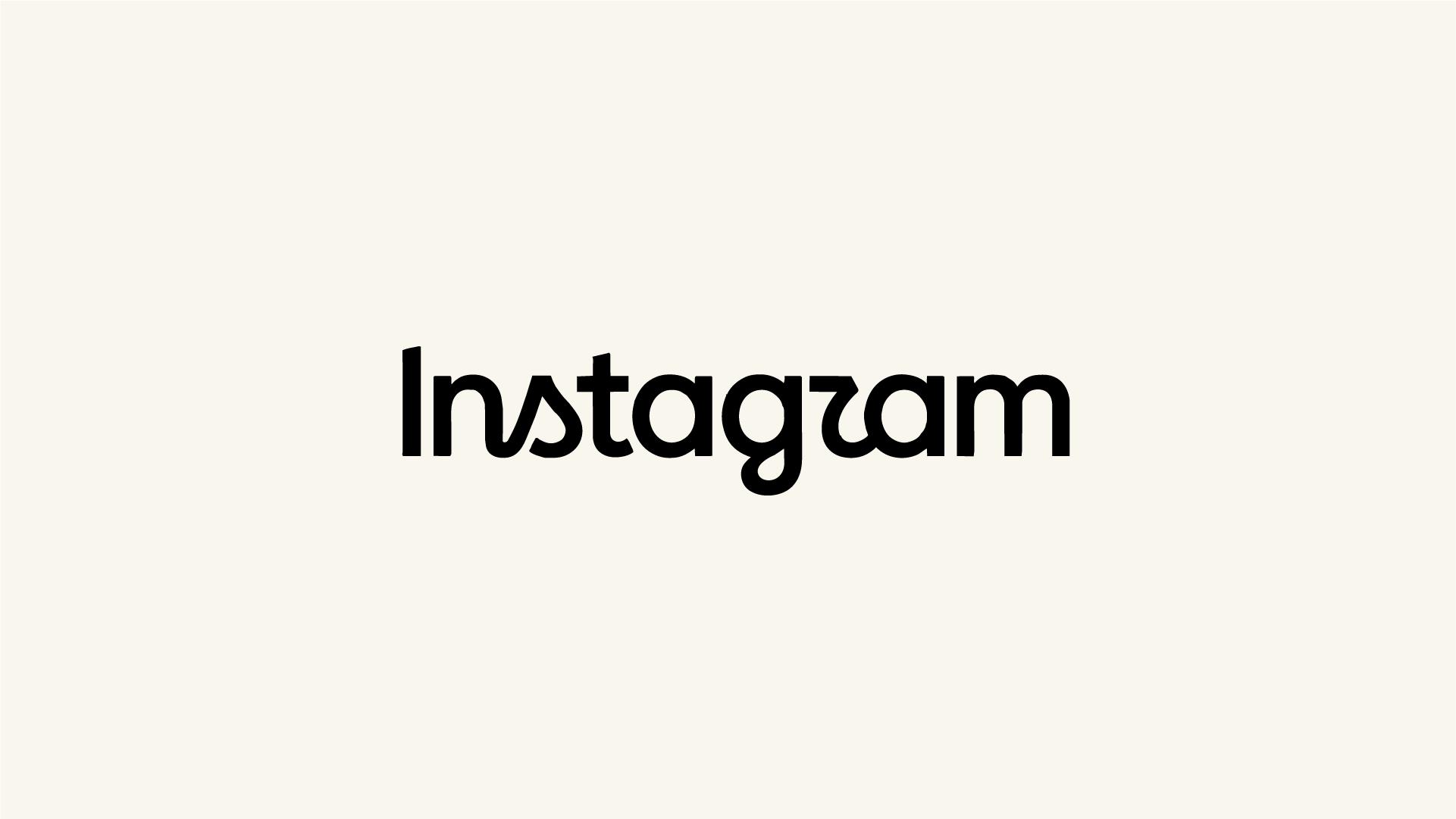
Most rebrands announce themselves before they ship, a manifesto, a case study, a "why we changed" video built to get ahead of criticism. Instagram's new wordmark arrived with none of that. Ten years of leaving a well-liked mark untouched, hundreds of directions explored before landing on a decision, and a launch with zero fanfare: that's a real process worth studying, not just a logo worth reacting to.
A Wordmark Change With No Fireworks
On August 13, 2026, Instagram head Adam Mosseri posted the new wordmark directly on Instagram and Threads. No campaign, no press event, no manifesto explaining the reasoning before anyone had the chance to react on their own.
That's worth pausing on, because it's a useful test we can apply to any rebrand, not just this one: does the brand explain itself before or after the reaction lands? Pre-justification is usually defensive. It signals the team anticipates the work won't hold up on its own, so they wrap it in reasoning first. Post-hoc explanation, offered only when asked, signals the opposite: the team is confident the design carries its own logic. Instagram let the typography speak first and only detailed the thinking afterward, through its design account and Meta's own blog. That sequencing is itself a design decision, and it's the first real signal that this wasn't built to survive a news cycle. It was built to survive scrutiny.
Why "Leaving It Alone" Was Also a Decision
The old wordmark held since 2016. In that same window, nearly everything else about the app got rebuilt: Stories launched, Reels took over the feed algorithm, the platform pivoted so hard toward video that Mosseri had to publicly reassure users photos weren't disappearing. The wordmark was the one visual constant through all of it.
Here's the analytical point that matters more than the timeline itself: brand elements inside fast-moving products don't survive a decade by accident. They survive because someone, repeatedly, defends them against the constant internal pressure to "modernize something." That pressure is real and it's structural, teams need visible wins, leadership wants proof of relevance, redesigns are an easy way to generate both. A wordmark surviving ten years of that pressure means it kept winning the argument on merit, not on inertia.
That reframes the timing question. This wasn't a rebrand triggered by a merger, a new exec wanting to leave a mark, or a relevance panic. When a brand finally changes something it has defended for a decade, the burden of proof has already been met internally. The open question isn't why they changed it. It's whether the replacement clears the bar the original was defended on.
The Typography Problem, Explained Properly
This is where most coverage of this rebrand stops at "they made a new font," which tells you nothing useful. Here's what actually happened and why it matters.
Instagram replaced a single logotype with three coordinated typefaces: Instagram Sans as the core system font, Instagram Pen as a handwritten register, and Instagram Mono for technical or structured contexts. That's a different kind of problem than choosing one typeface. A single wordmark only has to work in one context, at one scale, expressing one tone. A type system has to hold a consistent identity across radically different jobs: a headline, a handwritten-feeling caption sticker, a monospaced data label, while still reading as unmistakably the same brand in every one of them.
The design team has said publicly that they explored hundreds of directions, including all-caps lettering and literal handwriting, before returning to a refined version of the original script. That detail matters analytically, not just as a fun fact: it tells us the final form wasn't the first idea that tested well, it was what survived after alternatives were tried and rejected. Divergent exploration followed by convergence on a modified version of the original is a stronger signal of rigor than either extreme, keeping the old mark unchanged, or replacing it with something generic.
Where the System Breaks: The "Instagzam" Problem
Now the part that doesn't get a pass just because the process was good. Within hours, people online started reading the new lowercase "r" as a "z," turning the name into "Instagzam." This isn't a case of people resisting change on principle. It's a specific, diagnosable type design failure.
A wordmark's entire job is instant recognition, at small sizes, at a glance, across a global audience with wildly different reading habits and screen conditions. The moment a letterform requires a second look to parse correctly, the design has failed its core function, regardless of how expressive or crafted it looks in isolation. In this case, the flattened, cursive-leaning shape of the "r" reduces the visual distance between it and a "z," which is exactly the kind of ambiguity type designers are trained to eliminate first, before worrying about personality or warmth.
What likely happened is a real tradeoff, not a mistake: the team prioritized preserving some of the original cursive character over maximizing letterform distinction, and that choice has a measurable cost. It's worth naming clearly: a defensible creative instinct and a design flaw can be the same decision. Calling it "just a joke on social media" undersells it. Calling it "proof the whole rebrand failed" oversells it. It's a legibility defect inside an otherwise well-structured system, and both of those facts need to stay true at once.
The Real Test Isn't This Week
There's a useful precedent here worth being precise about, rather than hand-waving toward it. When Instagram changed its app icon in 2016, the backlash was sharp and immediate, and it faded specifically because the new icon had no functional flaw, it was simply unfamiliar. Familiarity problems resolve with exposure. Legibility problems don't, they persist until the letterforms are adjusted, because the friction is structural, not emotional.
That's the distinction that should guide how Instagram handles this going forward, and it's the transferable lesson for anyone evaluating their own rebrand: not every wave of backlash is the same kind of signal. Some backlash is people needing time to unlearn familiarity, which resolves on its own. Some backlash is people accurately identifying a functional defect, which doesn't resolve until the design changes. Treating both as "noise that will pass" is how legitimate flaws get shipped permanently.
What Holds Up, and What Doesn't
The system-level thinking here is genuinely strong: restraint in sequencing the announcement, ten years of earned patience before touching the mark, real divergent exploration before convergence, and a coordinated type family instead of a single logo swap. Those are structural signals of a brand team working with real intent.
The legibility issue is a separate, legitimate failure that doesn't get absorbed by everything else being well done. A rebrand can be right at the system level and still ship a letterform that breaks its most basic job. Both are true here simultaneously, and the useful skill, for evaluating this rebrand or the next one you're asked to judge, is holding both without collapsing into either "they nailed it" or "they blew it."