June 26, 2026
LOGO ANATOMY: WORDMARKS, LETTERMARKS, SYMBOLS, AND EVERYTHING IN BETWEEN
A logo isn't a single thing. It's a family of marks — and knowing each member of that family makes you a sharper designer.
When a client says "I need a logo," they usually mean one thing. But what they actually need is a system — a set of marks that work across a business card, an app icon, a billboard, and an embroidered patch on a tote bag. These marks have names, specific functions, and real design logic behind them.
This is the anatomy of a logo. We'll use Vittare — a platform for discovering and booking therapists — as our reference throughout, because their identity is a clean, well-structured example of how these pieces fit together.
A Logo Is Not One Thing — It's a System
The word "logo" is an umbrella term. In practice, it refers to several distinct visual instances, each with a different job. A wordmark is not a symbol. A combination mark is not an emblem. Mixing these up isn't just a terminology issue — it affects how you design, how you present work to clients, and how you build identity systems that actually scale.
Let's break each one down.
Wordmark — When the Name Does the Heavy Lifting
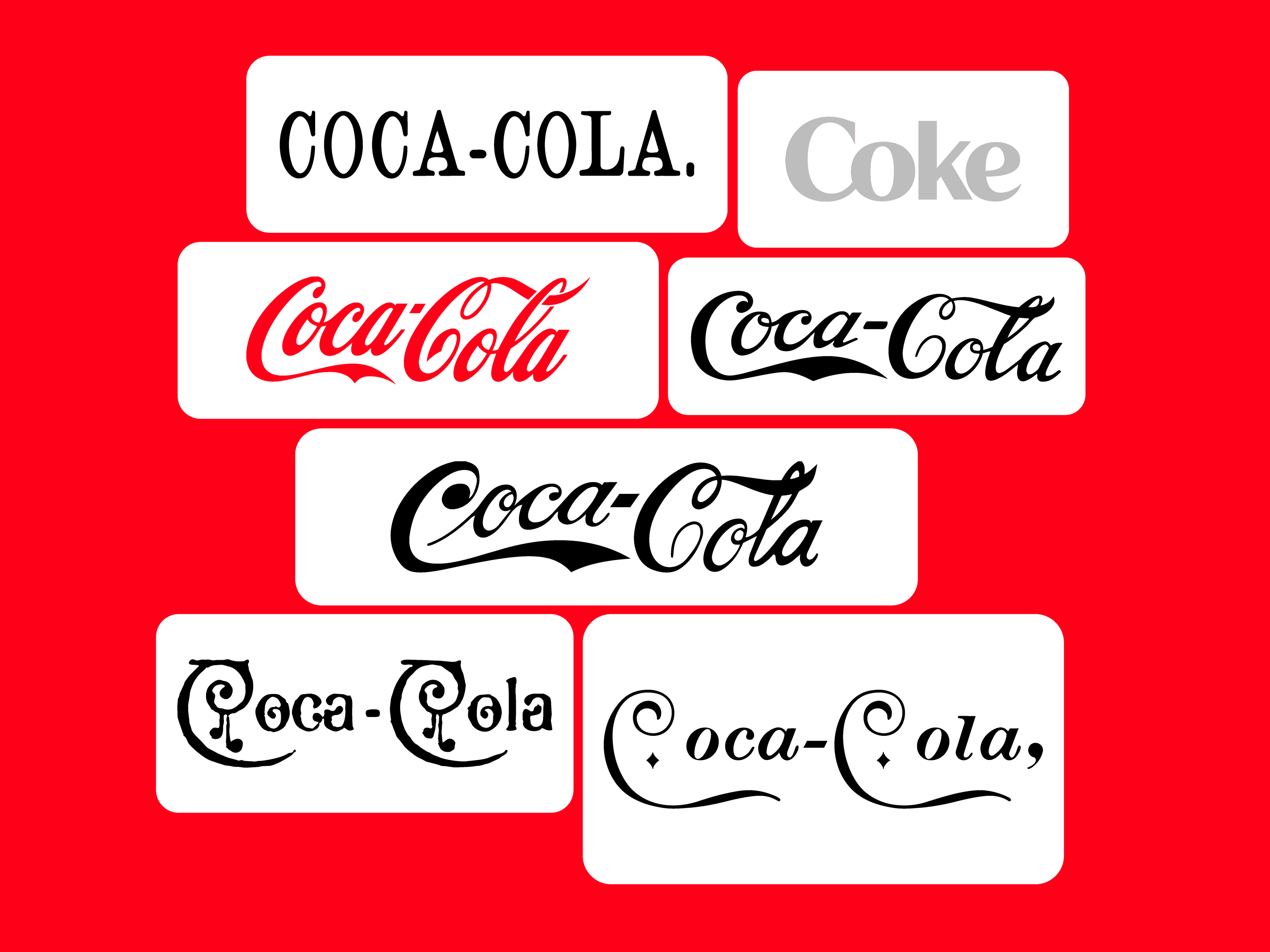
A wordmark is the brand name set in a custom or carefully selected typeface, treated as the primary mark. No icon. No symbol. Just the word, doing the work.
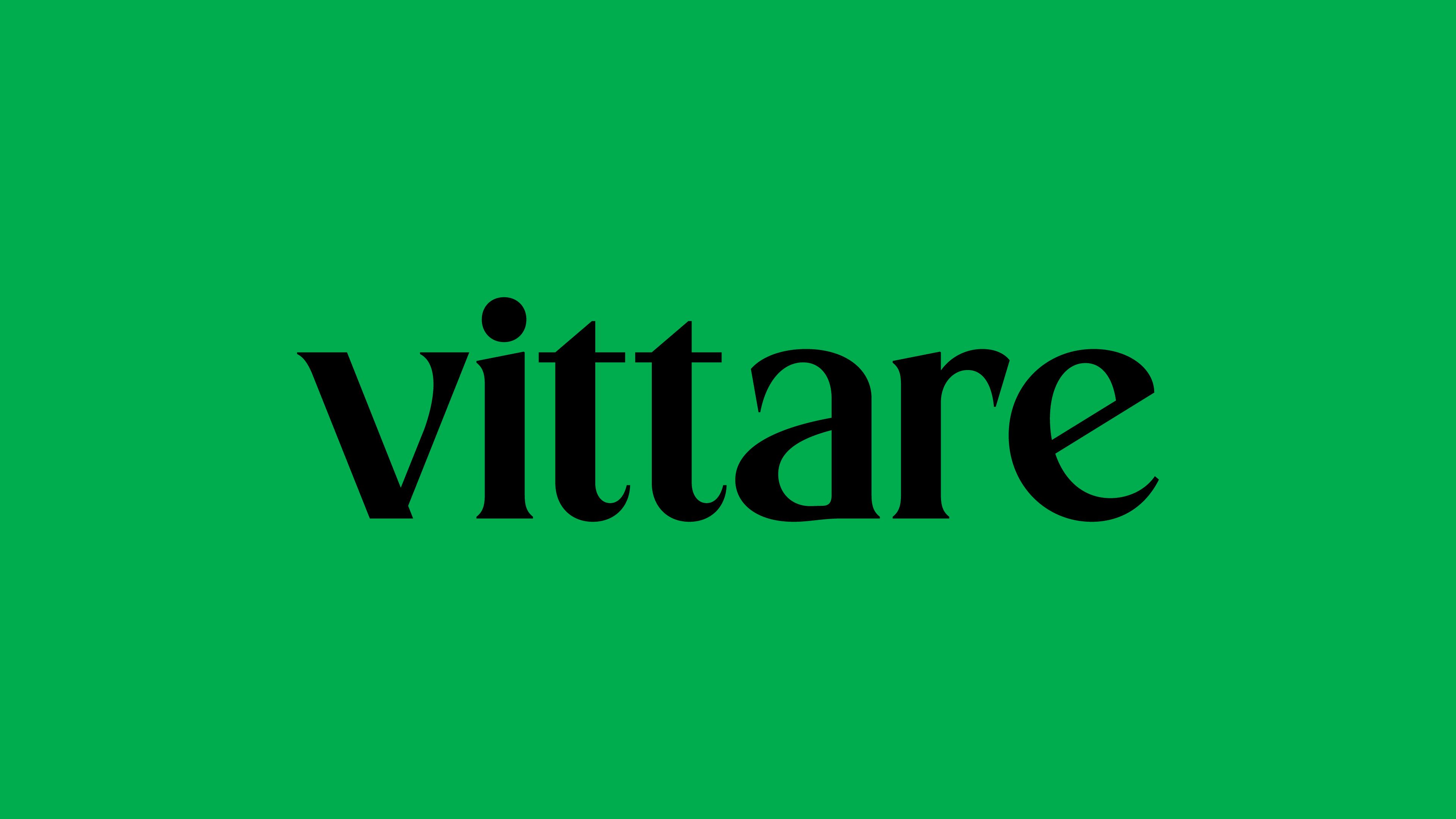
Vittare's wordmark sets the name in a high-contrast serif — the kind of type that has thick strokes meeting thin ones with intention. The letterforms are warm but precise, which tracks for a brand that lives in the mental health space: you want authority without coldness. The all-lowercase setting softens the formality further, making it feel approachable rather than clinical.
Wordmarks work best when:
- The brand name is short enough to be legible at small sizes
- The name itself has visual character worth exploring typographically
- The brand is building recognition from scratch and needs the name front and center
The risk with wordmarks is scalability. At 16px or embroidered at 1cm, a wordmark can break down fast — which is exactly why most brands don't stop there.
Lettermark — The Initial as Identity
A lettermark (also called a monogram) reduces the brand to its initials. Think of it as the wordmark's more condensed cousin — useful when the full name is long, hard to render at small sizes, or already well-established enough that initials carry the weight.
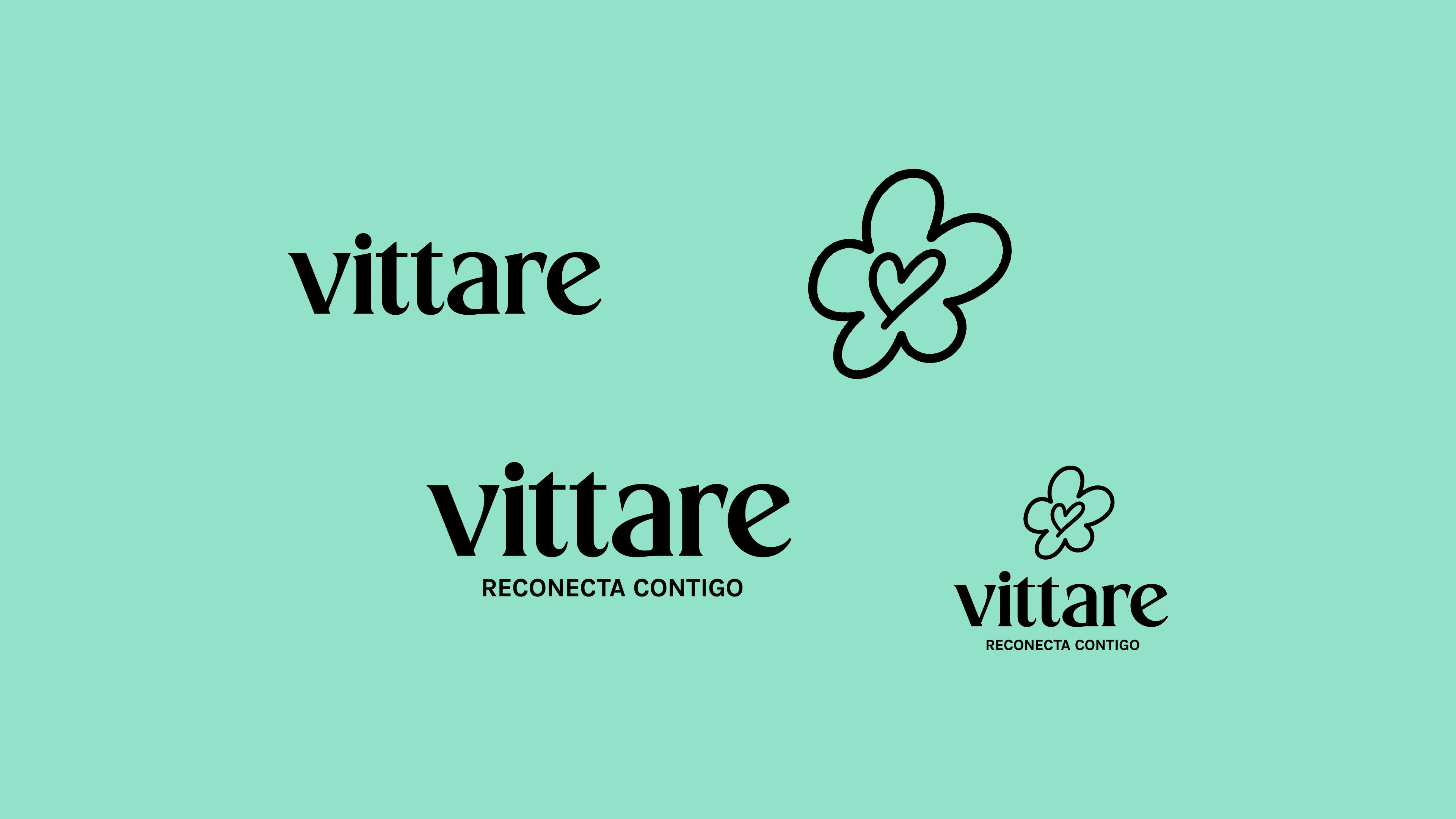
Vittare's name is short enough that a lettermark isn't structurally necessary, but a "V" mark could function as an app icon or favicon in contexts where the full wordmark and symbol are too complex. This is a common design decision: the lettermark isn't always the hero, but it earns its place as a utility player in the system.
Lettermarks make the most sense when:
- The brand name has three or more words
- The initials are distinctive and don't create awkward combinations
- The brand has enough recognition that initials alone communicate identity
Symbol (or Logomark) — The Mark That Stands Alone
A symbol, also called a logomark or brandmark, is a purely visual mark — an icon, shape, or illustration that represents the brand without any text.
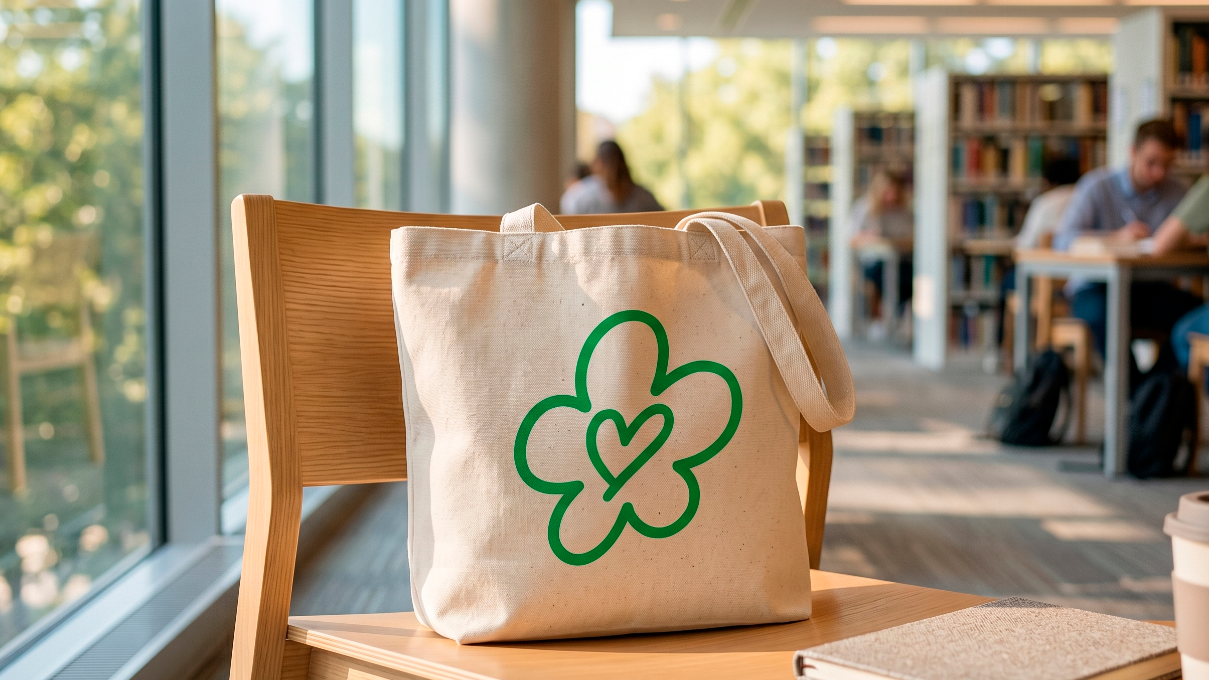
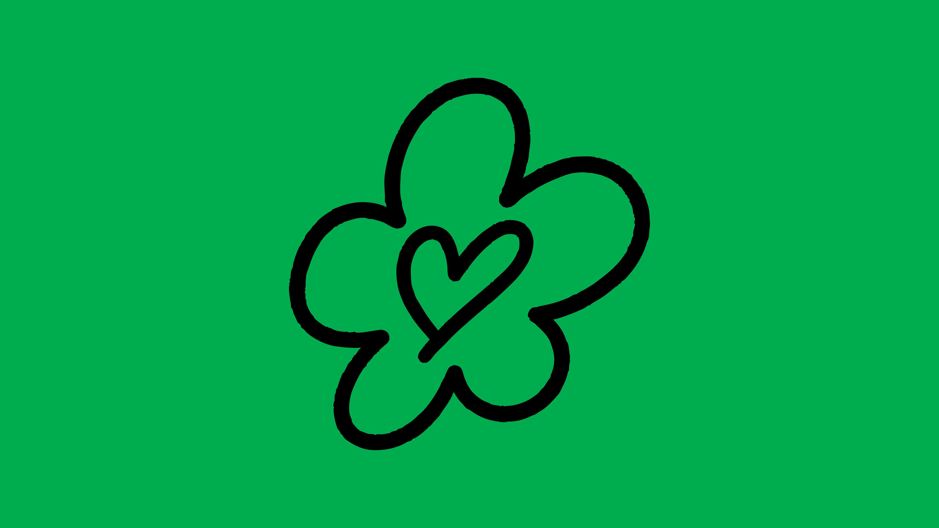
Vittare's symbol is a four-petal flower with a heart drawn into its center, rendered in a continuous outline stroke. The line is organic and slightly irregular — not geometric, not clinical. It reads as hand-drawn without being sloppy. For a therapy platform, this is doing a lot of emotional work quietly: growth, care, softness, and connection, all in one contained shape.
There are three broad categories of symbol:
- Figurative marks — recognizable objects or forms (Vittare's flower falls here)
- Abstract marks — shapes with no literal reference, where meaning is built over time
- Geometric marks — precise, constructed forms that feel systematic and modern
One thing worth saying clearly: not every brand should have a standalone symbol, especially early on. A symbol only works independently once people already know what it represents. Before that recognition is built, a symbol without a name is just a shape.
Combination Mark — The Most Common Version in the Wild
A combination mark pairs a symbol and a wordmark into a unified lockup. This is the most versatile format and, for most brands, the right starting point.
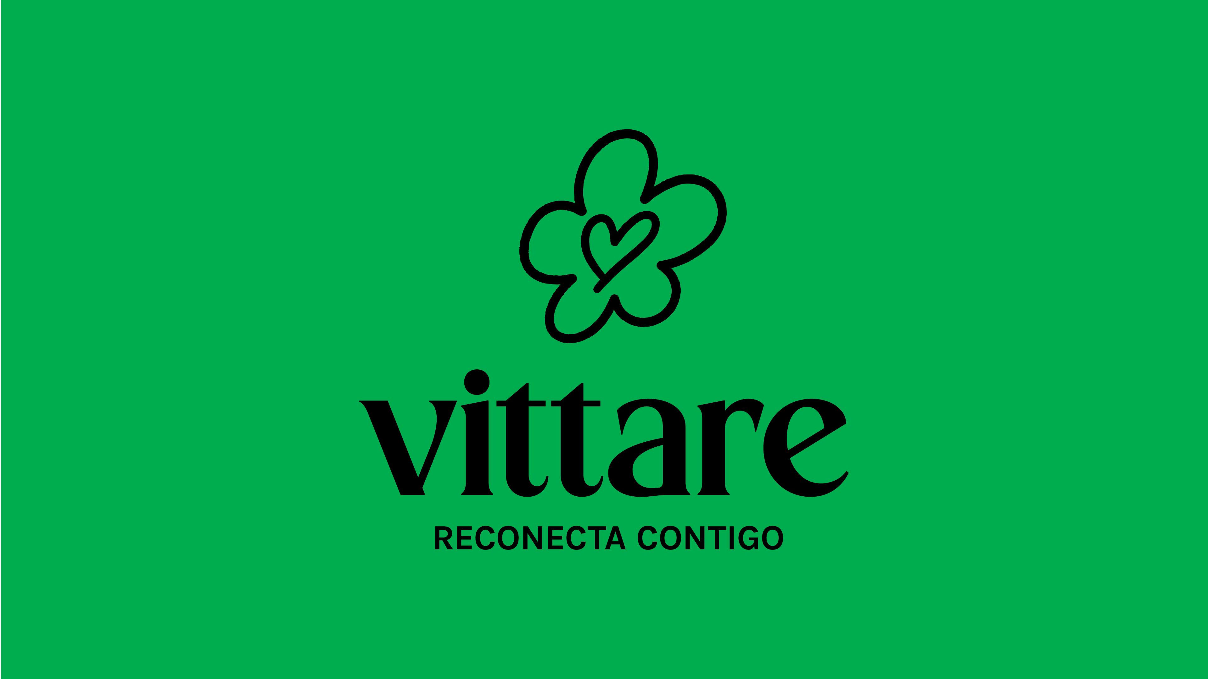
Vittare's primary mark is a combination mark: the flower symbol positioned above the wordmark, centered, with clear vertical spacing between them. It's a stacked lockup — one of the two standard configurations.
The two standard lockup orientations are:
- Vertical (stacked): symbol above or below the wordmark. More compact, works well in square formats, social profile pictures, and centered layouts. This is Vittare's primary lockup.
- Horizontal: symbol to the left of the wordmark. Works better in navigation bars, email headers, and wide rectangular spaces.
A well-built combination mark should also work when either element is removed. That's the test: if the wordmark can't stand alone and the symbol can't stand alone, the system is fragile.
Emblem — When Everything Lives Inside One Shape
An emblem integrates text and symbol into a single, inseparable unit. Think badges, seals, crests. The text and mark don't float independently — they're locked together inside a containing shape.
Emblems carry weight and heritage by default. They communicate longevity, institution, authority. That's why you see them everywhere in universities, sports teams, government agencies, and heritage food brands.
The tradeoff is reproducibility. Emblems are harder to scale down — at small sizes, the integrated text can become illegible. They also don't adapt well across all surfaces. Before designing an emblem, it's worth asking whether the brand actually needs that kind of gravitas, or whether a combination mark would do the job with more flexibility.
Responsive Logos — The Modern Layer
This isn't a logo type in itself, but it's a concept every designer working today needs to understand: a logo system needs versions for different contexts.
The same brand might need to appear as:
- A full combination mark on a website header
- A symbol-only version as an app icon
- A wordmark-only version in a tight horizontal nav
- A simplified or outlined version for embroidery or small print
Vittare's identity, for example, would need a standalone flower symbol for its app icon — at 60×60px, the full stacked lockup becomes unreadable. The wordmark alone might work in a horizontal nav. The full combination mark lives on landing pages, packaging, and presentation decks.
This thinking — designing the mark as a system rather than a single file — is what separates a logo that works from one that breaks the moment it leaves the designer's screen.
Which Logo Type Is Right for a Brand?
There's no universal answer, but there are useful questions:
How long is the name? Short names (one or two words, under eight characters) can carry a wordmark on their own. Longer names often need abbreviation or a symbol to complement them.
How much context does the brand have? New brands need the name visible. Established brands can let symbols carry more weight.
Where will the mark live? A brand that lives primarily in digital — apps, social, web — needs a system that includes small-format versions from day one. A brand that lives on physical products needs to think about embroidery, print, and material surfaces.
What emotional register does the brand need? Geometric symbols feel systematic and modern. Organic, figurative marks feel warm and human. High-contrast serifs feel authoritative. The type and symbol choices are never neutral.
Vittare answers most of these questions well: a short, legible name set in warm serif type, paired with an organic symbol that carries emotional meaning without being literal about it. The stacked lockup is clean and flexible. The color system — bright green with dark green — is confident without being aggressive.
That's what a well-thought-out logo system looks like. Not one mark, but a family of them — each with a job, each designed to hold up on its own.