July 11, 2026
METRO CARD DESIGN: A VISUAL TOUR OF THE WORLD'S TRANSIT SYSTEMS
A metro card is one of the most-touched, least-examined pieces of graphic design in the world. We look at four of them — New York, London, Mexico City, and Tokyo — to see what actually holds up as design, and what changes when the card disappears into an app.
Why a Metro Card Is a Branding Object, Not Just a Ticket
Most people touch a metro card more often than they touch their own driver's license, and think about it far less. That's precisely what makes it an interesting design object: a metro card has to carry a city's visual identity, survive years of friction in a wallet, work at a glance under bad lighting, and mean something to millions of people who never once think of it as "branding."
That's four different design problems stacked into a rectangle the size of a credit card — color, typography, iconography, and material — and most transit systems only manage to solve two or three of them well.
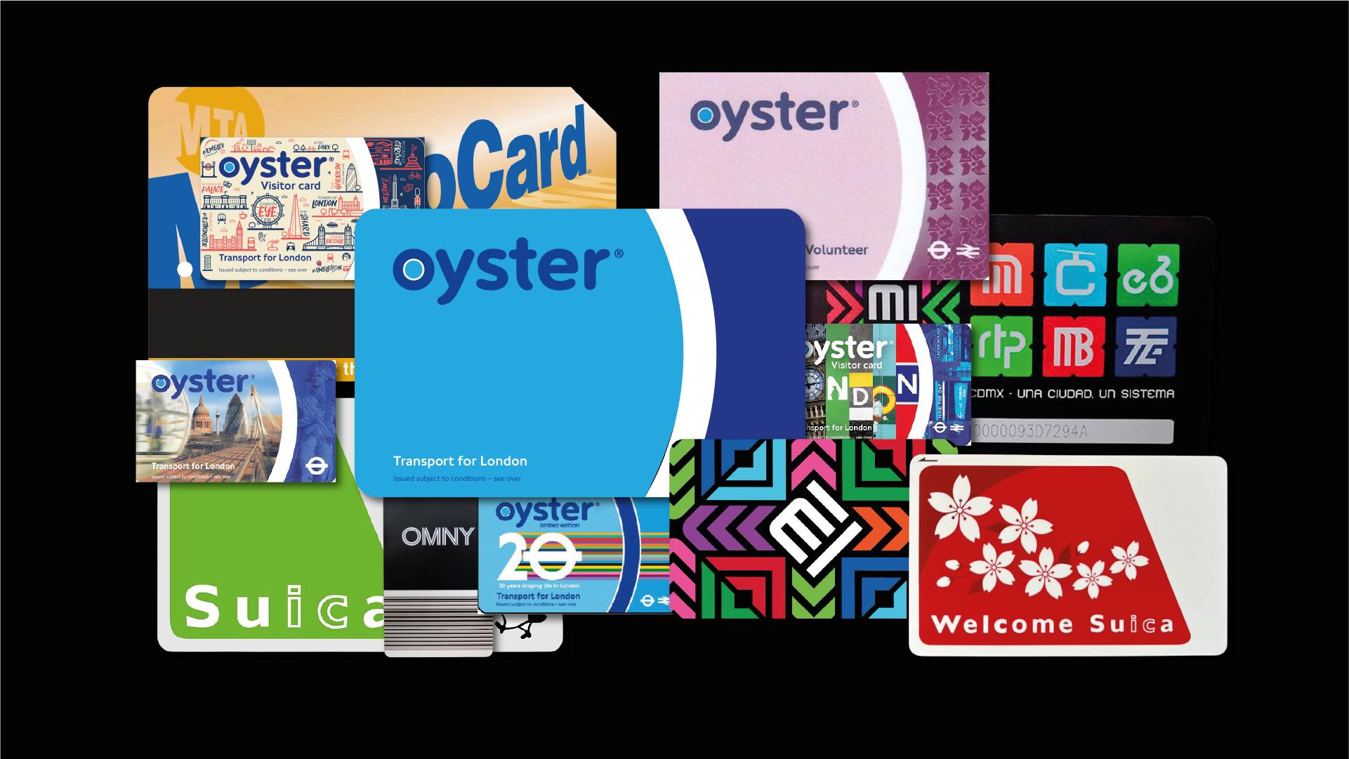
We're looking at four cards that solve this problem in genuinely different ways: New York's MetroCard, London's Oyster card, Mexico City's Tarjeta de Movilidad Integrada (MI), and Japan's Suica. Three of them are also, right now, in the middle of a harder problem than any of the above: what happens to that identity when the card itself stops being a physical object.
New York's MetroCard: An Icon on Its Way Out
The Yellow as a Signal System
The MetroCard's gold-yellow isn't a brand color chosen in a boardroom — it reads more like municipal signage than corporate identity, closer to a caution sign than a logo. That's the point. In a system with hundreds of stations and millions of daily riders, the card needed to be identifiable at a glance, in a crowded pocket, under fluorescent light. The condensed, all-caps typography does the same job: it's built for speed of recognition, not for elegance.
Where the Heritage Goes
The MetroCard launched in 1994 to replace the subway token, and after three decades it's now the one being replaced. The MTA stopped selling and refilling MetroCards at the end of 2025, as the system completes its shift to OMNY, the contactless tap-and-pay system that's been rolling out since 2019. By the time MetroCards are gone entirely, over 90% of riders will already be tapping a phone, a bank card, or an OMNY reader instead.
OMNY isn't a downgrade as design — it's a genuinely considered identity. Pentagram built it around a custom typeface, OMNY Titling, whose letterforms nod to train tracks, with a circular O drawn deliberately to rhyme with the existing MTA logo, so the new system reads as a continuation of the brand rather than a break from it. What actually changes is the kind of object doing the branding. The MetroCard was a plastic card with a color you could spot across a platform — gold-yellow, tactile, unmistakably itself. OMNY's readers are sleek and black, marked with a blue glow at the tap point, closer to consumer electronics than to municipal signage. The heritage isn't gone; it's relocated — from a color you'd recognize from twenty feet away into a typeface and a logo mark you have to be close enough to read.
London's Oyster Card: Branding by Inheritance
Blue as a Functional Choice
The Oyster card, introduced in 2003, is blue for a reason that's more practical than poetic: it needed strong contrast against the yellow card readers riders tap it on. That's a useful reminder that some of the best branding decisions in transit design aren't about mood boards — they're about visibility under real-world conditions.
Borrowing Equity from the Roundel
What makes the Oyster card smart as a piece of design isn't originality — it's restraint. Rather than inventing a new visual identity, it borrows directly from the London Underground's existing system: the roundel, and the Johnston typeface, commissioned back in 1916 to keep Underground signage from being mistaken for advertising. That typeface is still, over a century later, one of the longest-running examples of consistent corporate branding anywhere.
By building on that inheritance instead of competing with it, the Oyster card reads instantly as "part of London transport" rather than as a separate product with its own logo. It's a case for consistency over novelty — something worth remembering any time a brand is tempted to give a sub-product its own identity instead of reinforcing the one it already has.
Mexico City's Tarjeta MI: Design With a Lineage
Lance Wyman's Fingerprints
The Tarjeta de Movilidad Integrada carries a design lineage that neither of the previous two cards can claim: it was developed in collaboration with Lance Wyman, the designer behind the 1968 Mexico City Olympics identity and the original pictogram system for the Mexico City Metro. That's not incidental trivia — it means the card is a continuation of one of the most influential wayfinding systems in Latin American design history, rather than a break from it.
A Design System, Not Just a Card
What's easy to miss is that the Tarjeta MI isn't papering over eight unrelated agencies — it's the physical output of an actual unified design manual. Mexico City's Movilidad Integrada program has its own graphic standards covering geometric construction, color, typography, and icon integration across STC Metro, Metrobús, Cablebús, the electric transport system, Ecobici, RTP, concessioned buses, and CETRAM interchange hubs. Designer Pablo Peña extended Wyman's original Metro typeface into a broader "Movilidad Integrada" type family for use across the whole network, while keeping the historic Metro type reserved for the Metro system alone.
That's a genuinely ambitious design decision: building one shared visual language across eight agencies that didn't have one to begin with, instead of leaving each mode to its own devices and asking a card to fake the coherence. It's the closest thing on this list to London's approach — extending an existing identity rather than inventing a new one — just executed at a much larger institutional scale. A digital version of the card recently launched, extending that same manual into an app interface; the interesting question there isn't whether the identity holds together, since the manual already solved that, but whether a screen can carry the same graphic precision a printed system was built for.
Japan's Suica: When a Mascot Becomes the Interface
The Penguin Logic
Suica takes a completely different approach to the same problem. Instead of leaning on color systems or inherited typography, it built its identity around a character: a round, green Adelie penguin designed by illustrator Chiharu Sakazaki, chosen because penguins move smoothly through water — a visual pun on Suica's own name, a play on the Japanese word for "smooth." Since the card launched in 2001, that penguin has done more to make Suica recognizable than any typeface or color palette could.
Retiring a 25-Year-Old Character
Which makes what's happening now particularly interesting. JR East has announced that the Suica penguin will retire in 2026–2027, as the company repositions Suica from "Japan's transit card" to what it's calling a "global lifestyle payment tool." A new character is expected to take its place.
It's a rare, live case study in what happens when a brand's ambition outgrows the identity it was built on. A mascot-driven system works beautifully when the product is warm, local, and specific — a companion for your daily commute. It gets harder to justify once the product wants to be global infrastructure. Watching what Suica does with its next character will say a lot about how much emotional design a "payment tool" is allowed to keep.
What Separates a Well-Designed Transit Card From a Forgettable One
Looking at these four side by side, there isn't one right formula — there are three distinct design logics, and each one carries over differently once it goes digital. New York and London both built their identities on color and type, but arrived there in opposite ways: MetroCard's gold-yellow was a street-legible signal that had to be reinvented, not just ported, when it became OMNY, while Oyster's blue works because it borrows from a system bigger than itself, giving it something to carry over even as the payment method around it changes. Mexico City's Tarjeta MI is the most systemic of the four — a single graphic manual built on purpose to extend one legacy across eight separate agencies, so its coherence was engineered rather than inherited by accident. And Suica is the outlier: a character-driven identity that worked precisely because it wasn't systemic, which is exactly why it's the hardest of the four to carry into a "global payment" future.
The common thread is this: a card's design was never really about the card. It's about how much of a system's personality can survive being tapped, folded, and eventually replaced by a phone. The systems doing this well right now aren't the ones with the prettiest cards — they're the ones that decided, deliberately, which part of their identity was worth protecting before the plastic disappeared.