July 22, 2026
WHY EME STUDIOS' WEBSITE FEELS SO CLEAN (AND STILL CONVERTS)
Eme Studios' website proves that "simple" and "unfinished" are not the same thing — here's what their restrained, interaction-smart design gets right, and what any business with an online store can learn from it.
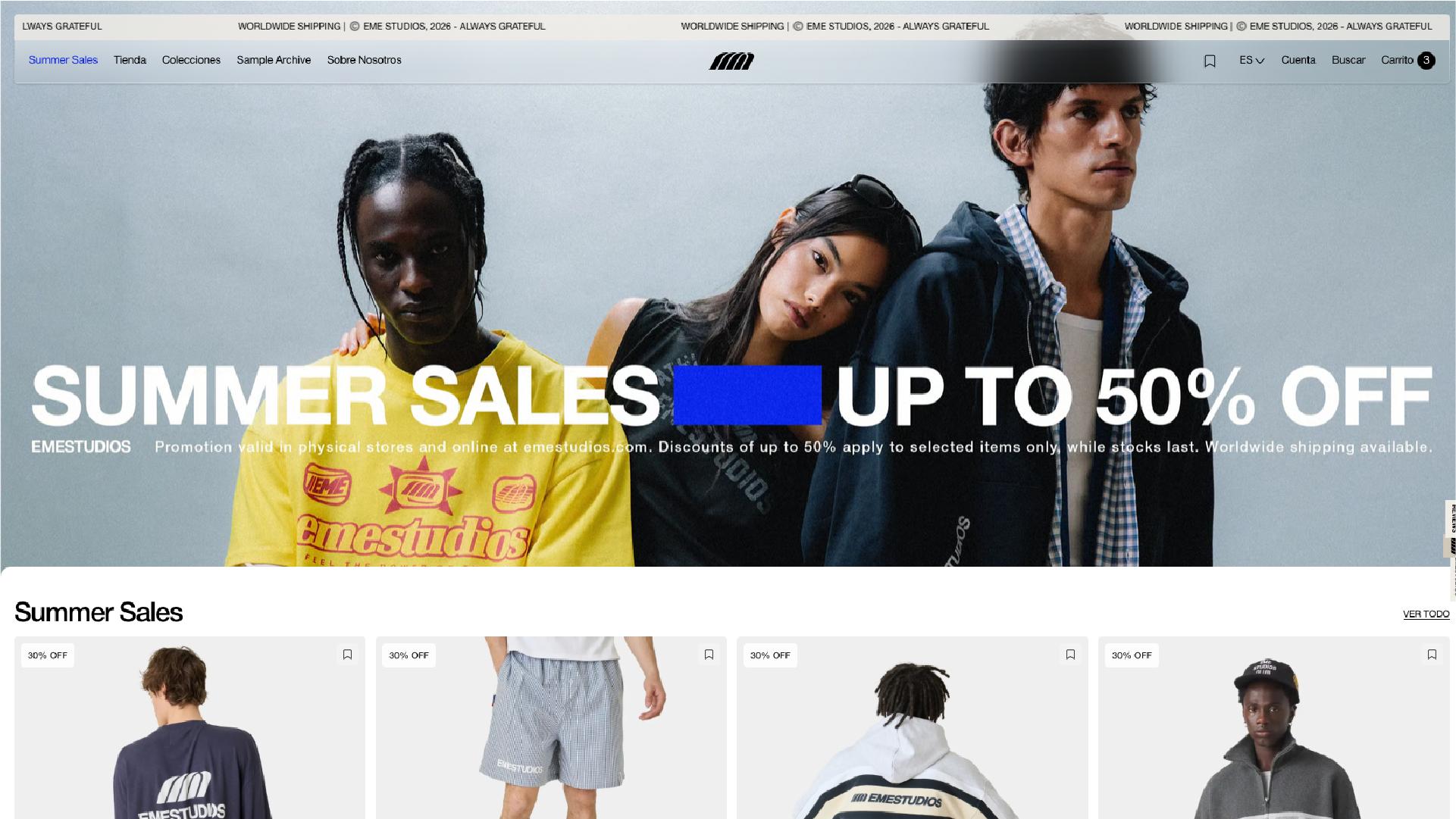
Open most fashion e-commerce sites today and you're greeted by a full-screen video, a slow-loading hero animation, or a carousel that won't stop moving before you've even found the navigation. Eme Studios, the Spanish streetwear brand with stores in Madrid, Barcelona, and Valencia, does none of that. Its homepage loads, shows you a clean product image, and gets out of the way.
That restraint is easy to mistake for a lack of effort. It isn't. A genuinely minimalist website design is one of the harder things to pull off well — because when there's nowhere to hide, every remaining element has to earn its place. Eme Studios is a useful case study precisely because it shows what disciplined simplicity looks like when it's done on purpose.
The First Impression: Nothing Fighting for Your Attention
Landing on the Eme Studios site, there's no scroll-jacking, no auto-playing hero video, no pop-up begging for an email before you've seen a single product. What you get instead is a full-bleed image, a "Shop Now" call to action, and a grid of new arrivals right underneath.
This is a deliberate hierarchy decision. The product is the message, so the design steps back and lets it speak. For a clean e-commerce design to work, the homepage has to answer one question almost instantly: what do you sell, and how do I get to it? Eme Studios answers that in under two seconds, without a single unnecessary transition.
That's also a UX principle worth naming: reduce the distance between arrival and action. Every animated flourish between the visitor and the "add to cart" button is friction, even if it looks impressive in a portfolio reel.
The Product Grid Is Doing More Than It Looks
Scroll past the hero and the site starts showing its actual craft. The product grid isn't just a wall of thumbnails — hovering or tapping a product reveals a quick-view option and a size selector without forcing a full page reload. You can add a hoodie to your cart, in your size, without ever leaving the collection page.
This is a small interaction, but it's the kind that separates a well-designed store from a merely decorated one. It removes a step — click into product, click size, click add — and compresses it into one. In UX terms, that's a reduction in interaction cost: the mental and physical effort a user spends to complete a task. Lower interaction cost usually means fewer abandoned carts.
There's a second, quieter mechanic at play too: the wishlist. It's framed as a simple utility — save what you like for later — but it's also a soft way of getting a visitor to create an account and return. It's a retention tool wearing the costume of a convenience feature, and it works because it never feels like it's asking for anything.
Neither of these interactions involves heavy animation. They're just well-placed. That's the part worth underlining: interactivity and minimalism aren't opposites. A site can be visually quiet and still be doing real interaction design work underneath.
Restraint as a Strategy, Not a Budget Constraint
It would be easy to read "no big animations" as "they didn't invest much in design." The opposite is usually true. Stripping a site down to typography, white space, and product photography means there's nowhere for weak design decisions to hide behind motion or effects.
Eme Studios leans on consistent typography, generous spacing between product cards, and photography that does the selling — no illustrated banners, no overlapping text-on-image tricks that fight for legibility. Every choice has to hold up on its own, which is a harder discipline than adding another carousel.
This connects directly to business outcomes, not just aesthetics. A lighter, less animation-heavy site typically loads faster — and load time still correlates with conversion and bounce rate on nearly every platform. So "simple" isn't just a look here; it's a performance decision with a business impact. For a brand selling apparel, where people are comparing colors, fits, and prices across multiple tabs, a site that loads instantly and doesn't make them wait for a scroll animation to finish is a real competitive edge.
Where Digital Meets Physical: The Store Locator as UX, Not an Afterthought
Most brands with physical stores treat the "find us" page as a formality — an address, a Google Maps embed, done. Eme Studios treats its Madrid, Barcelona, and Valencia locations as part of the same design system as the rest of the site: consistent typography, clear opening hours, a "get directions" link that actually goes somewhere useful.
It sounds minor, but it's a good example of a principle that gets skipped constantly: the online and offline experience should feel like the same brand made both. If your product pages are polished and clean but your store locator looks like it was bolted on by a different team, the visitor notices, even if they can't articulate why. Eme Studios keeps that thread consistent, and it's part of why the whole site feels intentional rather than assembled from templates.
So What Does This Mean for Your Own Site?
None of this is really about Eme Studios specifically — it's about a mindset. A simple site isn't one where the designer ran out of ideas; it's one where every decision was tested against a single question: does this help someone buy, or does it just look nice in a screenshot? Eme Studios answers that question the same way in its hero section, its product grid, its wishlist, and even its store pages, and that consistency is what makes the simplicity feel intentional instead of unfinished.
If there's a lesson worth taking from this, it's that restraint has to be earned with craft — good typography, real hierarchy, interactions that remove friction instead of adding decoration. Skip that groundwork, and a "minimal" site just looks empty. Get it right, and minimal starts to look like confidence.