September 24, 2026
TEXTURE IN DESIGN IS THE REASON SOME WORK FEELS REAL (AND SOME DOESN'T)
Ever wonder why some design feels like you could pick it up off the screen while the rest looks like it came out of a template? The difference is often a layer most people never notice. Let's break down how texture pulls it off, and what Vox figured out about it before everyone else.
Screens are the flattest surface most of us will ever look at. No fiber, no dust, no ink soaking into anything. Just perfect pixels doing exactly what they're told.
That perfection is great for spreadsheets. For design that's supposed to make you feel something, it's a problem. Spotless fills and silky gradients have a way of looking expensive and empty at the same time, like a showroom nobody lives in.
So designers keep reaching for the same fix: a layer of texture. The real question is why something as small as a bit of grain changes how a piece feels, and how to use texture in design without making everything look like an Instagram filter from 2014.
Why Texture in Design Tricks Your Brain Into Feeling Something Physical
Designers talk about two kinds of texture. Tactile texture is the real thing: the tooth of watercolor paper, the emboss on a business card. Visual texture (also called implied texture) is the illusion of it, a surface you can see but never touch. On screen, visual texture is all we've got, and it turns out to be enough.
Here's the trick. Real materials are never perfectly uniform. Paper has fibers, film has grain, ink spreads a little where it lands. Our eyes have spent a lifetime reading those tiny irregularities as proof that something exists in physical space. When a surface has none of them, the brain quietly files it under "fake." Add them back and the same image reads as an object, something that was printed, photographed or assembled by someone. Texture in design works because it's evidence.
There's a technical upside too. A subtle layer of noise adds micro-contrast (tiny variations in value that give the eye something to hold onto in large flat areas). It also fixes one of digital design's most annoying bugs: color banding, those visible steps that show up in smooth gradients. A little grain blends the transition and the steps disappear.
The best place to see all of this working at once is Vox. Their explainer videos are a masterclass in texture: warm paper backgrounds, halftone photo cutouts, torn edges, strips of tape, newspaper clippings. Topics that could easily be dry end up feeling like a desk covered in research that someone cut and pasted by hand. We'll keep coming back to them, because almost every lesson here shows up somewhere in a Vox frame.
The Texture Toolkit, Decoded
Not all textures say the same thing. Each one carries its own associations, and picking one is really picking a story about how the piece was made.
Grain Texture: The Analog Warmth Layer
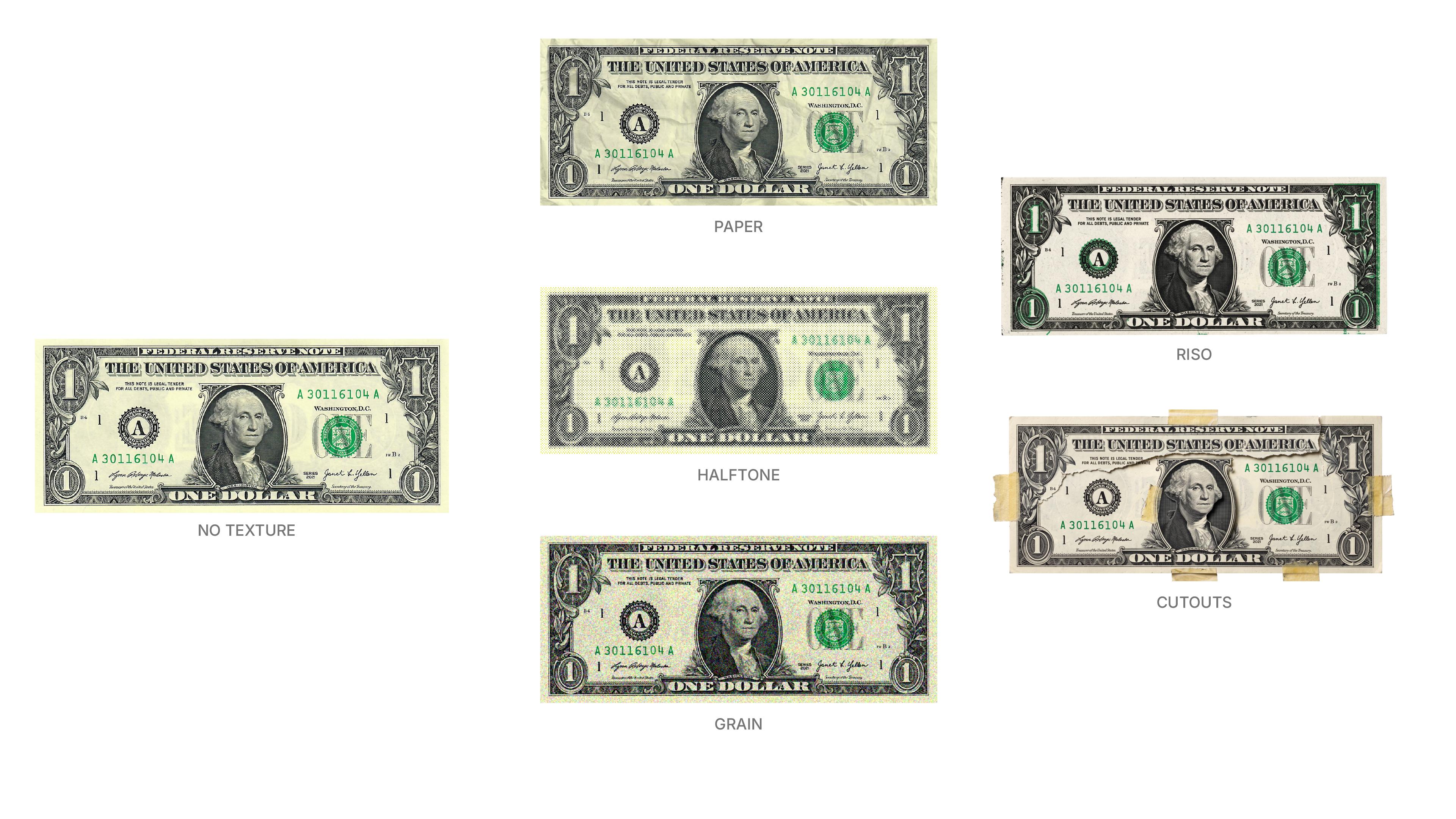
Grain (or noise) is the most subtle and versatile texture out there. It borrows from film photography, so it reads as warm, cinematic and a little nostalgic. At low opacity most people won't consciously notice it. They'll just feel that the image is less sterile. In video, it's the glue that makes graphics and footage look like they belong to the same world.
Paper Texture: Instant Print Credibility
A paper texture overlay says "this was printed," and print still carries an editorial weight that screens have to borrow. Vox's frames tend to sit on warm, off-white paper instead of pure digital white, and that one decision does a lot: it softens contrast, makes every element feel placed on a surface and sets an editorial mood before a single word appears.
Halftone Texture: The Archive Look
Halftone is the dot pattern printers use to reproduce tones with a single ink. Up close, a newspaper photo is just dots of different sizes. From a distance, your eye blends them into grey. A halftone texture on a photo signals newsprint, archive and pop culture all at once. It's why a halftone cutout in a Vox video feels like evidence pulled from a file, not a stock image dropped onto a slide.
Riso Texture and Misregistration: Imperfection on Purpose
Risograph printing lays down one color at a time, and the layers never align perfectly. That slight offset is called misregistration, and designers now fake it on purpose. Paired with uneven, grainy ink coverage, it reads as indie, handmade and slightly rebellious. Great for posters and zines. Risky for a bank.
Torn Edges and Cutouts: Proof of Assembly
Torn paper, rough scissor cuts, tape, a drop shadow under a clipping. These don't describe a material so much as a process: a person put this together. That's the core of the Vox collage look, and it's why their videos feel authored instead of generated.
How to Use Texture in Design Without It Looking Like a Filter
Knowing the toolkit is half the job. The other half is application, and this is where most texture goes wrong.
Start with blend modes, because they do most of the heavy lifting. Multiply keeps the darks of your texture and drops the whites, which is perfect for paper fibers and ink. Overlay and soft light push lights lighter and darks darker, so the texture interacts with the colors underneath instead of sitting on top like a dirty window. If your texture looks like a sticker, the blend mode is the first thing to check.
Then think about scale. Texture has to match the size and distance the piece will be seen from. Grain that looks perfect on a phone disappears on a billboard, and paper fibers blown up 400% stop looking like paper and start looking like a low-res accident. That's one of the most common mistakes we see: small textures stretched far beyond their resolution, or tiled so obviously that you can spot the seams repeating across the frame.
Keep one texture family and one light source. Vox's frames feel coherent because the paper, the halftone and the shadows all behave as if they're on the same desk under the same lamp. Mix a gritty concrete texture, a clean paper overlay and a grain filter from three different packs, and the brain stops believing any of them. Texture on top of texture on top of texture isn't richness. It's just noise, in the bad sense.
Protect legibility. Texture is a background actor. Keep it lighter behind small type, pull it off body copy entirely if needed and let headlines carry the rougher treatment.
If you work in motion, texture has to move too. A static grain overlay on moving footage looks like a smudge on the viewer's screen. Real film grain changes every frame, so animated noise (often called boiling grain) is what makes a piece feel shot rather than rendered.
And finally, the uncomfortable one: texture can't rescue a weak layout. We've all seen the grunge pack dumped over a design that had no hierarchy to begin with. It doesn't hide the problem. It just gives it a vintage finish. Get the composition right first, then add the layer.
Texture Is Evidence, Not Decoration
The Vox style has become one of the most imitated looks in video, and it's not because paper and halftone are trendy. It's because every texture on screen tells the same story as the content: this was researched, printed, cut out and assembled by people who cared. Texture and message are saying the same thing.
That's the real test for texture in design. Before you drop a layer on, ask what it's evidence of. Film? Print? Handwork? Time? Answer that, and you'll pick the right texture, apply it with restraint and end up with work that doesn't just look good on a screen, but feels like it could exist off of it.