September 1, 2026
WHAT PASSPORT DESIGN SAYS ABOUT A COUNTRY
The passport is the most widely owned piece of graphic design in the world, and almost nobody looks at it. Its interior pages are also one of the most constrained briefs a designer can get, which is exactly why they are worth studying.
The most-owned graphic design object nobody looks at
You have probably carried the same passport for five or ten years. You have handed it to strangers in booths, buried it in hotel safes, and pulled it out of a bag at 5 a.m. And unless you are unusually curious, you have never actually looked at it.
Passport design is one of the few disciplines where the audience is guaranteed and the attention is close to zero. Every reader of this article owns one. Almost none of them could describe what is printed on page 14.
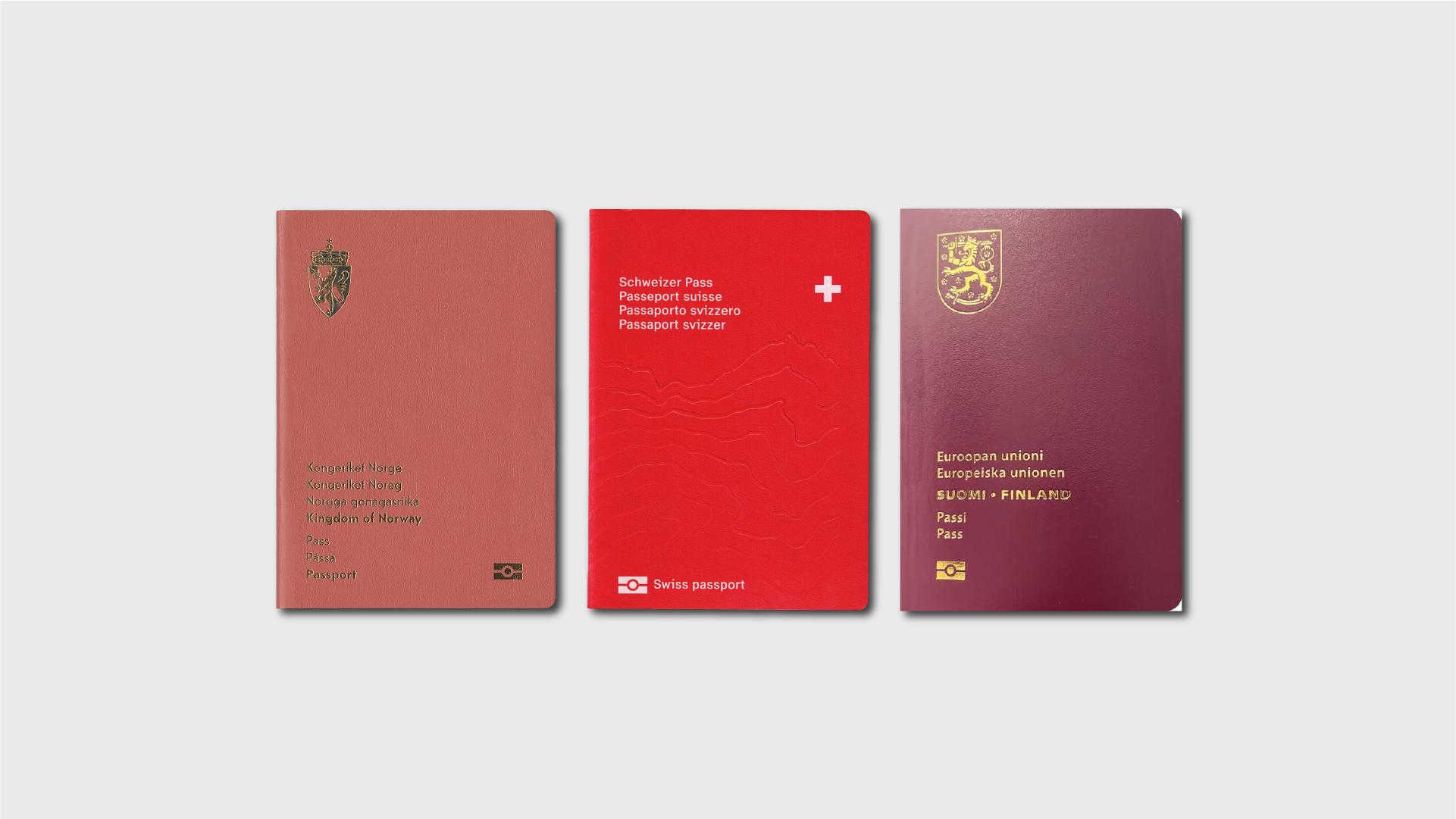
What people do remember is the cover: the color, the crest, the gold foil, the typeface. Fair enough, that is the part you see. It is also the least interesting part. Covers are largely inherited, semi-standardized, and constrained by convention. The real design work happens where nobody is looking, on the pages that exist to be stamped.
Why passport design is a hard brief in graphic design
Start with the constraint. Passports are built to an international technical standard (ICAO Doc 9303), which specifies not just page dimensions and data structure but a layered set of anti-counterfeiting requirements: two-color guilloche backgrounds, intaglio printing that you can feel with a fingertip, microprinting, UV-reactive inks, front-to-back register features where an incomplete shape on one side lines up with its other half when held to light.
That is the floor, not the ceiling. And it means the graphic language is not chosen, it is inherited from a security engineering problem.
Then comes the constraint that actually kills most ideas. Every visa page has to accept a wet rubber stamp, sometimes a full adhesive visa sticker, applied by a person who is not looking at your artwork and will not be careful. Whatever you print has to survive being covered, and more importantly, it has to not compete with what gets put on top of it. The stamp is the content. Your illustration is the background, permanently.
This is why passport interiors are all pale, low-contrast, thin-line work. It is not a stylistic preference, it is a functional ceiling. A designer used to controlling hierarchy has to accept that the hierarchy here is set by a border officer in a hurry.
Most briefs give you a problem and some room. This one gives you a problem, a rulebook, and a guarantee that someone will draw on your work.
How three studios solved the same technical problem
Norway: the ornament is the security feature
Oslo studio Neue won the competition to redesign Norway's passports in 2014, and the documents finally entered circulation in 2020. Six years, which tells you something about how this category actually moves.
Every visa page carries a different illustrated fragment of landscape, drawn in one continuous style across the whole booklet. The palette is deliberately pale, because it has to be. Under UV light, the same pages shift from day to night and ribbons of the northern lights appear across the sky.
The move worth stealing is that the illustration is not sitting on top of the security layer, it is the security layer. Unique artwork on every page is itself hard to forge. Neue did not decorate a secure document, they made the decoration do the work.
Switzerland: one rule, twenty-six variations
Switzerland's current passport, designed by Geneva studio RETINAA and issued in late 2022, keeps a structural principle from the 2003 version by Roger Pfund: one page per canton. That is a system, inherited and updated rather than thrown out.
The visual language is cartographic. The ID page centers on Pizzo Rotondo, a summit in the Saint-Gotthard massif, and under UV light contour lines emerge around the holder's data. Architectural landmarks were redrawn and pushed entirely into the UV layer, so they are present but invisible in daylight, which keeps the daylight page quiet enough to be stamped over. The inside covers carry hydrological maps.
Where Norway went minimal, Switzerland went dense, close to horror vacui. Both work, because both are systems rather than collections.
Finland: the joke that also passes inspection
Finland puts a small animal in the corner of each page. Flip the booklet and it walks. A moose in the 2006 version, a flying swan in 2017, a seal in the current one.
It reads as charm, and it is. It is also functional: a precise frame-by-frame sequence across dozens of pages is genuinely difficult to reproduce, and a page that is wrong in the sequence is a page that is wrong. The flipbook is a security feature that happens to make people smile in an immigration line.
We think this is the most underrated of the three, because it proves a delightful idea and a technical requirement are not opposites. Usually when a client hears "security," everything charming gets cut. Here it survived three redesigns.
Choosing what goes on thirty pages that can never repeat
Everything above is about form: how you make an illustration survive a rulebook, a stamp and a pale palette. But solving the technical problem leaves the harder question untouched. What actually goes on those pages?
That is a curatorial question, not an illustration question, and the answers reveal a lot. Japan chose heritage over territory. Since 2020, its visa pages carry Hokusai's Thirty-six Views of Mount Fuji, twenty-four of the prints in the ten-year booklet and sixteen in the five-year one, replacing an earlier cherry blossom design. The country did not depict its landscape, it depicted how its own culture had already depicted it. That the dense line work of a woodblock print is also a counterfeiter's nightmare is not a coincidence, it is the kind of decision that only survives when both departments say yes.
New Zealand chose a theme instead of a list. Its black passport develops navigation and travel across every page, and the fact that each page is different is stated openly as a security decision, not an aesthetic one. A theme scales to thirty pages because it does not run out. A list of national monuments does.
Australia chose a compositional rule. The R Series, issued in 2022, spreads seventeen locations across double-page images, held together by a single fixed horizon line that runs through every scene, with a kangaroo positioned on that horizon each time. Under UV the scenes turn to night and native animals appear.
Three countries, three completely different answers, and the same underlying discipline: not one of them is a folder of nice pictures. Each has a rule that holds thirty pages together, whether the rule is a source, a theme, or a line.
This is also why changing these images tends to make people uncomfortable. The passport is a legal document, but it functions as a symbolic one, and swapping what is printed inside is understood, correctly, as editing the story a country tells about itself.
What passport design teaches about brand systems
The lesson here is not "make your brand look like a Norwegian passport." It is narrower and more useful than that.
Every one of these documents got better under constraint, not despite it. Pale palettes, unrepeatable pages, invisible layers, a mandatory rulebook, and a guarantee that someone will stamp over the work. Those limits did not produce watered-down design. They produced the concept. Norway's landscape works because it had to be faint. Australia's horizon line works because seventeen images had to feel like one book.
Most brand systems never get tested this hard, which is why so many of them are cr*p in application. They look immaculate in the presentation deck, on three mockups, in ideal conditions. Then the real world shows up with a bad photo, a cramped format, a page someone else will write on, and the system falls apart because it was never a system, it was a mood.
The honest test of a visual identity is not the case study image. It is thirty applications in a row, none identical, all recognizable, none of them the hero. That is what good passport design does every single time, on a document nobody bothers to look at. If your brand can survive that, it will survive a rebrand, a bad campaign, and a junior designer's first week.
Worth opening yours, at least once, before the next trip.