October 27, 2026
WHAT IS WAYFINDING DESIGN?
Wayfinding design is the invisible system that gets you through hospitals, airports and museums without a second thought. What it’s really made of might surprise you, and the two very different maps of the new Lucas Museum are a good place to start looking.
Wayfinding design is the practice of helping people understand where they are, where they’re going and how to get there. It does this through a coordinated system of typography, color, symbols and spatial cues. That’s the short answer. The longer one starts somewhere less pleasant.
Picture a hospital at 7 a.m. You’re looking for Radiology, the corridor splits three ways, and every sign seems to point anywhere except where you need to be. For most people, that is the only moment they ever think about wayfinding: when it fails. When it works, nobody claps. You just arrive.
That invisibility isn’t luck. It’s designed, piece by piece, and once you see how, you won’t look at a corridor (or a website menu) the same way again.
How is wayfinding different from signage?
People use the two words as synonyms, but they describe different things. Signage is the objects: the panels, arrows and plaques on the wall. Wayfinding is the whole experience of moving through a space without feeling lost. If signage is vocabulary, wayfinding is grammar. You can have a hundred beautiful signs and still have a building nobody can navigate.
A good wayfinding system answers four questions, usually in this order:
- Where am I? Orientation, the “you are here” moment.
- Where am I going? Identifying the destination.
- How do I get there? The route and every turn along it.
- Did I arrive? Confirmation that you’re in the right place.
A few terms you’ll hear in this field:
- Environmental graphic design (EGD): the broader discipline that covers wayfinding, signage and graphics in physical spaces.
- Decision point: any spot where a person has to choose a direction, like a hallway split or an elevator lobby. These are where information matters most.
- Landmark: a memorable element (a sculpture, a staircase, a bold color wall) that people use to orient themselves, often without realizing it.
That last one says a lot about the discipline. Architecture, lighting and even flooring do wayfinding work too. In a well-planned building, the sign is often the backup, not the main act.
What makes wayfinding design work?
Wayfinding design runs on four ingredients. None of them works alone, and that’s the whole point.
Typography. Wayfinding type gets read from far away, at an angle, while walking or driving. That’s why it favors typefaces with a generous x-height (the height of lowercase letters), open counters (the inner spaces of letters like “e” and “a”) and comfortable spacing. Size depends on viewing distance: a sign read from across a lobby needs much bigger letters than a room number read up close. Style comes second. Legibility in motion comes first.
Color. Color can code zones (blue floor, green floor), types of action (exits, services) or levels of importance. The rule is simple: once a color means something, it has to mean that everywhere. There’s also a technical caveat: never let color carry the message alone, because a meaningful share of people have some form of color vision deficiency. Pair it with text, shape or position.
Pictograms. A good pictogram crosses languages, ages and reading levels in a fraction of a second. Think of the restroom figure or the little suitcase for baggage claim. The best ones are reduced to the minimum: one idea, one silhouette, no decoration. If someone has to study it, it’s an illustration, not a pictogram.
Hierarchy. Not all information deserves the same volume. Main destinations get the biggest, clearest treatment, and secondary ones come later, in smaller type, closer to where they’re needed. Designers call this progressive disclosure: show people what they need at each decision point, and nothing more.
The glue holding all four together is consistency. If the cafeteria is called “Cafeteria” on one sign and “Food Court” on the next, people stop trusting the system. And a system nobody trusts is just decoration.
Why does the Lucas Museum have two maps?
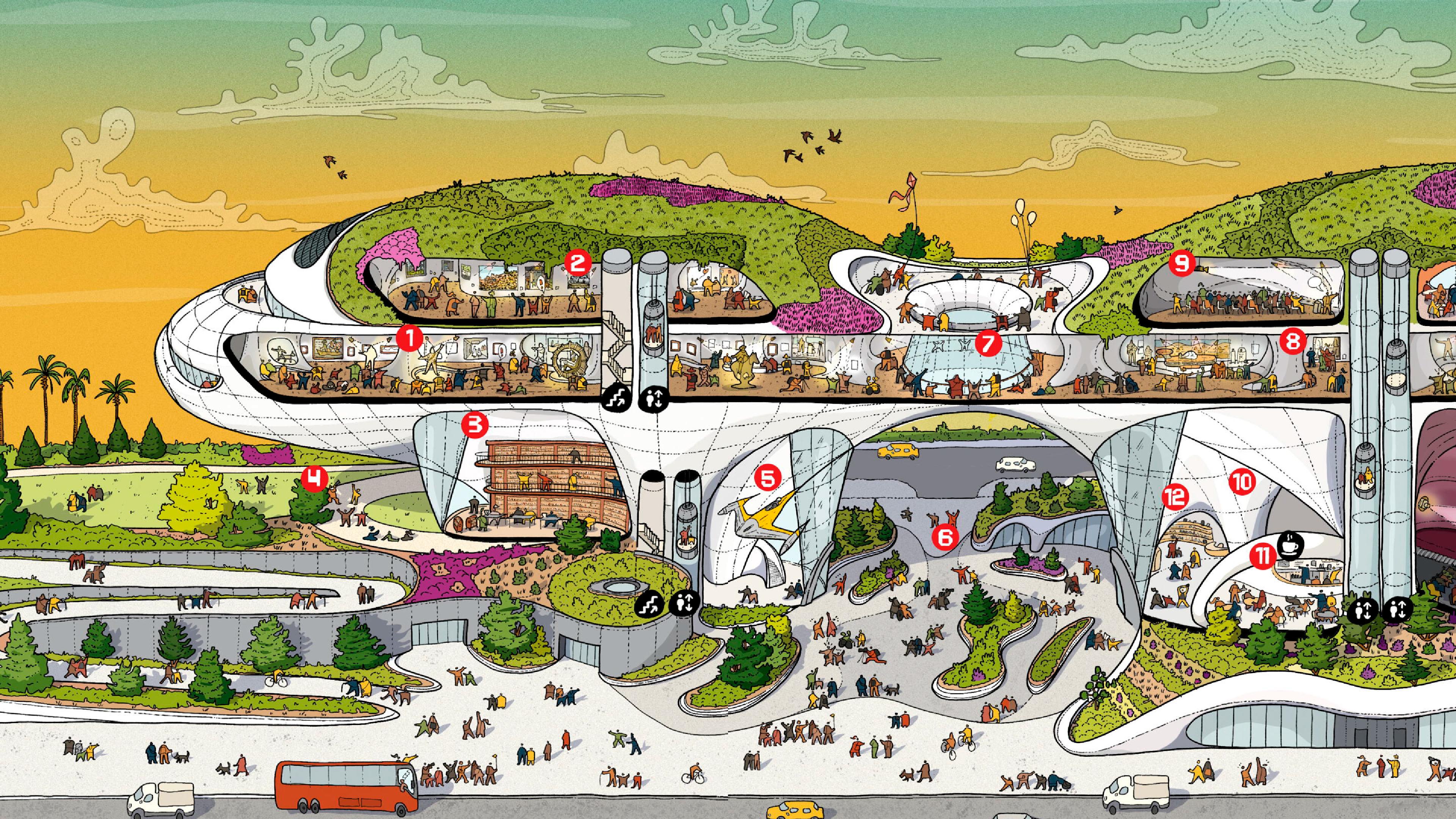
The Lucas Museum of Narrative Art, which opened this fall in Los Angeles’ Exposition Park, offers a nice lesson in how two different visual approaches can solve two different wayfinding problems. The museum shows its layout in two ways: a top-down map and a cartoon-style cross-section of the building.
The top-down version is a plan view, the same logic as an architectural floor plan. It flattens one level and shows how spaces relate horizontally: what’s next to what, which way to walk, where one gallery ends and another begins. It answers “how do I move across this floor?”
The cross-section is a section view. Imagine slicing the building like a cake and looking at it from the side. Suddenly you can see the floors stacked on top of each other and how they connect. It answers a different question: “what’s above me, what’s below me, and how do I get there?”
Neither one is the right one. They are two lenses for two kinds of disorientation, and a multi-level building benefits from both.
There’s a second layer worth noticing. The cartoon-like drawing style isn’t a random choice for a museum built around storytelling, illustration and comics. The map speaks the same visual language as the collection. That’s a reminder that wayfinding is also a brand touchpoint: often one of the first things a visitor reads, and one of the things they hold in their hands the longest.
Your Website Is a Building Too
Here’s where wayfinding design leaves the physical world. Every website is a space people move through, and its navigation is digital wayfinding, built on the same principles.
Your main menu is the building directory. Breadcrumbs are the “you are here” marker. Active states in the menu, which highlight where you are, work just like color-coded floors. Your homepage and landing pages are decision points, where visitors pause and choose a direction. Even plan and section views have digital twins: your sitemap shows how pages relate side by side, while page depth shows how far down someone has to dig to find what they need.
The same failures carry over too. A menu item called “Services” that leads to a page titled “What We Do” is the cafeteria that became a food court halfway down the hall. A navigation bar with twelve equal-weight links is a lobby with twelve identical signs. When we design a site, we spend a surprising amount of time on exactly this: naming things once and keeping that name, and deciding what earns a spot in the main menu versus the footer.
Good wayfinding design, on a wall or on a screen, earns the quietest compliment in design: nobody mentions it. People just get where they were going, and they never knew someone planned every step.