October 7, 2026
WHAT AMERICA.GOV DESIGN MEANS FOR THE FUTURE OF GOVERNMENT WEBSITES
America.gov is the U.S. government's new AI-powered front door, built by the National Design Studio under the country's first Chief Design Officer, Joe Gebbia. It skips the seals and menus and opens with a single question, and the reason behind that choice may change how every public website gets designed.
For most of the internet's life, a government website has looked like a filing cabinet with a header. Seals in the corner, menus named after departments, links that lead to more links. You don't visit it so much as excavate it.
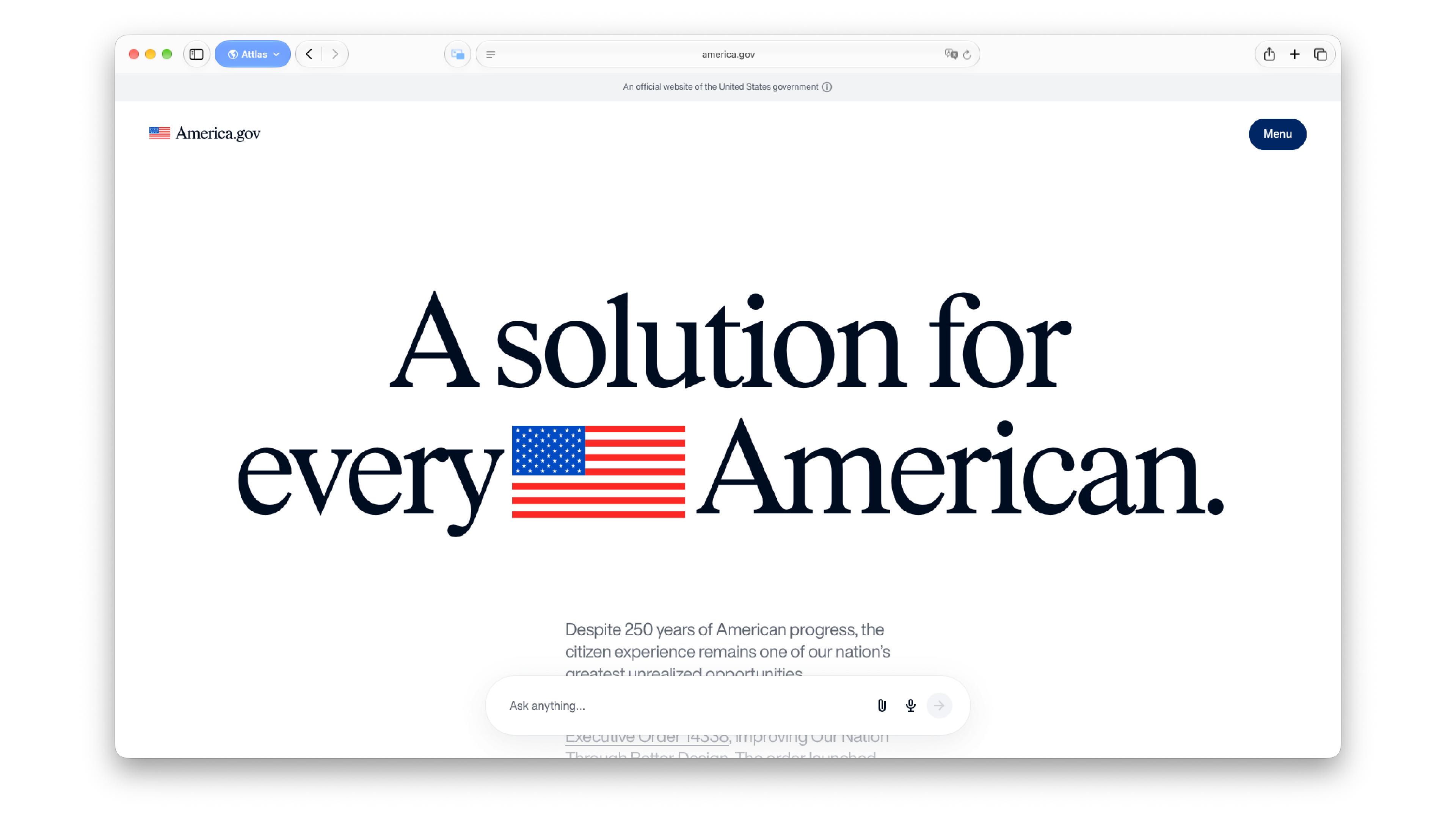
Then America.gov launched in late September 2026, and the homepage greets you with two words set in a large, confident serif: "Hello, America." Below that sits a single search field, gently suggesting you ask how to register a new business.
We're not here to grade it. What interests us is what America.gov design signals, because we think it's the start of a pattern, not a one-off. To understand why, it helps to begin with what the site actually is, and who was hired to make it.
What is America.gov?
America.gov is a single, AI-powered entry point to U.S. federal government information. Instead of browsing agency by agency, you type or speak a question, and the site answers using content from official government websites, linking back to the original sources. It was built by the White House's National Design Studio together with the General Services Administration, the agency that manages much of the government's shared digital infrastructure.
Its pitch is scale: roughly 29,000 federal websites folded into one place. Today it answers questions. The stated plan is to move from answers to actions starting in 2027, so tasks like applying for a passport or updating your legal name across agencies would happen inside the platform instead of across a dozen browser tabs. The site already previews that future in a collage of interface cards: a passport application, a name change checked off across several agencies, a tracker showing a document moving from "submitted" to "processing."
In other words, it's less a website than a front door. And as any architect will tell you, the front door sets the tone for the whole house.
A Chief Design Officer is the real headline
The person behind the studio is Joe Gebbia, Airbnb co-founder and a graphic and industrial designer by training, appointed as the first Chief Design Officer of the United States. Whatever anyone thinks of a specific output, the title itself is the news for our industry.
Here's the distinction that matters. When design works as a service, it gets called in at the end to make decisions look good. When design works as a leadership function, it sits in the room where decisions are made, and it has the standing to say "this process shouldn't exist in this form." Gebbia has described a routine government task that took 87 clicks being cut down to 12. That kind of change rarely comes from a nicer button. It comes from someone with the authority to question the flow itself.
The idea isn't entirely new. Gebbia has pointed to a federal design program from the 1970s as an inspiration, from an era when agencies commissioned serious identity work. What's different now is that the canvas is no longer a logo or a poster. It's a service.
When the homepage becomes a question
There's a principle in systems design called Conway's Law: organizations tend to build systems that mirror their own internal structure. It explains why so many government sites are organized by who does the work instead of what you need. To renew a document, you first have to know which department owns it. The navigation is basically the org chart, published.
America.gov flips that logic. Navigation starts from intent, not from structure. And the details of the search field do quiet, clever work. The placeholder text ("Try 'How do I register my new business?'") is microcopy acting as onboarding, because an empty box is intimidating and an example teaches you what's possible. The paperclip and microphone icons are affordances: visual cues that tell you, without a word of instruction, that you can upload a file or speak instead of type.
The shift also moves responsibility around. In a menu-based site, the user's job is to find. In a conversational interface, the system's job is to understand. That means content becomes the product. Every answer is only as good as the source pages behind it.
Designing trust when the interface is almost empty
When there's almost nothing on screen, every remaining choice carries more weight. America.gov design leans on a few of them.
Type pairing. Headlines are set in a high-contrast serif with tight spacing, the vocabulary of editorial magazines and heritage brands. Supporting copy and interface text use a clean grotesque sans serif (the family of plain, unadorned sans faces built for neutrality). The serif brings institutional weight; the sans keeps the interface calm and functional. It's a classic editorial move applied to a government product.
One accent color. The palette is light gray, near-black text and a single deep navy reserved for actions: the Menu pill, the send button. Using one accent for interactive elements creates instant hierarchy, since anything navy can be clicked. The flag's red and white shrink to a tiny icon next to the wordmark. That's real restraint for a national brand.
Seals as proof, not ornament. One of the most interesting moments is a huge typographic statement where agency seals sit inline between the words, right next to "official government sources," and a fingerprint icon sits beside "privacy." It's a technique borrowed from product marketing, where icons act as words. Seals have traditionally been decorative; here they work like trust badges. The promises (free, no ads, privacy protected) are set as the largest type on the page, which is typographic hierarchy doing the job of a policy statement.
People over monuments. The hero photo shows a mechanic working in a bike shop, not a building or a landmark. The citizen, not the institution, is the protagonist. Even the collage of old government sites has a visible pause button, a nod to accessibility guidance that asks for a way to stop moving content.
All of this sits between two lenses that designers have been debating: government as consumer brand versus government as public utility. The first optimizes for delight, familiarity and the feeling of a product you'd choose. The second optimizes for durability, consistency and working for everyone on any device. They aren't opposites, but they ask different questions, and visually America.gov speaks fluent consumer tech. The real test is what happens underneath.
Why other governments will probably follow America.gov
The "single front door" idea isn't new. The United Kingdom consolidated hundreds of department sites into GOV.UK years ago, and it became a reference for public design worldwide. What's new is the conversational layer on top.
People now use chat interfaces every day, and expectations travel fast. A government that answers questions in plain language makes every menu-based government site feel a generation older overnight. Add a visible design title at the top of the structure, and you have a model that's easy to copy. We'd expect other governments, including some in Latin America, to test similar approaches soon.
Translating it won't be copy and paste, though. Countries with several widely spoken languages, uneven connectivity or older devices need different answers. Voice input, for instance, matters far more where many people don't type comfortably.
What design at government scale actually demands
The launch screen is the visible tip. Underneath, a project like this lives or dies on things nobody screenshots.
The first is a design system. A style guide tells you what things should look like; a design system gives you reusable components, with rules, code and documentation, so hundreds of teams can build consistent experiences without a designer in every meeting. The cards in America.gov's preview (segmented controls, checklists, progress trackers) are exactly the kind of components that have to work across thousands of services. The U.S. already has a public federal design system with typefaces chosen for legibility, so the question of how the new visual language coexists with existing standards is a genuinely interesting design problem.
Then come content design (writing answers people understand on the first read), accessibility (contrast, screen readers, keyboard navigation, often a legal requirement) and governance: who decides what happens when an agency wants its own look. None of it is glamorous. All of it is the work.
What we can learn from America.gov
The first lesson isn't really about government. Most corporate websites are organized exactly like old government ones: About, Services, Divisions, the org chart wearing a nice font. America.gov is a reminder to start from the question your customer arrives with, not from how your company is structured.
The second is about restraint. One accent color, one strong type pairing and a lot of space made the trust promises the loudest thing on the page. Visual calm can be a credibility tool.
The third is about where design sits. A title doesn't guarantee good outcomes, but it changes what can be questioned. In a year, America.gov design won't be judged by its serif or its rounded corners. It'll be judged by whether the answers were right and the steps got fewer. For governments, and for brands, the identity people remember may no longer be the seal. It may be the moment someone types a question and gets exactly what they needed.