October 1, 2026
BAO LONDON BRANDING: WHEN COOKING AND DESIGN ARE THE SAME CRAFT
BAO London never had to choose between being a food place or a design place. Here's why its branding feels like one single universe, from the Lonely Man to its pixel city.
Most restaurants pick a lane. Either they're food people who call a studio once the menu is locked, or they're design people who open a gorgeous room and hope the kitchen keeps up. You can usually tell which one you're in within five minutes of sitting down.
BAO London is the rare case where you can't. The bun and the brand feel like they came out of the same steamer. That's what makes BAO London branding so worth studying: it isn't a great identity applied to a good restaurant. It's one creative practice that happens to express itself through pork belly, illustration, interiors and pixels, all at once.
We're fans, unapologetically. So let's break down why it works.
A Bun in Taiwan and Three Art School Brains
The story doesn't start with a logo. It starts with lunch. After Erchen Chang and Shing Tat Chung finished art school, they set off on a trip around Taiwan with Shing's sister, Wai Ting. Somewhere in the mountains in the northeast of the island, they ate a bao so soft it rewired their plans. They came back to London determined to get that bun right.
Food was already in the family. Shing's parents had run a Cantonese restaurant in Nottingham, so hospitality wasn't a foreign language to them. The creative side ran just as deep. Erchen and Shing met studying fine art at the Slade, where she leaned into sculpture and performance. Shing later did a master's in Design Interactions at the Royal College of Art. Wai Ting came from the world of clothing design.
So when they started, they did everything themselves: sewing their own uniforms, building their own stalls, designing the identity, coding the website and testing the recipe over and over. It all began as street food in East London, with little more than a coolbox and a steamer. A few years later, in 2015, they opened their first restaurant in Soho, a tiny room of around 30 seats.
Their mantra sums it up: think food, serve design. For them, food is how they speak and design is how they think. Nobody bolted design on later. Both passions walked in the door at the same time.
Why BAO London Branding Feels Like One Universe
Here's a distinction worth having in your toolkit. A visual identity is the logo, the palette, the typography: the things that make a brand recognizable. A brand world is bigger: a character, a tone, a set of unwritten rules and a story. An identity keeps things consistent. A world gives you permission to be different every time and still be recognized. Think of it like a TV series: every episode looks different, but you never wonder which show you're watching.
BAO is a world.
The Lonely Man, an Artwork That Found a Home
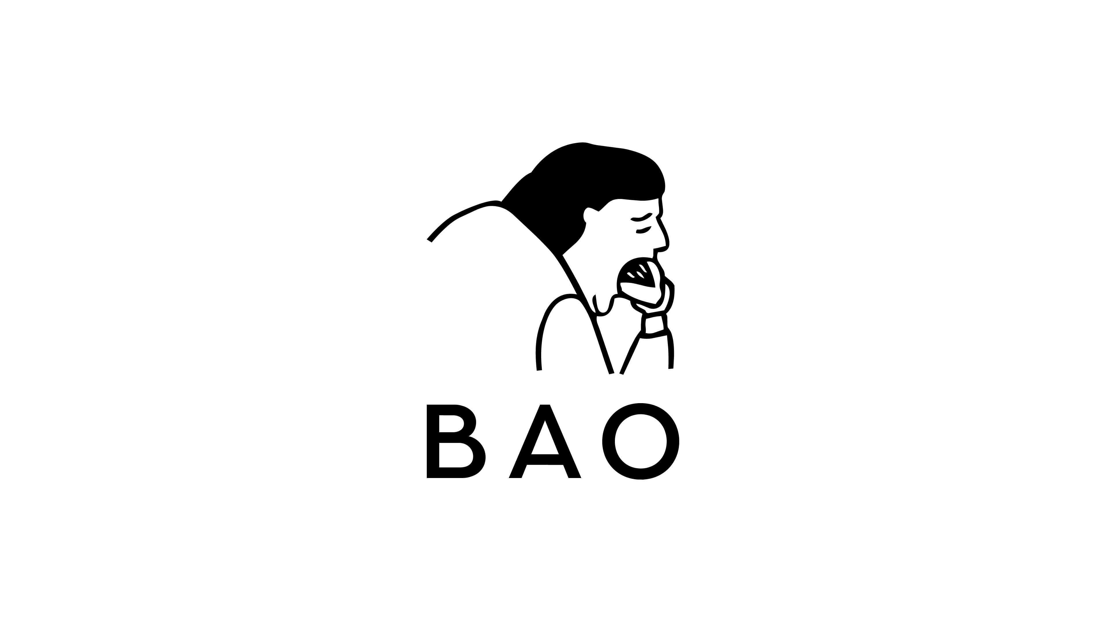
The logo existed before the restaurant did. Erchen created the Lonely Man for her final show at the Slade, a character drawn from the figure of the Asian salaryman: oversized suit, eating alone, quietly emotional. When BAO came along, he found the perfect job: enjoying a bao by himself, completely content.
This is why a character beats a symbol. A symbol just sits there. A character has a mood. He can show up on a tote bag, in a menu or in 8-bit, and he's still the same guy. And his mood (a small, perfect, slightly solitary moment with your food) is exactly how eating at BAO feels.
Two Hands, One Language
Look closely and you'll notice two sensibilities at work. Shing brings the clean, precise side of design; Erchen brings the loose, hand-drawn line. That tension is the secret. Pure system feels cold. Pure gesture feels messy. Clean structure with a human hand drawn over it feels like a person with taste made it. Because a person with taste did.
Menus, Spaces and Photography
The same voice runs through every physical touchpoint: warm wooden interiors, crisp white uniforms, dishes plated with a calm, almost sculptural restraint. And yet no two restaurants are clones. Each location takes on a different way of eating, from karaoke rooms to entirely new concepts, but always seen through the same lens. Different rooms, same world.
The Pixel Universe
This is where most brands would sh*t themselves. When the pandemic closed dining rooms, BAO launched a delivery spin-off called Rice Error and went louder than ever: a full menu redrawn in isometric pixel art, with a digitised Lonely Man straight out of an old computer game. Later came BAOverse, an app built with the studio HATO, where you wander a pixelated BAO city and each real restaurant has its own place on the map.
A completely different rendering style, and it still reads as BAO instantly. That's the real stress test of a brand world: change the medium, keep the soul.
The Bao Is Designed, the Design Is Cooked
What ties everything together is that the mindset runs in both directions.
The bao itself is treated like a designed object. It's handheld, soft, contained, proportioned to be eaten in a few bites: a format as much as a dish. Look at how it's plated and photographed and you'll see the same restraint you see in the interiors. Nothing extra on the plate, nothing extra on the wall.
And the design is treated like a recipe. It's tested, adjusted, balanced. A good dish doesn't need twenty flavors fighting each other; it needs one clear idea and the right supporting notes. BAO's branding works the same way: one character, a warm palette, a hand-drawn line, a sense of humor. Every new touchpoint is seasoned with those same ingredients.
That's also why copying BAO doesn't work. You can borrow the soft tones, the cute illustrations, the wood. But if the kitchen and the studio aren't the same brain, the result reads as decoration. At BAO, the design tastes like the food because it comes from the same place.
What We Can Learn From BAO
- Let design be born with the product, not after it. The strongest brands don't "get branded" once the business works. The thinking happens at the same time as the product.
- Give your brand a character, not just a symbol. A character can act, change context and carry emotion. A symbol can only be repeated.
- Consistency lives in tone, not in repeating the logo. BAO's locations are all different, and they all feel like BAO. Define the voice, not just the assets.
- Let your world travel. If your brand only works in one style or one format, it's fragile. Test it in a new medium and see if it survives.
- Make it with your own hands first. Sewing aprons and building stalls taught the founders what their brand actually was before anyone wrote it down.
BAO London branding is proof that you don't have to choose between being a great restaurant and a great brand. When cooking and design are treated as the same craft, every touchpoint ends up speaking one language, and people can taste the difference.