August 13, 2026
UEFA CHAMPIONS LEAGUE BRAND IDENTITY: INSIDE THE "KICK OF LIGHT" REBRAND
UEFA had every excuse to redesign the Champions League logo in 2024. It didn't. What it protected, and what it risked instead, says more about brand strategy than the glass effects ever will.
Most rebrands are an excuse to touch everything: the logo, the colors, the voice, the whole damn thing, because someone in a boardroom decided "fresh" means "different." UEFA had every excuse to do that in 2024, new format, new cycle, new revenue targets, and didn't take it. That refusal is the story. The glass effects are just the part that photographs well.
The Trinity: Why Three Assets Beat One Logo
Here's the branding-101 concept every agency deck loves to cite and almost nobody actually earns: the distinctive brand asset. A shape, a color, a sound, anything a market recognizes without needing the name attached. The Ehrenberg-Bass Institute has spent decades proving that fame comes from a small set of assets deployed with obsessive consistency, not from a punchier tagline or a seasonal creative refresh. Most marketing teams nod along to this in a workshop and then redesign their badge every four years anyway.
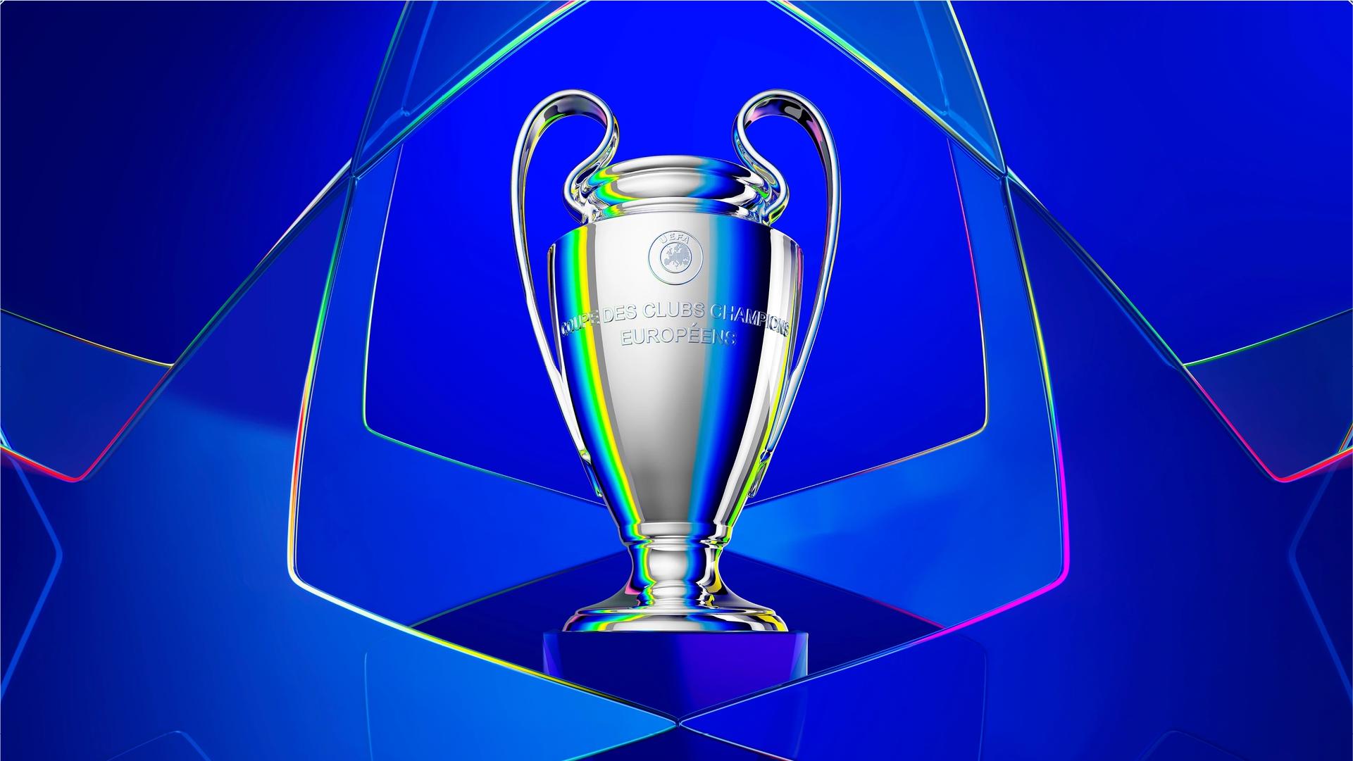
Most leagues get one asset, and it's usually a crest that does nothing: static, page-bound, a corner bug nobody clocks. The Champions League has three that actually clear the bar, ownable, since nobody else has a starball; consistent, same core object since the late '90s; and flexible enough to be a 2D mark, a stadium dome, a light source, and a sound cue without losing the plot. That last part is the whole game, and it's exactly what got tested when the format changed: a 36-team league phase meant something in this system had to move. The question wasn't whether UEFA would touch it. It's what they'd let themselves touch, and what they wouldn't.
Kick of Light: The Metaphor Is Doing Structural Work
The lazy read on Kick of Light is "ooh, glass." The actual problem it's solving is less pretty and more useful: how do you visually represent 36 competing clubs, 36 identities, 36 egos, and still have it read as one brand on a scoreboard graphic?
The prism does that job honestly. White light in, full spectrum out, still one source. Each club gets a color at the edge of the starball; the ball itself never stops being singular. That's a functioning visual argument, not a rendering flex. And here's where the restraint actually shows up: even as the entire system got rebuilt, the stadium dome, the typeface, the motion graphics, the logo itself didn't move. Every rebrand pitch deck says "we protected what matters." Most of them are lying, because the client's ego wants a new logo more than the brand needs one. UEFA didn't blink here, which is rarer than it should be. But protecting the logo doesn't mean the whole system played it safe, it means the risk had to land somewhere else.
Where the System Takes On Real Risk
It landed in the typeface first. Champions Display Refracted lets individual letters shift color mid-word, same prism logic, applied to type. Cute in a brand book. A liability on a live scoreboard, where a lower third has about half a second to be read correctly by someone watching on a phone in a bar with the sound off. If that typeface ever wanders past hero titles into functional UI, it's not an aesthetic risk, it's a readability bug wearing a concept as a costume. The safe assumption is that it stays decorative. Safe assumptions are also exactly what brand guidelines exist to enforce, and guidelines get ignored by year three of every cycle, ask any agency who's had to defend their own system against a regional marketing team with Canva access.
The light wave texture inherits the same problem, just moved from screen to stadium. A refracted glass motif renders however you want it to in a case study video. It has to survive as tier-dressing, physical lighting, actual architecture, none of which forgive a concept for being "just an idea." Vasava's reel looks flawless. Twenty stadiums, twenty install crews, twenty budgets later is where that concept either holds or turns into a slightly-off gradient sticker nobody in the room signs off on but everyone quietly ships. Everything discussed so far, the trinity, the prism, the typeface, lives in the part of the brand people can see. The part they can't, the one asset spared from all of this execution risk, has been sitting in the background the entire time.
The Sonic Asset Almost No One Accounts For
The anthem. Nobody puts it in the case study deck because it isn't a render, it's a sound, and sound doesn't screenshot well. That's a mistake, because it's arguably the strongest asset UEFA owns, precisely because nobody had to reinvent it, only protect it. Building a sonic asset with this kind of recall takes decades of not touching it, the sound that makes a room go quiet before a ball's even kicked. The 2024 refresh re-recorded it with original composer Tony Britten and the choir Tenebrae, richer orchestration, same composition, untouched. Same restraint as the logo. Zero of the risk the typeface and stadium textures are quietly sitting on. Which is a nice story about discipline, right up until someone in finance asks the only question that actually matters: does any of it move revenue, or is asset discipline just good theory that photographs well in a portfolio?
The Business Case, With a Caveat
There's a real number here, and it deserves better than a victory lap. Following the earlier rebrand built around the starball, Champions League revenue jumped from €2.136 billion to €2.853 billion the next season. That is not proof that a prettier ball equals more money, and any agency selling you that math is selling something else too. Format changes, media rights renegotiations, and football's broader commercial boom all happened in that same window. What the number does support, more narrowly and more honestly: a competition this dependent on global sponsorship cannot afford to look inconsistent or forgettable. Every choice covered so far, protect the logo, protect the anthem, spend the risk budget only where it's decorative, was built to avoid exactly that failure mode, which is really just the same decision made five different times.
What We Can Learn From This
Strip the football out and what's left isn't a lesson about starballs, it's a lesson about restraint under pressure to change everything. UEFA had every justification to touch the logo in 2024 and didn't, protected the anthem and barely touched it, and spent its actual risk budget on a typeface and a stadium texture that still have to prove themselves outside a reel. That's not a company being cautious. That's a company that knows exactly which asset is too expensive to gamble on, and which ones can absorb the bet. Most rebrands can't tell the difference, which is why most rebrands are forgotten within a cycle and this one is still getting written about a year later.