July 20, 2026
WHAT IS VISUAL HIERARCHY AND HOW DO YOU BUILD IT
Visual hierarchy isn't about making things bigger or bolder for the sake of it — it's a deliberate system of contrast that tells the eye where to go first, second, and last. Here's how it actually works.
The Eye Doesn't Wander, It Follows Instructions
Look at any well-designed page and your eyes move in a specific order, almost without you noticing. That's not an accident. That's visual hierarchy — the system of visual cues that tells the reader what to look at first, what matters second, and what's there to support the rest.
Visual hierarchy is, at its core, the visual expression of importance. Every element on a page — a headline, an image, a button, a caption — carries a certain weight. When that weight matches how important the element actually is, the reader moves through the content effortlessly. When it doesn't, the reader has to work to figure out where to start, and most of them won't bother.
This is different from what people often call "flat design" gone wrong: not minimalism, but a layout where everything has roughly the same visual weight. No clear entry point, no clear path. It's not that the design lacks style — it lacks instructions.
The Four Tools That Build Hierarchy
Hierarchy isn't a single decision. It's built from a small set of tools, used together and in contrast with each other.
Size and Scale
The most obvious lever: bigger elements get noticed first. But size only works as hierarchy if it's used selectively. If every headline is huge, "huge" stops meaning anything — the reader loses the reference point that told them what was most important in the first place.
Contrast and Color
Contrast isn't just about color choice — it's about value contrast: how light or dark something is relative to what's around it. A dark headline on a light background reads before a light gray line of text, regardless of font size. Color can support hierarchy, but value does most of the actual work.
Spacing and Proximity
White space isn't empty space — it's an active tool. Elements placed close together read as related; elements separated by space read as distinct. Generous spacing around an element also gives it more visual priority, almost like a spotlight.
Position and Flow
Readers don't scan randomly. In left-to-right reading cultures, eyes tend to follow predictable patterns — a Z-pattern for simpler layouts, an F-pattern for text-heavy pages. Placing your most important content along that natural path means less work for the reader, and more chances your message actually lands.
None of these tools work in isolation. Real hierarchy comes from layering them — size and contrast and spacing pointing in the same direction.
Putting It Into Practice: Text and Images Together
Text Hierarchy — From Headline to Fine Print
Inside typography specifically, hierarchy is built through a smaller set of controls:
- Size — the most direct signal of importance.
- Weight — bold vs. regular tells the eye what to prioritize even at the same size.
- Tracking — the spacing between letters; tighter tracking reads as more assertive, looser tracking reads as lighter or more refined.
- Leading — the space between lines; tighter leading groups text as one unit, looser leading lets it breathe.
A simple hierarchy usually looks like this: headline (largest, boldest) → subtitle (smaller, often lighter weight) → body text (readable, neutral) → caption or fine print (smallest, often a lighter color). Each level has a job. The headline earns attention. The subtitle adds context. The body does the explaining. The caption supports without competing.
Where Images Fit Into the System
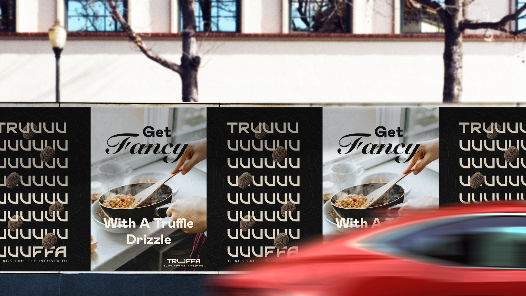
Images aren't decoration sitting next to the "real" content — they carry their own visual weight, often more than text does. A large, high-contrast image will almost always win the eye's attention over a paragraph, regardless of how important that paragraph actually is.
This is where a lot of layouts break down: a large image and a headline of similar visual weight end up competing for the same level of attention, and the reader isn't sure which one to process first. The fix isn't to shrink the image — it's to decide, on purpose, which one leads. If the image is the story, let it dominate and treat the text as support. If the text is the story, scale or crop the image so it reinforces rather than competes.
Structuring Sections Without Losing the Reader
Hierarchy doesn't stop at the level of a single headline or image — it also has to work across an entire page. Every section needs its own visual entry point: something that signals "a new idea starts here" before the reader even reads a word. That can be a section heading, a shift in spacing, a change in background, or a recurring visual pattern.
Consistency matters as much as contrast here. If every section uses a different logic for what's important, the reader has to relearn the system every time they scroll. A page with strong hierarchy repeats its own rules — once someone understands that bold headlines mean "new topic," that pattern should hold for the rest of the page.
A simple way to check if any of this is actually working is what's sometimes called the squint test: blur your eyes slightly, or step back from the screen, and see what still stands out. If the right elements are still readable as shapes and blocks — even without reading a single word — the hierarchy is doing its job. If everything blurs into the same gray mass, something in the system needs more contrast.
That's really what visual hierarchy comes down to: designing so the reader doesn't have to think about where to look next. The layout has already done that thinking for them.