October 30, 2026
HOW CHURCH BRANDING GREW UP, AND WHY RELIGIOUS SPACES ARE TAKING IDENTITY SERIOUSLY
Some of the most beautiful buildings in any city have some of the weakest visual identities. A few religious spaces are quietly changing that, and one church in East London found its entire identity hiding in a window.
Think of the last church or temple you walked past. Chances are the building was stunning: centuries of craft in the stone, the windows, the proportions. Then you looked at the sign by the door, or searched for it online, and found a logo that felt borrowed from a different decade.
That gap between architecture and communication is where church branding lives. We’re looking at it the way we’d look at any industry, as designers. Not at what a community believes, but at how a place presents itself to the people walking by.
And lately, a few of these places have started presenting themselves very well.
What church branding actually means today
Church branding is the system that helps a religious space look and feel like itself everywhere it shows up: on the door, on a website, on a poster for a weekend concert. It isn’t about marketing a faith. It’s about giving a place, and the community around it, a clear and consistent visual voice.
The key distinction here is between a logo and a visual identity. A logo is one mark. A visual identity is the full kit: symbol, typography, color, photography style, and the rules for how they all work together. Many religious spaces have the first without the second, which is why their materials often look like they came from five different places. Usually, because they did.
Why is this happening now? Many of these buildings do much more than host services. Concerts, cafés, community programs and events all live under the same roof, and each new activity tends to arrive with its own flyer and its own font. At the same time, most people meet a place on a screen before they ever step inside. And when a historic building goes through a restoration, it becomes a natural moment to rethink how it communicates too.
The smartest projects borrow from what’s already there. In branding we call these distinctive brand assets: shapes, colors or details that people instantly connect with you. For a religious space, they’re often built into the walls. An arch, a window pattern, a material. There’s no need to invent a symbol when the architecture has been holding one for centuries.
A small case study from East London
One of our favorite examples is Saint Church, formerly known as Hackney Church, in East London. The historic building went through a major restoration and now also works as a venue for music and events, alongside a range of community projects.
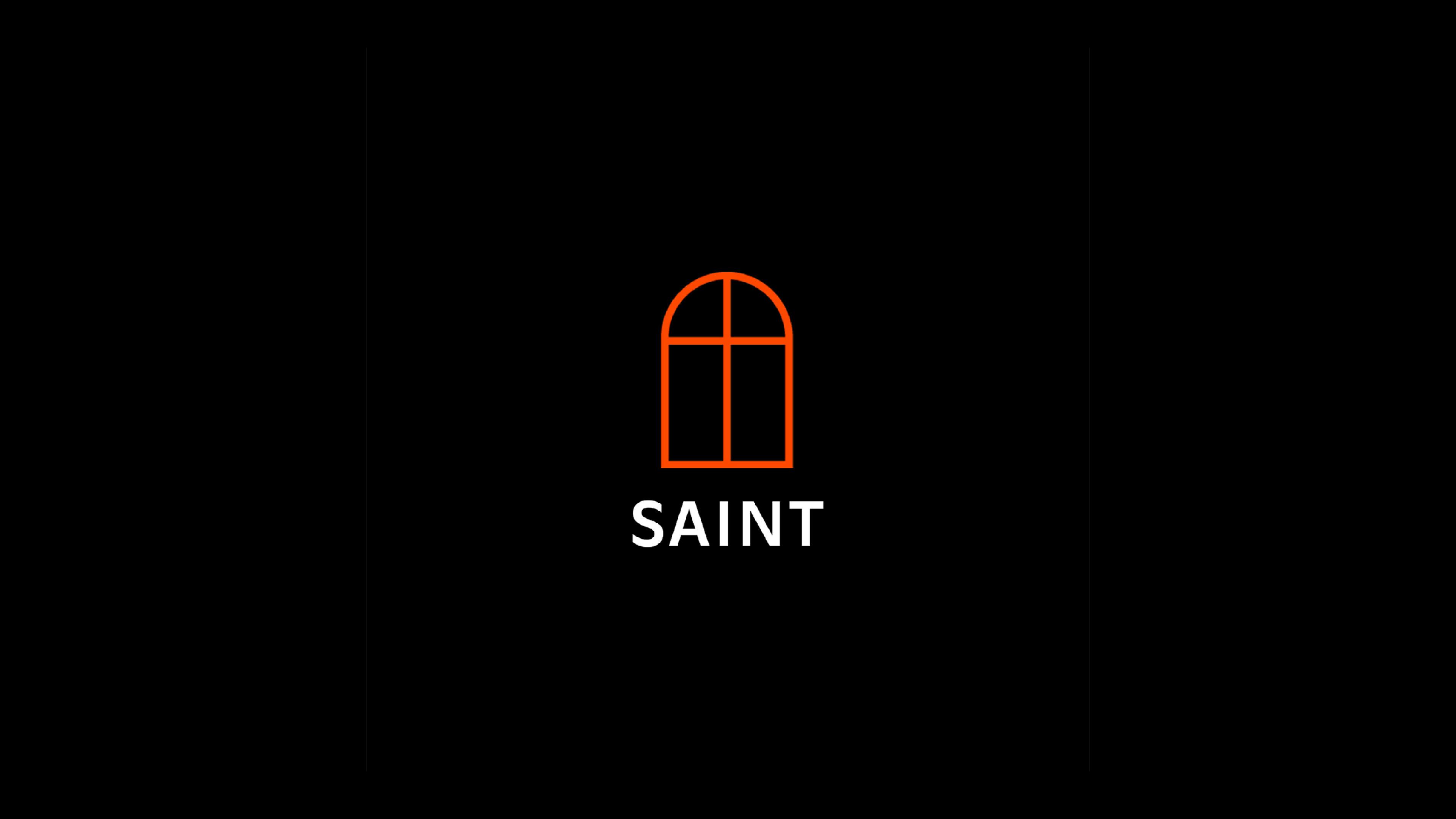
The identity, designed by London studio Omse, starts with the building’s large stained-glass windows. Their arched outline became the core symbol. From there, the studio created a family of smaller symbols for each area of activity, from the music venue to a brewery to beekeeping. In branding terms, this is an endorsed brand architecture: each sub-brand has its own personality, but all of them clearly belong to the same parent.
The really clever part is how the arch works as a frame device, a recurring shape that holds other content, like a window you look through. Here, the arch frames photos on the website, appears on signage and volunteer name tags, and even shapes the labels on cans. Once the shape becomes the brand, the brand can carry almost anything inside it.
Typography follows the same logic. A classic serif, GT Alpina, sets a calm and rooted tone across the main identity, while a sans-serif, Ginto, gives the youth programs a bit more energy. Same system, different volume depending on who’s listening. That flexibility is exactly what separates an identity from a logo.
If you run a religious or community space, here are 3 things you could review tomorrow
Count your logos. Gather every flyer, sign and social post from the last year and put them side by side. If you find three versions of your mark and five different fonts, that’s not a crisis. It’s a signal that you need a system.
Check your website for the basics. Service times, location, how to get there, what to expect on a first visit. Before any visual decision, your site should answer these clearly and calmly. Good church branding starts with being easy to understand.
Look up. Walk through your building and notice what people already remember about it: a window, a doorway, the color of the stone. That’s often where your identity is quietly waiting.
The same principles apply to temples, synagogues, mosques and other sacred spaces, with one extra layer of care. Sacred symbols carry meaning that no design studio should casually redraw. The strongest work builds a system around them, through typography, color and architecture, rather than reinterpreting the symbols themselves.
Good branding doesn’t change what a place means. It simply makes it easier for more people to find it, understand it and walk through the door. When church branding is done well, the building and its communication finally start speaking the same language.