October 31, 2026
FICTIONAL MOVIE BRANDS THAT BECAME REAL
Some brands were never supposed to exist. They were props, background noise, a logo on a cup in the corner of a frame, and yet a few of them now have real customers, real menus and real shelf space. The reason why has a lot to do with the designers nobody credits.
In 2017, people lined up in downtown Los Angeles for free curly fries at a fried chicken restaurant that, on television, was the front for a meth empire. Nobody was confused. Everyone in that line knew Los Pollos Hermanos wasn’t real. They showed up anyway.
That’s the strange power of fictional brands that became real. They were designed to live in the background of a story, and at some point the audience decided they wanted them in their lives too.
It would be easy to credit fandom and move on. But fandom alone doesn’t explain why these three brands made the jump while thousands of others stayed on set. That part starts with design.
Every fictional brand starts as a real design brief
Film and TV art departments have graphic designers whose whole job is inventing brands. Naming, logo, packaging, signage, uniforms, even the copy on a napkin. Sometimes it’s because real brands cost money or bring legal headaches. Sometimes it’s because no real brand fits the world of the story.
The working principle is verisimilitude: the quality of feeling true. A fictional brand has to look like it has a history behind it. Packaging should follow the conventions of its category, the logo should feel like it’s been through a couple of marketing meetings, and the tagline should sound like someone approved it. Too polished and the audience notices the designer. Too lazy and the whole fictional world feels cheap.
When that work is done well, something interesting happens. Marketers call these protobrands: brands that build emotional equity before any real product exists. The audience already knows the logo, the voice and the story. Eventually someone asks the obvious question: what if we actually sold this?
Los Pollos Hermanos and the art of looking ordinary
In Breaking Bad, Los Pollos Hermanos is the chicken chain Gus Fring uses to hide his drug business. That makes for an unusual brief. The brand has to be forgettable enough to hide something, and familiar enough to pass as a regional chain people trust with their lunch.
The logo shows two chickens in sombreros standing back to back, created in 2008 by Mexican artist Humberto Puentes-Segura. It sits inside a circular badge with a warm, bright palette, and it follows what designers call category codes: the visual conventions a category repeats until they become instantly readable. Fast food has spent decades teaching us that bright colors, friendly illustration and a badge-style logo mean “quick, cheap, tasty.” Los Pollos Hermanos follows those codes almost to the letter, which is exactly why it reads as real. Even the tagline, “Something delicious is always cooking,” does double duty as a wink to anyone watching the show.
Then the brand left the screen. Pop-ups opened at SXSW, Los Angeles and New York in 2017, followed by versions in Italy and Australia, and later a delivery-only virtual restaurant. The identity scaled to aprons, bags, cups and storefronts without breaking, which is the real test of any system.
There’s also a lesson here for designers. Puentes-Segura sold the logo for $640.50, with use limited to props, set dressing and wardrobe, and later sued Sony over the merchandise that followed. For a logo that ended up on T-shirts everywhere, that’s a cr*p deal, and a reminder that the usage rights clause is never boring paperwork.
Bubba Gump Shrimp Co. and a brand built around a person
In Forrest Gump, Forrest starts a shrimping business to honor his friend Bubba, who dreamed of it before dying in Vietnam. The name is literally two characters stitched together, which is an old naming technique: brands built on a person’s name carry a story from day one, the same way family businesses do.
The real version opened in Monterey, California, in 1996, two years after the film, through a partnership between Paramount and the Rusty Pelican restaurant group. It grew into an international chain and has been part of Landry’s since 2010. Of our three brands, this is the one that became a permanent business rather than an event or a product.
What makes Bubba Gump interesting from a design point of view is how the story turns into space. Dishes are named after characters, movie memorabilia covers the walls, and every table has a flip sign: “Stop Forrest Stop” when you need your server, “Run Forrest Run” when you’re fine. That’s a functional piece of service design wrapped in brand narrative.
In branding we talk about touchpoints, every moment a customer interacts with a brand. Most restaurants treat “can I get a refill” as pure logistics. Bubba Gump turned it into a line from the movie. Add a casual, coastal visual language that borrows from everyday Southern seafood shacks (what designers call vernacular design) and the restaurant works as the film translated into architecture.
Stay Puft and the mascot that flattened New York
In Ghostbusters, Stay Puft is a marshmallow brand whose mascot becomes a giant monster stomping through Manhattan. The joke only works because Ray picks it as the most harmless thing he can imagine. In other words, the mascot had to be believably sweet.
The character was conceived by Dan Aykroyd and designed by Bill Bryan, and it openly borrows from the Pillsbury Doughboy and Michelin’s Bibendum. Round, soft white volumes, a permanent smile and a sailor outfit: white cap with a red ribbon, blue collar, red neckerchief. Primary colors on white, the classic grocery aisle formula.
This is where mascots become distinctive brand assets, the elements people recognize even without seeing the name. A quick way to judge one is the silhouette test: if you can recognize the character as a solid black shape, it’s doing its job. A puffy body plus a sailor cap passes instantly.
Stay Puft made the jump as a licensed product, with real marshmallows produced by different companies over the years, in a bag that mirrors the one in the film. The irony is hard to beat. The mascot is literally the villain, and people still happily put him in their pantry. That’s how much weight a well-designed character can carry.
What these screen brands can teach the real ones
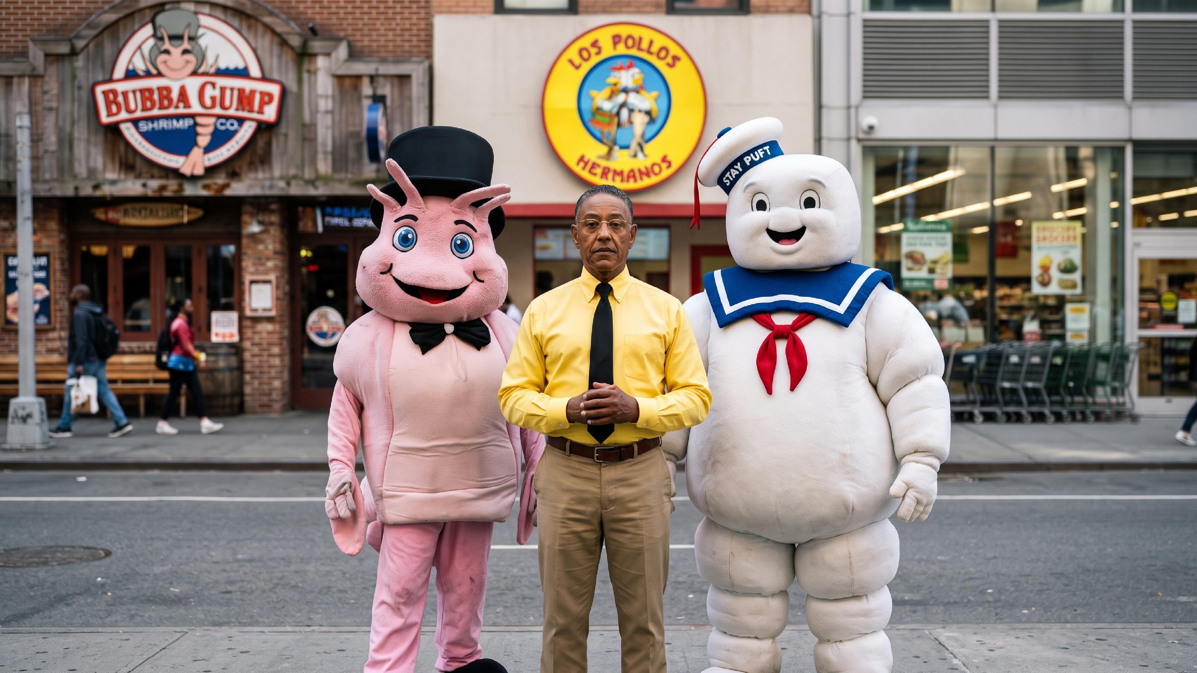
Look at the three side by side and the scales couldn’t be more different: a fast food identity, a full restaurant experience and a single mascot on a bag. They also left the screen in different ways, as a pop-up, a permanent chain and a licensed product.
What they share is that nobody designed them as fake brands. They were designed as real brands for fictional clients. They respected category codes, they had a story underneath, and their details were consistent enough to survive outside the context that created them.
That’s a useful mirror for real companies. Plenty of brands have bigger budgets and less personality than a prop built for a TV show. If a fictional chicken joint can draw lines around the block, the gap usually isn’t money. It’s clarity, character and a system that holds together.
That’s what we find most interesting about fictional brands that became real. They prove that good branding is storytelling with a system behind it, and that it works even when the client happens to be imaginary.