November 17, 2026
HANDWRITTEN LOGOS AND WHY EVERY BRAND SUDDENLY WANTS TO LOOK HUMAN
Handwritten logos look careless on purpose, and for a while that carelessness was the most convincing thing a brand could say. So what happens when every café on the block starts saying it too?
You walk past a new café, glance at the sign, and something in your head goes: a kid could have drawn that. Or maybe: they made this in five minutes on a napkin. The letters wobble. The line is thin in some places and heavy in others. Nothing sits quite straight.
Then you walk into the restaurant next door, and the menu looks the same. The clothing store across the street has the same scribbled wordmark on its tote bags.
Handwritten logos are everywhere right now, and they are not an accident. Someone paid for that wobble. The interesting question isn’t whether they look good. It’s why something that looks rushed makes us trust a brand more than something polished ever did.
It Looks Like a Kid Drew It, and That’s the Point
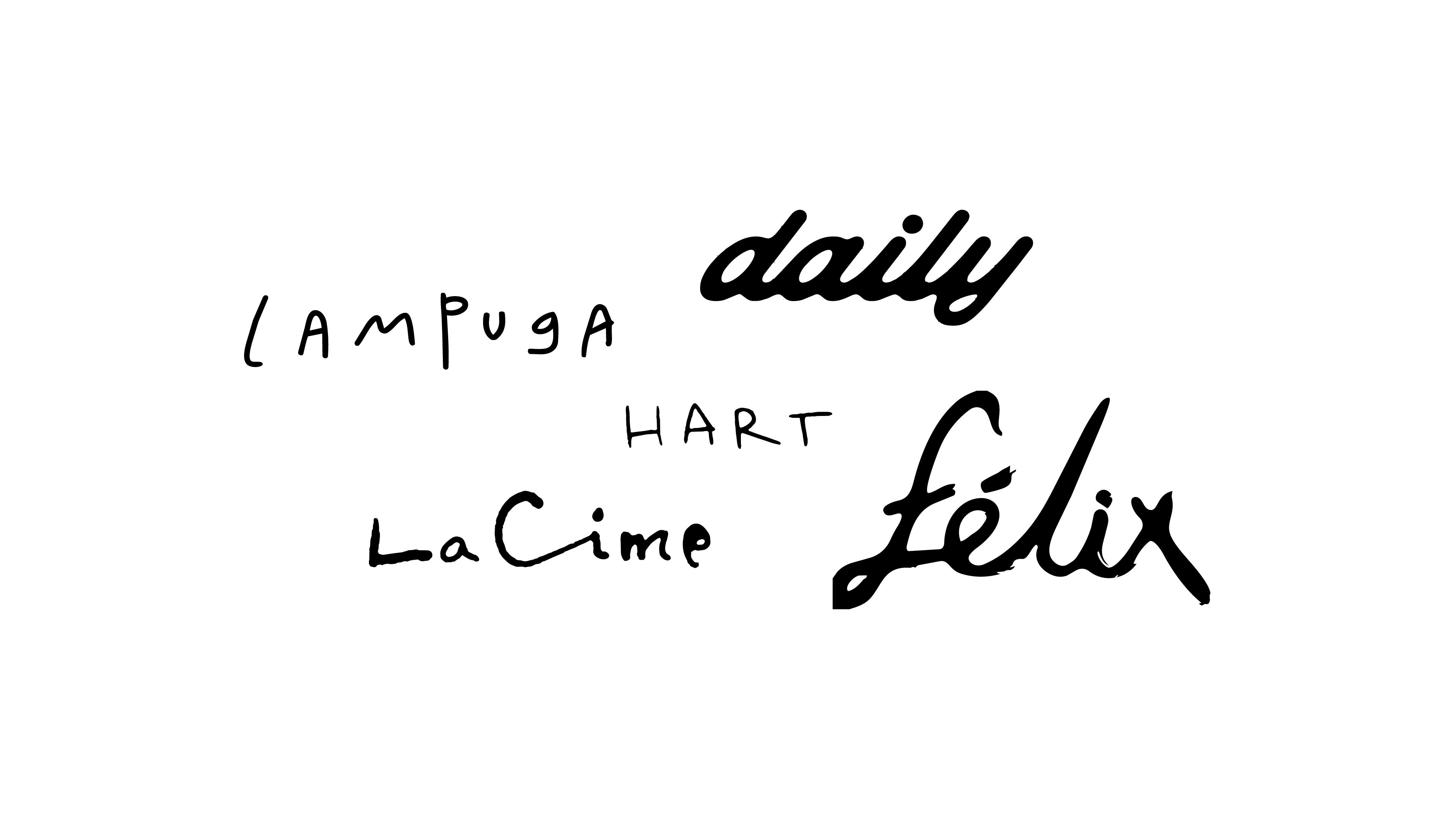
Look closely at most handwritten logos and you’ll find the same ingredients. A baseline (the invisible line letters sit on) that drifts up and down. Strokes that change weight mid-letter, as if the pen were running out of ink. Letters that repeat but never match: the two a’s in a name look like cousins, not twins. Edges with a bit of texture instead of crisp vector curves.
None of it is careless. Making something look spontaneous on purpose is one of the hardest briefs in design. Too clean and it reads like a script font. Too messy and it reads like a mistake. The good ones land in a narrow space where it feels like a person wrote it once, quickly, and decided it was good enough.
It’s a very specific kind of craft: designing the absence of design.
So if it’s that deliberate, what exactly is it switching on in our heads?
Why Handwritten Logos Make Us Believe a Brand Is Real
Our brains love shortcuts, and one of the oldest goes like this: polish means production, and production means someone is selling us something. When a logo looks perfectly engineered, we instinctively picture a boardroom, a brand committee, twelve rounds of revisions. When it looks rough, we picture a person.
That’s the whole trick. Imperfection reads as honesty. If it doesn’t look produced, we assume there’s nothing to hide.
The “a kid could have drawn that” reaction works in the brand’s favor too. Children’s drawings come with a built-in sincerity. A kid isn’t strategizing; they’re just making the thing. When a logo borrows that visual language, it borrows a bit of that innocence along with it.
The “made in five minutes” feeling does something else: it puts the owner in the picture. We imagine the founder of the café writing the name on a piece of paper the night before opening. Not an agency, not a deck. Just someone with a pen and a place they care about.
In design terms, this is signaling: visual cues that communicate values without saying them out loud. A handwritten wordmark signals small, independent, personal, made with care. It does that before you’ve tasted the coffee or touched the fabric.
When the trend started, that signal was powerful precisely because it was rare. Surrounded by brands that looked clean, geometric and interchangeable, a hand-drawn sign felt like finding a handwritten letter in a pile of mass mail. You noticed it. You believed it.
But signals have an expiration date.
When the Scribble Becomes the Uniform
A signal only works while it’s scarce. That’s the uncomfortable rule behind every visual trend, and handwritten branding is now running straight into it.
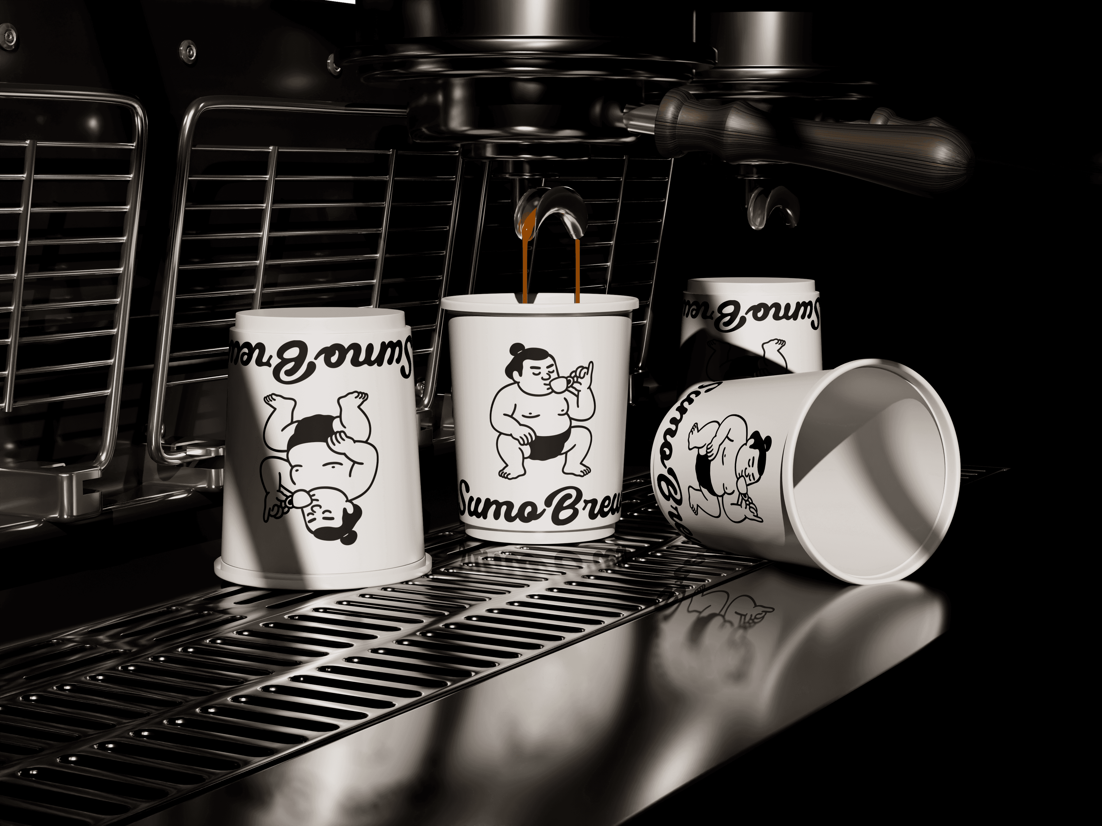
Walk through any neighborhood with a decent coffee scene and count the scribbled logos. The café has one. The natural wine bar has one. So do the brunch spot, the bakery and the small label selling linen shirts: same pen, same wobble, same “we’re just people” energy. Clothing brands push it even further, spreading hand-drawn wordmarks across tags, tees and shopping bags until the whole store feels like a sketchbook.
At that point, the scribble stops saying “someone real is behind this” and starts saying “someone saw this on Instagram.” Audiences learn fast. Once enough people realize the spontaneity is a style choice, what used to read as honest starts reading as strategy. And strategy dressed up as honesty lands worse than strategy that just admits what it is.
It’s also gotten easier to fake. Handwriting-style typefaces and ready-made “hand-drawn” logo kits mean the look can be applied in an afternoon, with no hand involved at all. The irony writes itself: some of the most personal-looking logos out there are now the most generic.
That’s how a rebellion becomes a uniform. Authenticity turned into an aesthetic, and aesthetics, unlike values, go out of style.
So what’s left for a brand that genuinely wants to feel human?
What’s Left When the Scribble Stops Working
The answer is less dramatic than putting the pen down for good. Handwriting isn’t the problem. Using it as a shortcut is.
The human feeling a brand is chasing rarely lives in the logo alone. It lives in the voice the brand writes with, the stories it chooses to tell, and how much of its process it’s willing to show. A restaurant that talks about its suppliers by name, a café that lets its staff’s personalities show on social media, a clothing brand that shows the hands actually stitching the garments: those feel human without a single wobbly line.
When a handwritten logo does make sense, it’s usually because it’s tied to something true. The founder’s actual handwriting. A sign painter from the neighborhood. A menu that really does get rewritten every week. That kind of mark doesn’t need the trend to justify it.
What made us fall for handwritten logos in the first place was never really the wobble. It was believing that someone was actually there, holding the pen, with something to say. The scribble was just the proof. Brands that remember that will keep feeling human long after the trend moves on.