July 21, 2026
WHY SUBWAY MAPS AREN'T GEOGRAPHICALLY ACCURATE (AND WHY THAT'S THE POINT)
The first time you compare a subway map to an actual city map, something feels off — and that's not a bug. It's the entire point of the design.
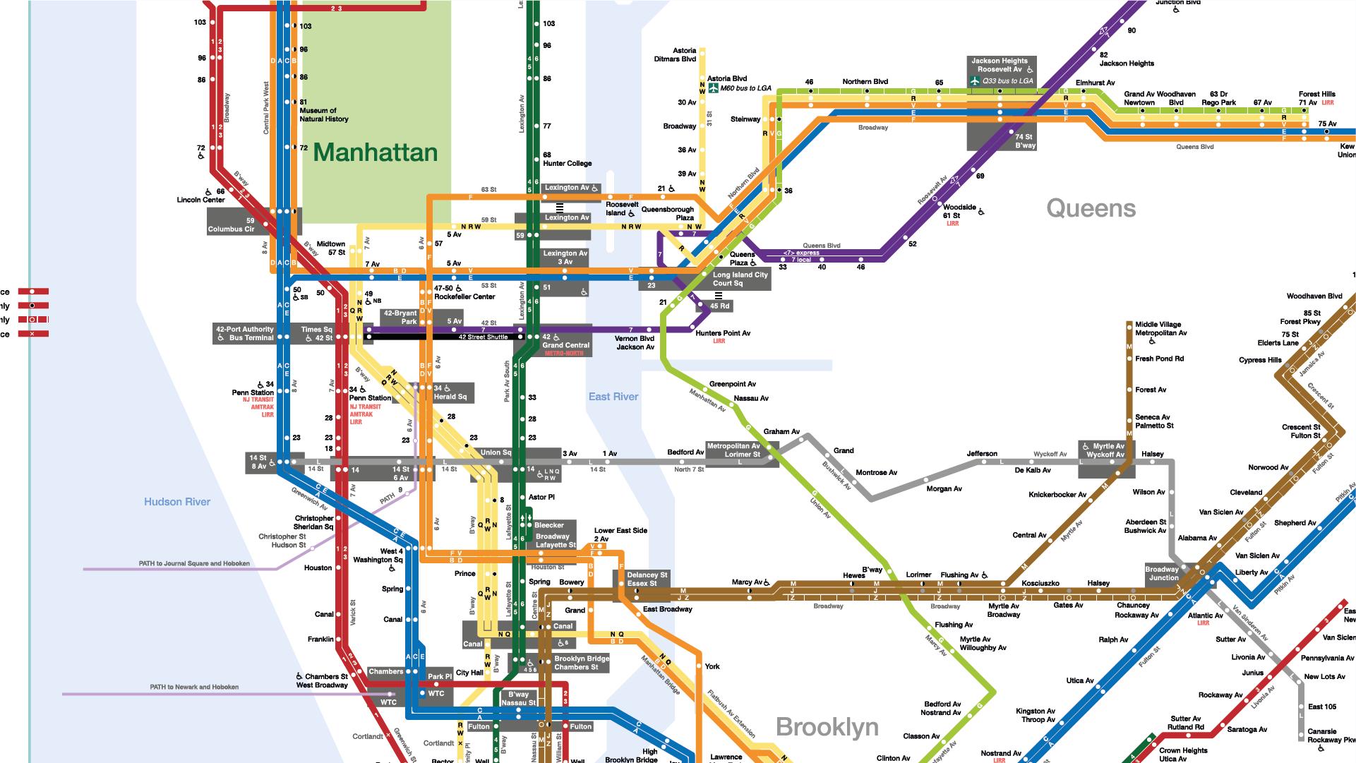
Open a subway map and your brain does something automatic: it assumes you're looking at a shrunk-down, accurate version of the city. Straight lines, evenly spaced stations, neat 45-degree turns — it reads like geography. It isn't.
What you're actually looking at is a topological map, sometimes called a schematic or diagrammatic map — a diagram that preserves connections and sequence while discarding real-world scale, distance, and angle. Two stations that look next to each other might be a 20-minute walk apart. A line that looks perfectly straight might curve three times underground. None of that matters to the map, because none of it matters to the question the map is answering, which isn't "where is this, exactly?" — it's "how do I get from here to there?"
This is why distances get compressed or stretched, curves get straightened into clean diagonals, and outlying stations get pulled inward so the whole system fits in a legible frame. And critically: almost nobody notices while using it. Human wayfinding doesn't run on precise spatial math — it runs on sequence, order, and connection points. We care that Station B comes after Station A and before Station C. We rarely care if B is geographically closer to A or to C. The map exploits that cognitive shortcut on purpose, and it's a genuinely elegant piece of information design because of it.
The Design Workarounds That Actually Make These Maps Work
Once you accept that a subway map's job is clarity, not cartography, the "inaccuracies" stop looking like flaws and start looking like a toolkit. Here's what's actually happening under the hood.
Angle standardization & uniform spacing
Real train lines curve, bend, and zigzag based on terrain, existing infrastructure, and geology. None of that visual noise survives into the diagram. Designers snap every line to a small set of fixed angles — typically horizontals, verticals, and 45-degree diagonals — so the eye never has to process an irregular curve. It's the same principle behind circuit diagrams and flowcharts: consistent angles reduce the cognitive load of tracing a path.
Alongside that, station spacing gets normalized. Two stations that are two kilometers apart and two stations that are two hundred meters apart often get drawn with nearly identical gaps. This isn't sloppiness — it's a deliberate choice to make every segment of the journey feel equally "readable," rather than letting long suburban stretches visually dominate a map that's mostly used for dense, central-city navigation.
Color and hierarchy as a wayfinding system
Color on a subway map isn't decoration — it's the primary navigation tool. Each line gets a distinct, high-contrast color specifically so a rider can say "follow the orange line" without ever reading a station name. That's a wayfinding system doing the job that text would otherwise have to do, and it works faster than text because color recognition is quicker than reading.
Typography and iconography sit right underneath color in the hierarchy. Interchange stations, terminals, and accessibility icons need to be scannable at a glance, which means designers are constantly making decisions about what gets bold, what gets a larger icon, and what gets deprioritized entirely. A well-designed transit map is really a hierarchy of "read this first, this second, ignore this unless you need it."
Node inflation & zonal insets
In a real city, a major interchange station might occupy roughly the same physical footprint as any other stop. On the map, it gets drawn bigger — a larger node, sometimes a distinct shape, sometimes extra visual weight — because it carries more decision-making importance for the rider, even though it carries no extra geographic size. This is a classic example of a map lying about scale in service of telling the truth about function.
The same logic shows up at the city-wide level through zonal insets: when a downtown core gets so dense with stations that drawing it at the same scale as the rest of the system would turn it into an unreadable knot, designers "pop it out" into a separate, zoomed-in box elsewhere on the map. It breaks geographic continuity completely — and it's exactly the right call, because a rider navigating the dense core needs a different level of detail than a rider crossing the outer system.
Clarity Over Precision — and What It Teaches Us Beyond Subway Maps
Every one of these workarounds is really the same trade-off wearing a different costume: sacrifice geographic precision to reduce cognitive load and speed up decisions. A rider glancing at a map mid-rush doesn't need to know true distances — they need to know "next stop," "change here," "almost there." A perfectly accurate geographic map would actually make that harder, not easier, by burying the useful information under real-world clutter.
This topological approach became the standard model for transit maps across major cities over the twentieth century, and it's worth noting that it wasn't an accident of style — it was a response to a real usability problem with earlier, geographically literal transit maps that were harder to parse at a glance.
The lesson travels well past subway systems. It's the same principle behind a good dashboard, a clear onboarding flow, or a well-structured site map: fidelity to the underlying system is not the goal. Fidelity to how someone actually needs to use the system is. Sometimes the most honest thing a design can do is distort reality — as long as it distorts it in service of the person trying to get somewhere.