September 10, 2026
WHAT ARE BRAND ASSETS, AND WHY THEY MATTER AS MUCH AS YOUR LOGO
Everyone obsesses over the logo. Fewer brands invest in the system of colors, type, patterns, and packaging that actually makes them recognizable, and that system matters just as much.
Ask most founders what their "brand" is, and they'll point at a logo file. It's the thing they paid a designer for, the thing that goes on the business card, the thing they'll defend for hours if you suggest changing the color.
But a logo is one asset. On its own, it can't carry the weight of an entire brand across a website, a product line, a storefront, and a social feed. What actually makes a brand recognizable, the thing you clock before you've even processed the logo, is a wider set of brand assets working together. Understanding what those are, and giving them the same attention you give your logo, is one of the more underrated moves a growing brand can make.
What Counts as a Brand Asset?
Brand assets are the reusable visual and verbal elements that make a brand identifiable, independent of any single piece of content. The logo is one of them. It's rarely the only one that matters.
Depending on the brand, the list usually includes:
- Color palette: not just a primary color, but how it's used, in what proportions, and where it shows up consistently.
- Typography system: the typefaces used for headlines versus body copy, and how consistently that hierarchy is applied.
- Iconography: custom icons or illustration style, if the brand uses them.
- Imagery style: photography treatment, illustration approach, or a consistent visual mood.
- Patterns and textures: recurring graphic elements that show up across packaging, print, or digital.
- Tone of voice: how the brand sounds in writing, which is a brand asset too, even if it's not visual.
Not every brand needs all of these. A B2B software company might lean hard on typography and a color system and skip patterns entirely. A consumer packaged goods brand might build its entire identity around packaging structure and a distinctive pattern. The point isn't to check every box. It's to know which brand assets actually do work for your specific brand, and to build those deliberately instead of by accident.
Why the Logo Alone Can't Carry a Brand
A logo is small, static, and often absent. It's not on every frame of a video, it's not visible from across a store, and it disappears entirely once a product is out of its packaging or a post loses its watermark. If recognition depends entirely on that one mark being present and legible, the brand is fragile.
Real recognition works differently. It comes from the brain pattern-matching multiple signals at once: a color, a shape, a texture, a rhythm of typography, even before the logo registers. That's why you can spot certain drinks across a crowded fridge shelf without reading a single word on the can. The color, the wave pattern, the typographic style are doing that work together, and the logo is almost a formality by that point.
This is also why rebrands that touch only the logo tend to underwhelm. If the rest of the brand asset system stays generic, the mark alone can't fix how forgettable everything around it feels.
Brand Assets in Action: Packaging as an Extended Canvas
Packaging doesn't add a new set of rules to this. It's simply the surface where the brand assets we just listed show up all at once, in the object a customer actually holds.
Take Crumbl Cookies. Strip away the logo and what's left carrying the recognition is a single, consistently applied color asset: that specific pink, always in the same role, always in the same proportion. It's a case of one brand asset doing an enormous amount of work on its own, which is a useful reminder that a system doesn't need to be complex to be effective. It needs to be applied without exception.
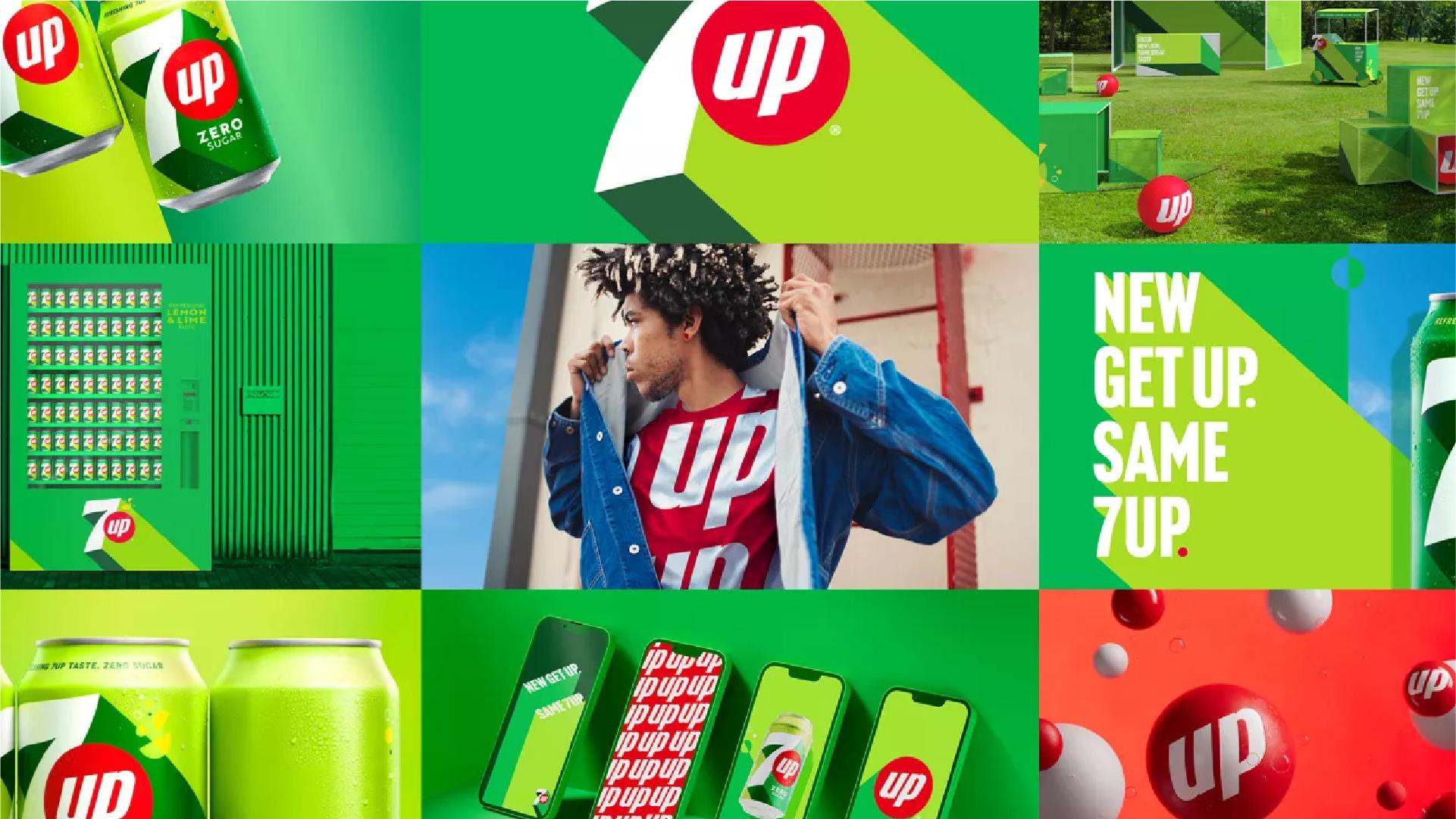
7up shows what happens when several brand assets converge on the same packaging at once: the green color field, the bubble and wave pattern, the citrus imagery, and a consistent typographic treatment, all repeated across cans, bottles, and secondary packaging. Cover the logo on a can and every one of those other assets is still doing its job, which is why the brand is still identifiable. That's the difference between a brand with one working asset and a brand with a full system: redundancy. If one asset is obscured or absent, the others carry the recognition instead.
Building a Brand Asset System (Not Just a Logo File)
Building this deliberately starts with sequencing, not a checklist. Color and typography come first. They're the assets people register fastest and the ones that get reused the most, across a website, a deck, a social post. Iconography, patterns, and textures come next, and a packaging or merchandise system only if the business actually needs one. A skincare brand and a neighborhood coffee shop don't need the same set of assets, and building the wrong ones first is wasted budget.
Prioritizing matters even more when resources are limited. If you can only invest in one thing beyond the logo right now, it should be whichever asset shows up most often in front of customers: packaging for a product brand, a color and type system for a service business, a photography style for anything visual-first.
None of this works if it lives in a PDF nobody opens. A brand asset system needs to be something the person designing the next Instagram post, the one printing the boxes, and the one building the website can all actually reference. If only the founder or the original designer knows the rules, they're not really rules, they're memory, and memory doesn't scale past one person.
The way to know if any of this is actually working is simple: cover the logo. Look at your packaging, your social feed, your storefront, with the logo blocked out. If the brand is still identifiable through color, pattern, type, or imagery, the system is doing its job. If what's left is generic, that's not a logo problem, it's a brand asset problem, and it points directly at what needs attention next.
If you're building or auditing your brand assets, here's where to start this week: check how often your brand depends entirely on the logo to be recognized across your own channels. Pick one secondary asset you're not using with intention yet (a color, a pattern, a typographic detail) and give it a fixed, repeated role. Then run the logo-covered test on your own packaging or Instagram grid. Wherever it fails is your real priority, not whatever's next on a generic to-do list.